Preproduction
The phase of shaping the concept for the book was by far the longest part of the entire process. From the moment we started working on it to the time it was finally published, nine years went by. Of course, this wasn’t nine years of constant, daily work on the book. The project was frequently set aside, and we would return to it in short, focused bursts whenever we managed to carve out even a single free week to work on it.
Trackernauts is an unusual and exceptional project. We didn’t want to create just “something.” Our goal was to craft something extraordinary—something that reflected our perspective, our sense of humor, and showcased our skills. We wanted anyone who picked up the comic to be captivated from the very first page and to see what they held in their hands as something truly unique and valuable.
Unfortunately, such an approach often runs counter to market trends and possibilities. Bold ideas come with significant risks, making it harder to find a publisher. We were aware of this and, even during the conceptual phase, we made several adjustments to cut costs, modifying some of the project's foundational ideas to make it more commercially viable. These changes, however, often forced us to discard substantial portions of our work and start over.
Idea
Comic game
Our starting point was to create a paragraph comic where the reader makes choices based on supplementary materials. The act of sifting through these additional materials immediately makes you feel like a detective, which naturally shaped the direction of the narrative — the story had to center around searching, tracking, and uncovering clues. This concept felt both fresh and exciting to us, but at that stage, we were still unsure how to fully bring this vision to life.
Scenario
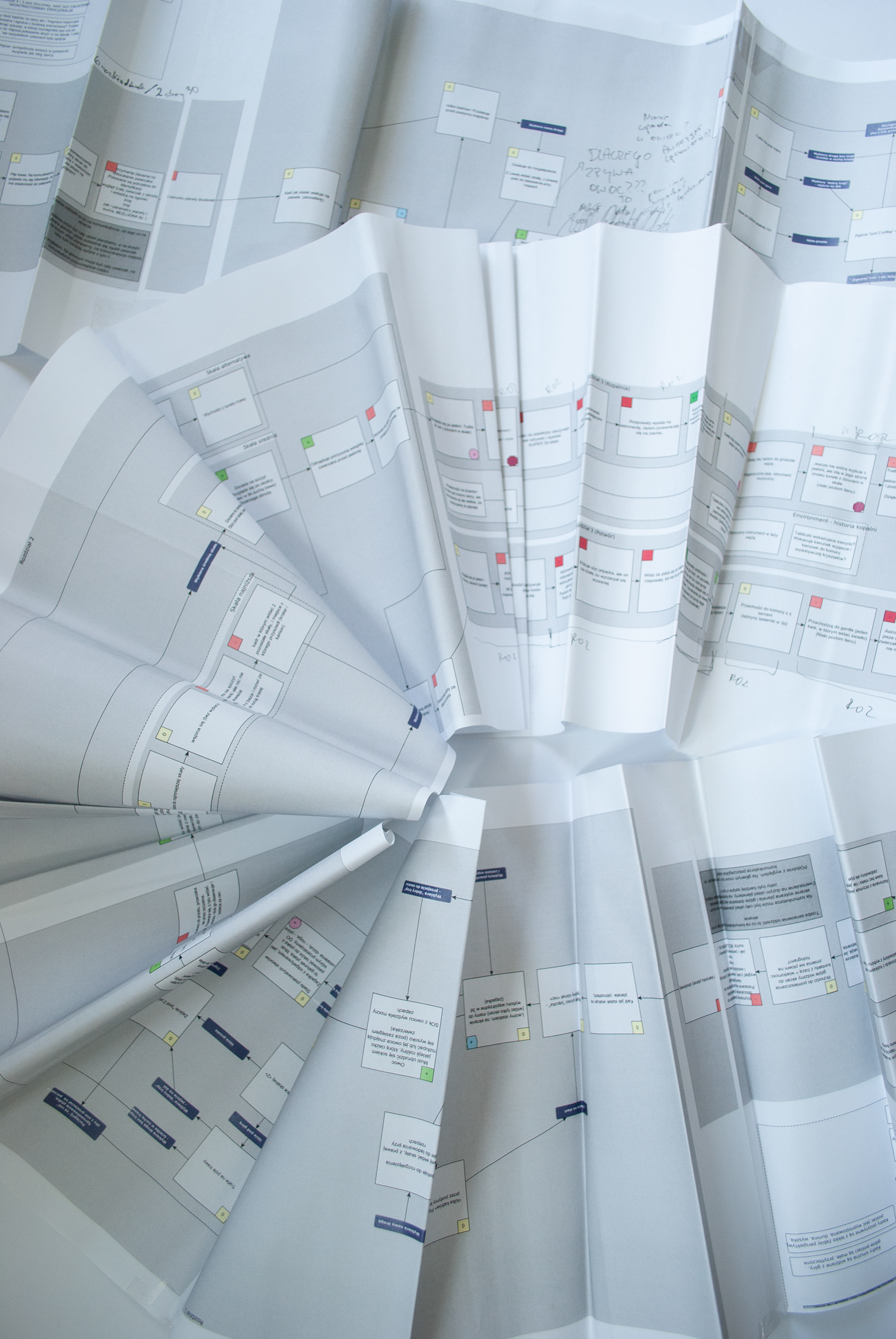
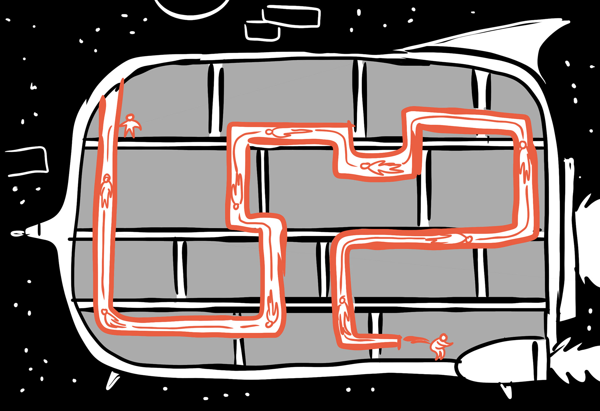
The framework of the script came together relatively quickly and took the form of a simple choice graph. This allowed us to visualize all possible paths through the book, identify the rhythms within the story, and mark moments where key themes reappear. The graph also helped us define the most important plot points that needed to remain consistent regardless of the chosen path.

Searching for the Form
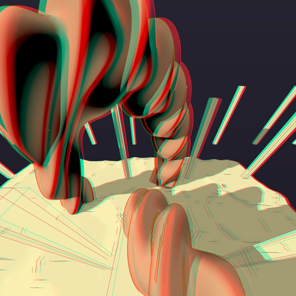
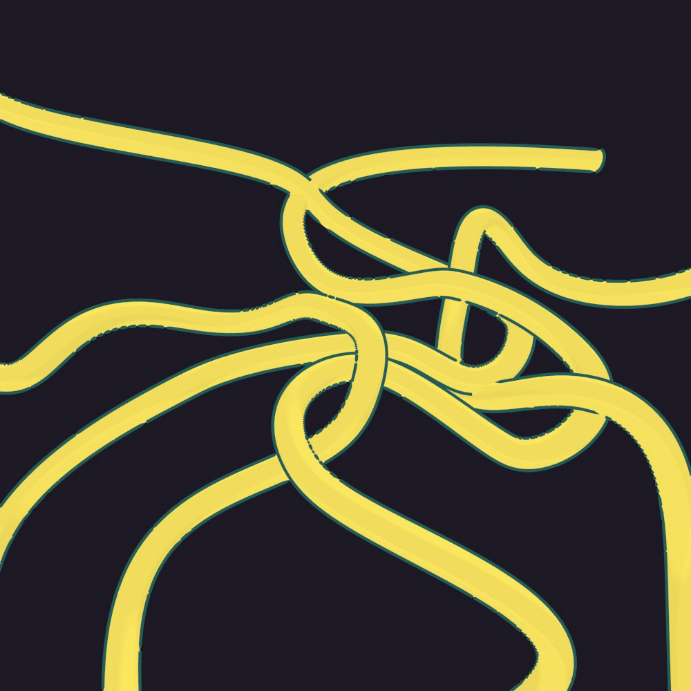
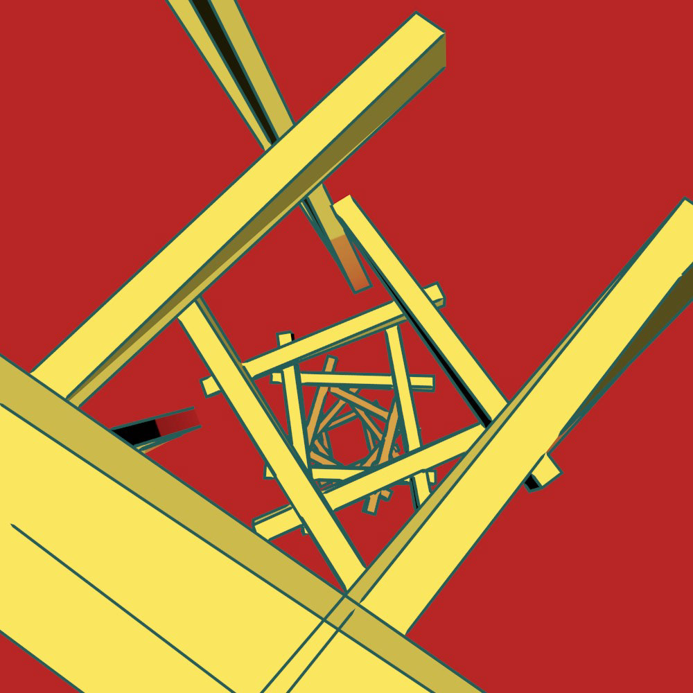
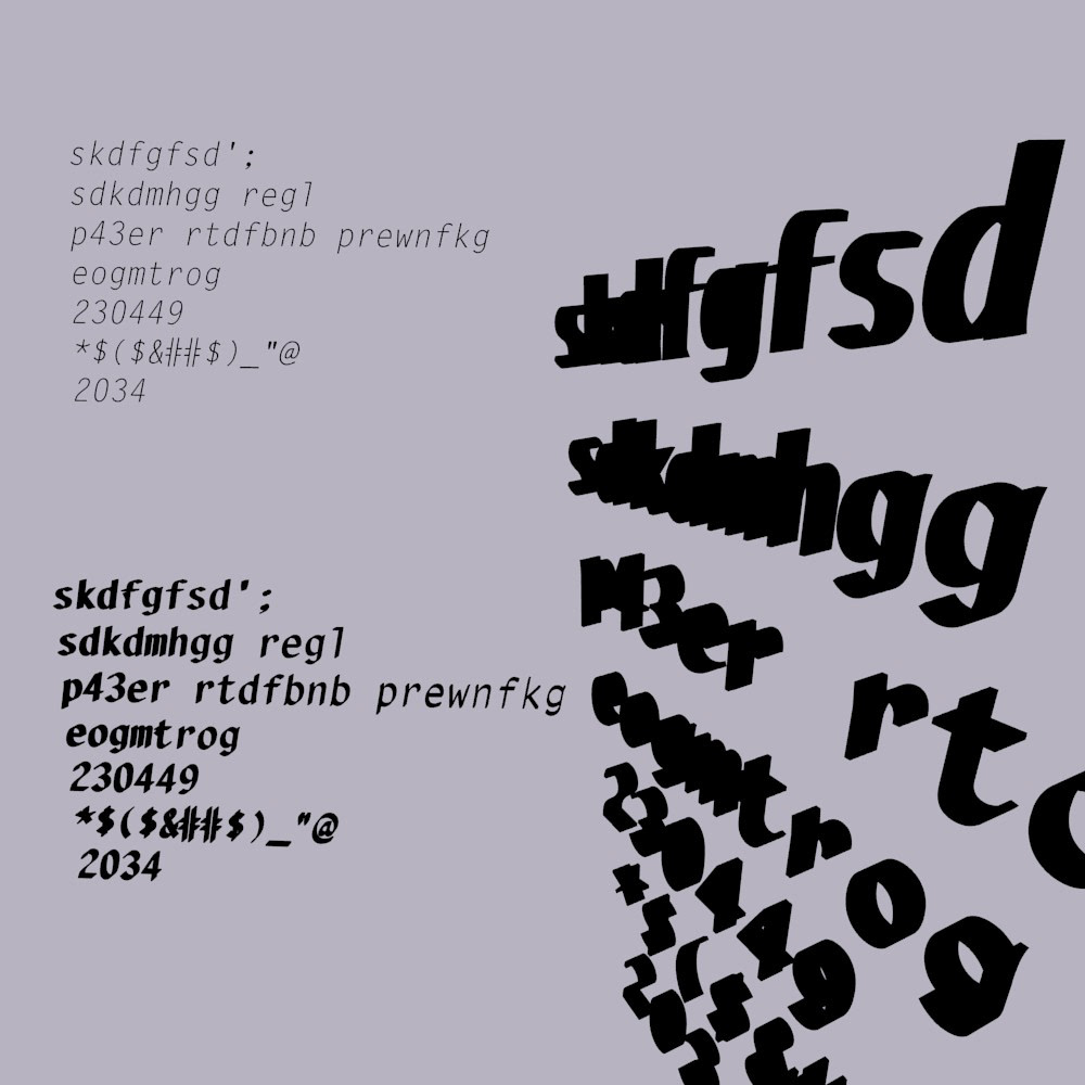
First Approach: A Book with 3D Puzzles
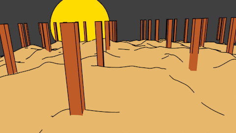
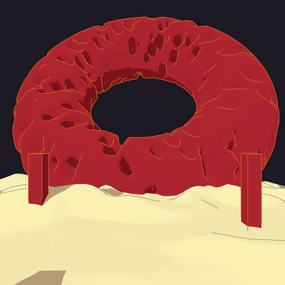
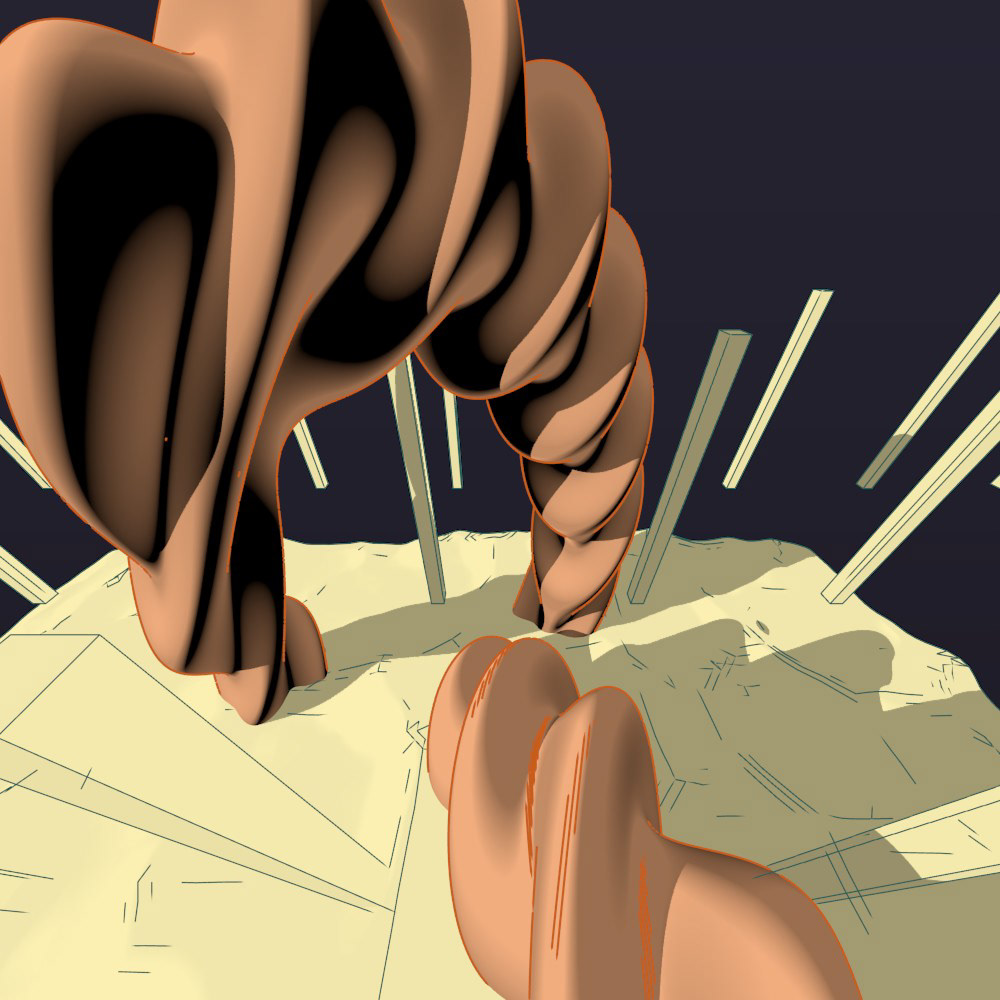
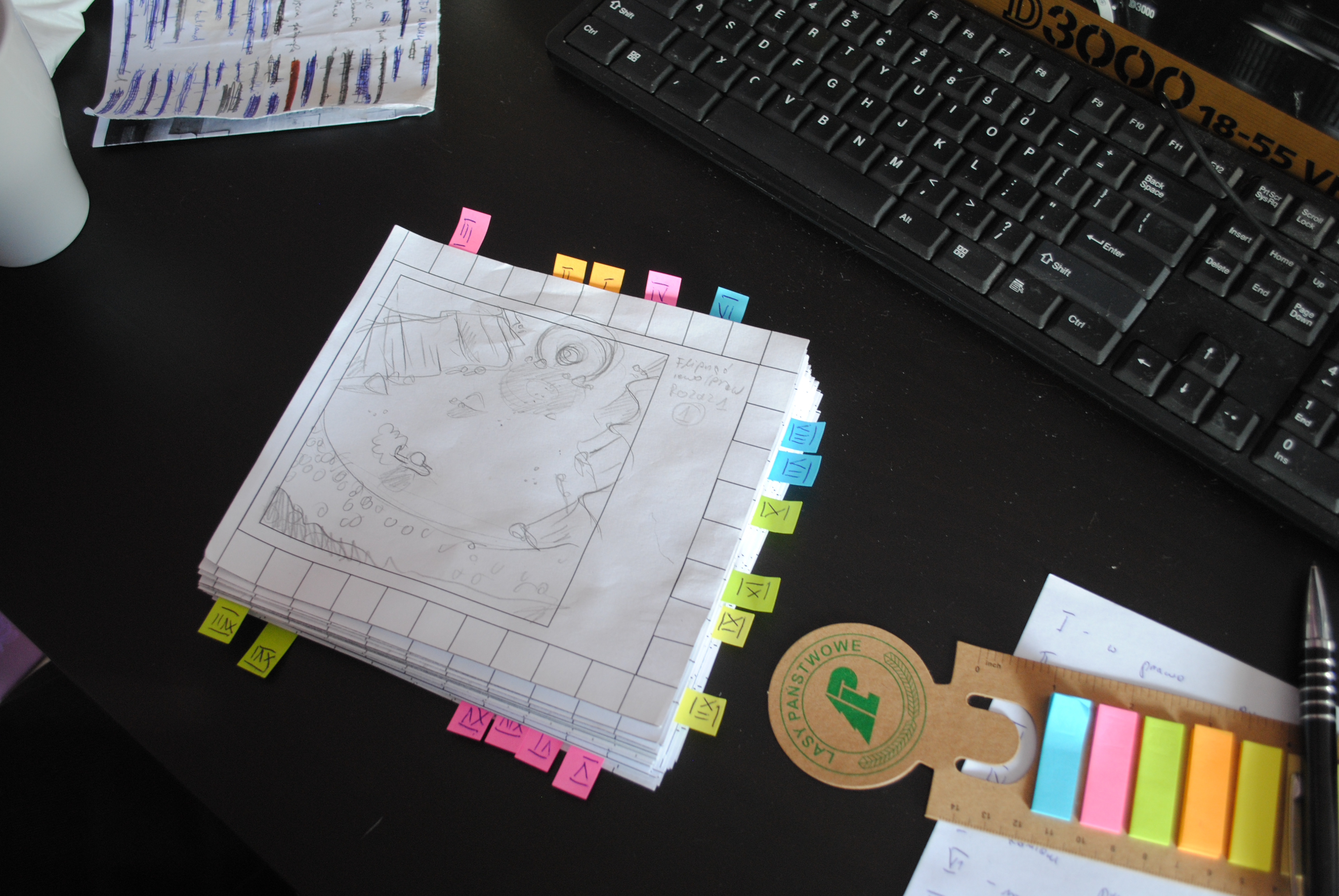
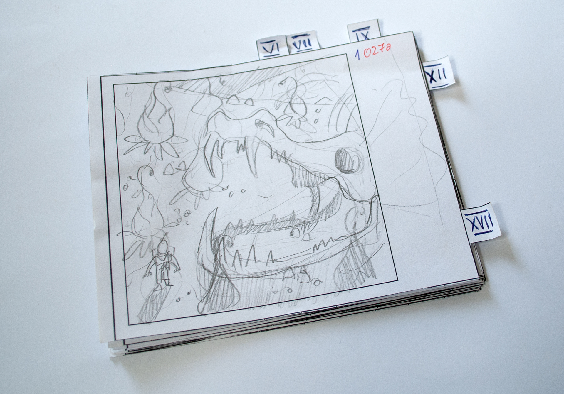
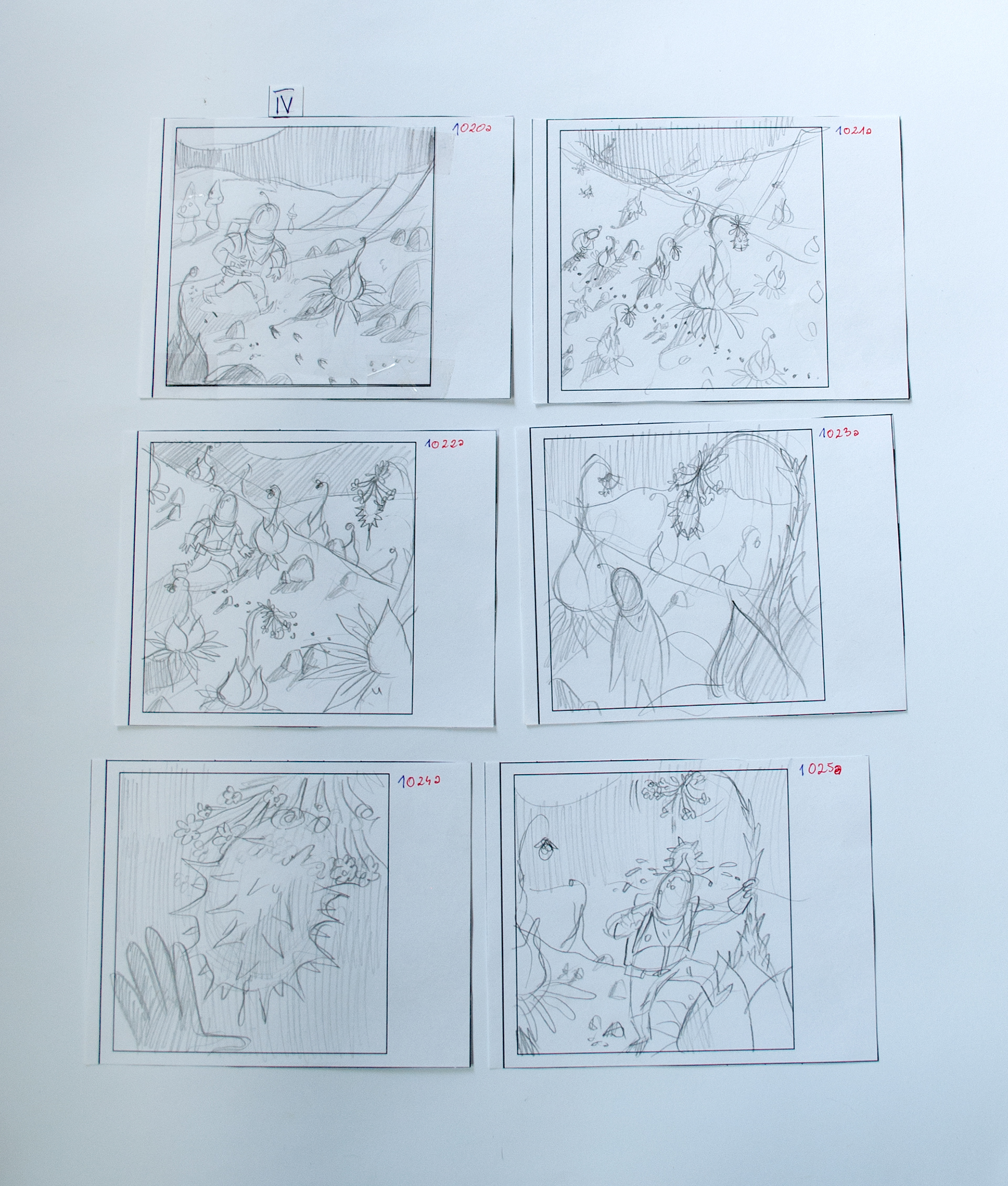
In the first iteration, the comic consisted solely of single-panel illustrations. On each spread, the action from the perspective of our protagonist was shown on the right side, while the left featured something like the screen of a mission computer, displaying various puzzles. Solving these puzzles would direct the reader to the correct page.
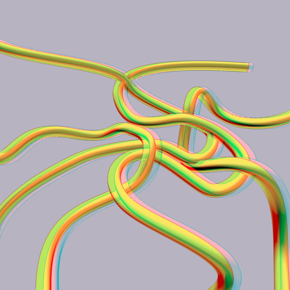
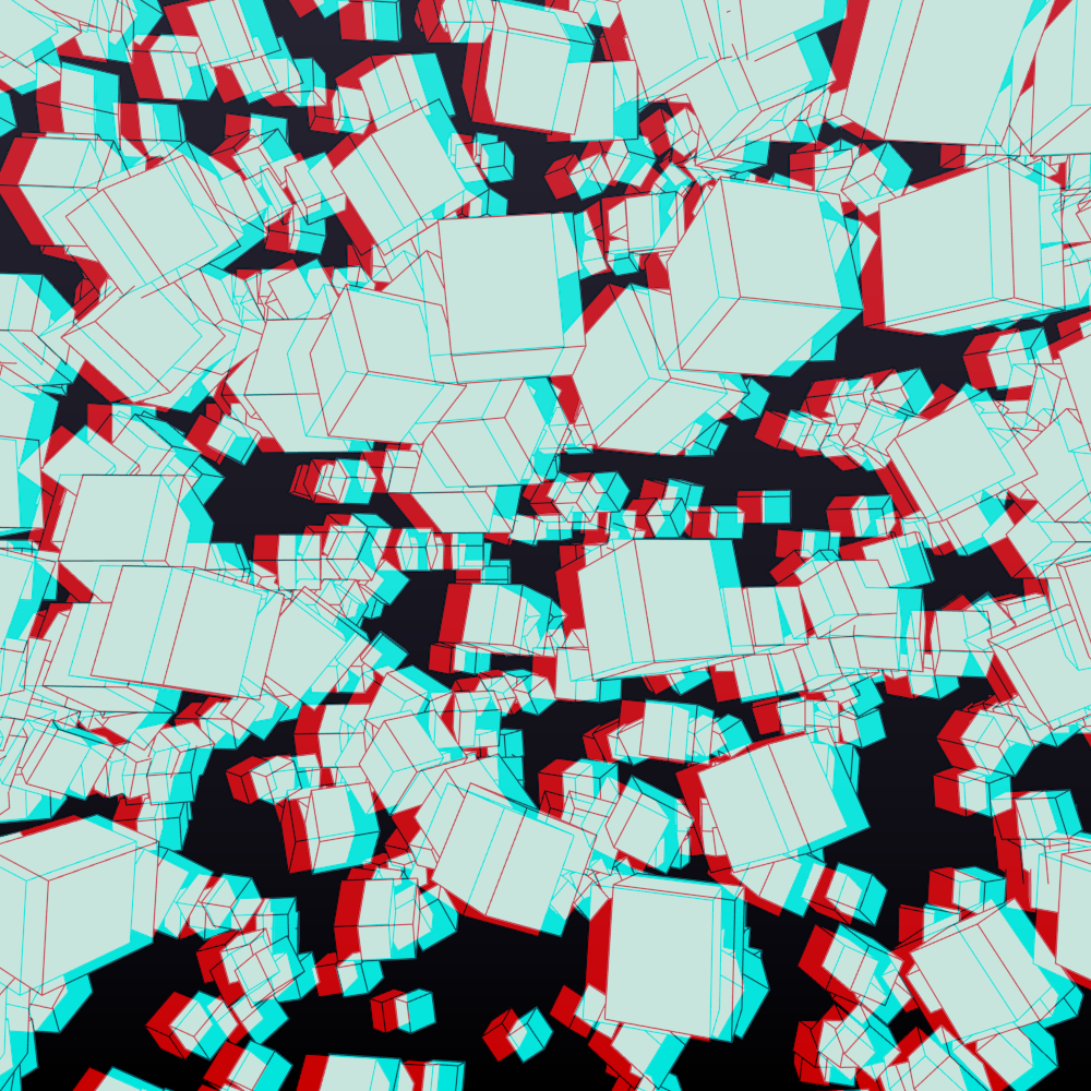
At this stage, we heavily experimented with the idea of puzzles in anaglyph 3D. While intriguing, this approach proved to be quite impractical, and we quickly decided to abandon it.
Second Approach: A Small Book with an Encyclopedia Inside
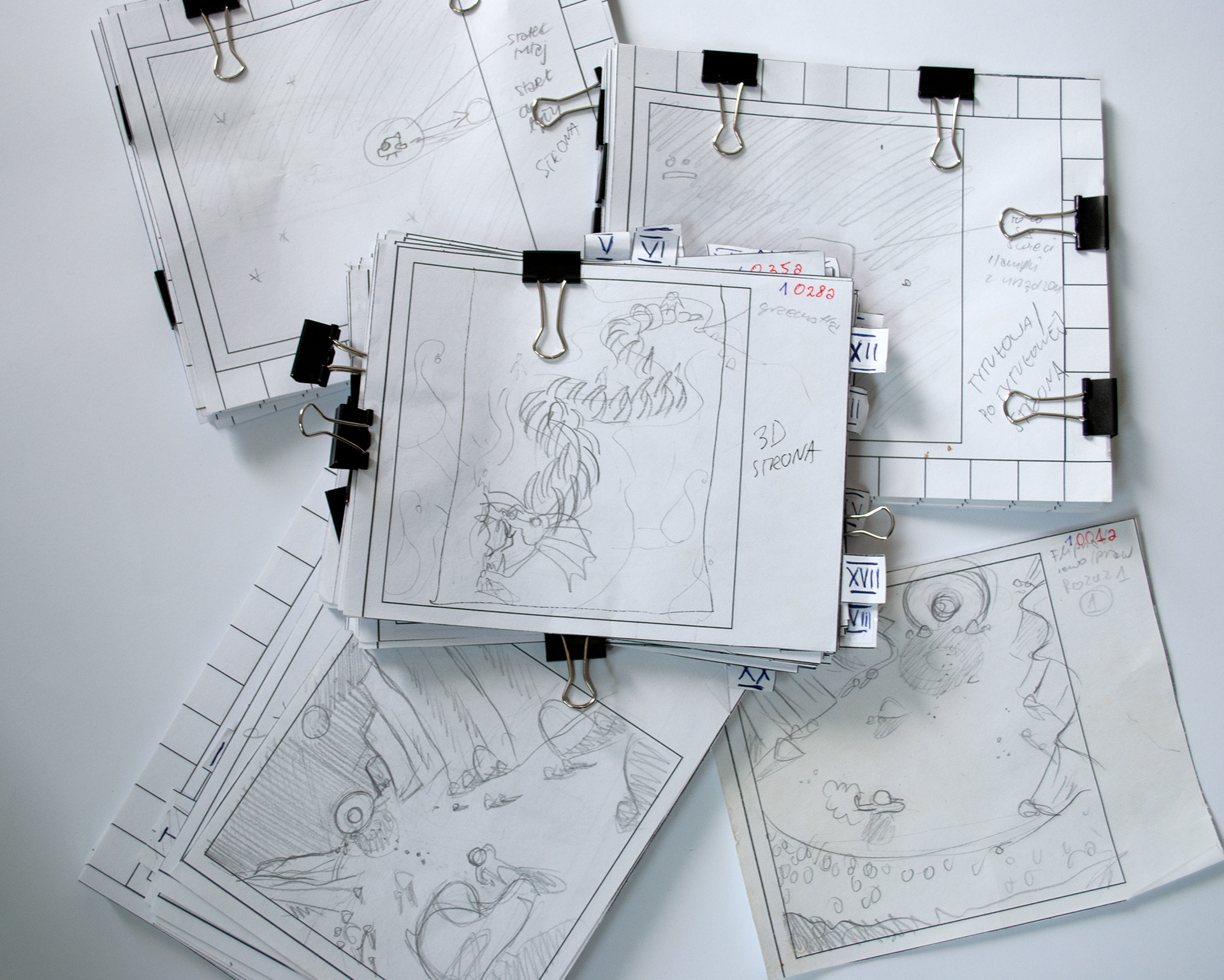
In the second version, the comic's overall structure didn’t change much, but the encyclopedia transformed into something resembling actual encyclopedia pages, providing a wealth of information at once.
This approach, however, was far from ideal. The convenience of whole-page encyclopedia entries tended to distract too much from the action happening in the comic itself.
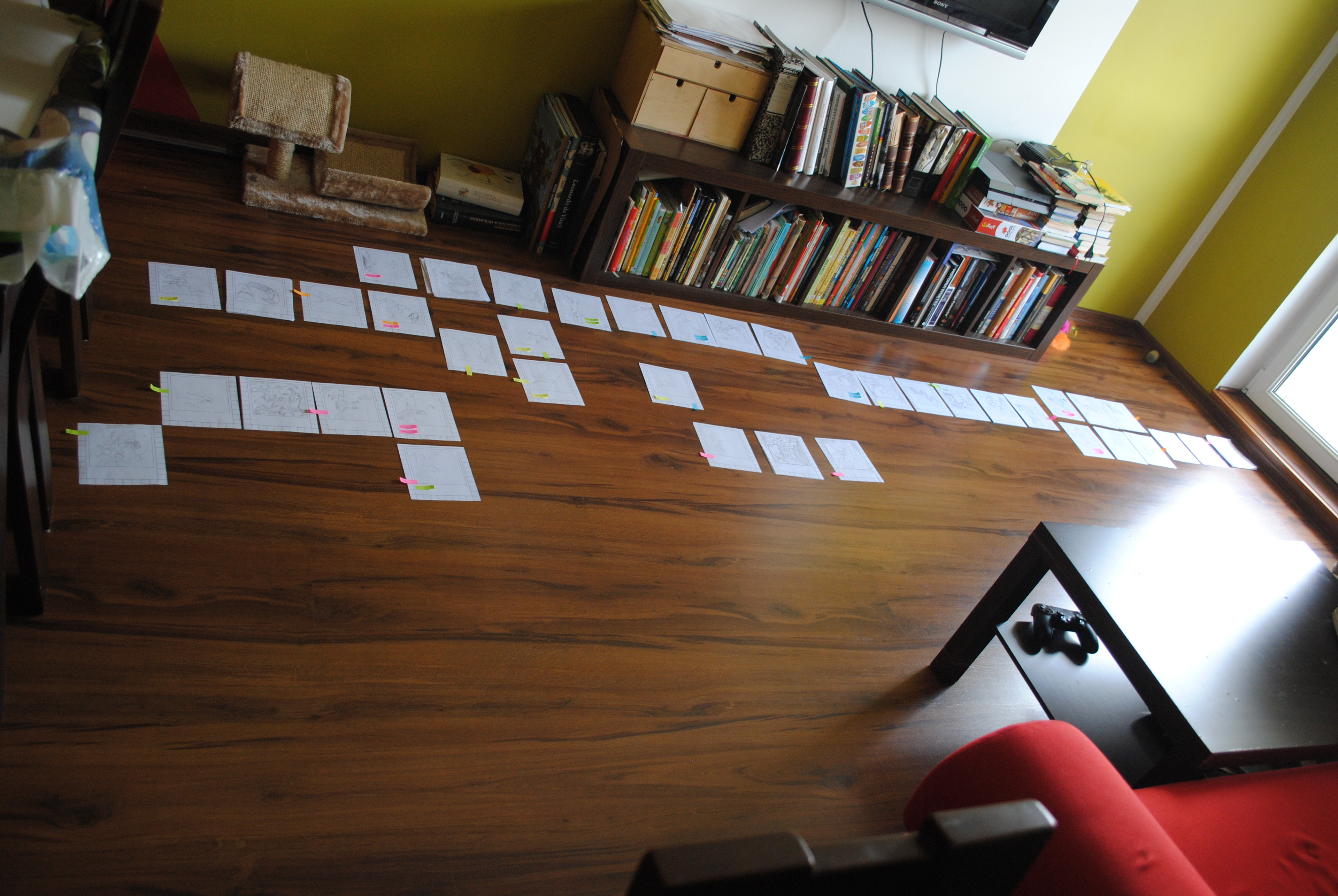
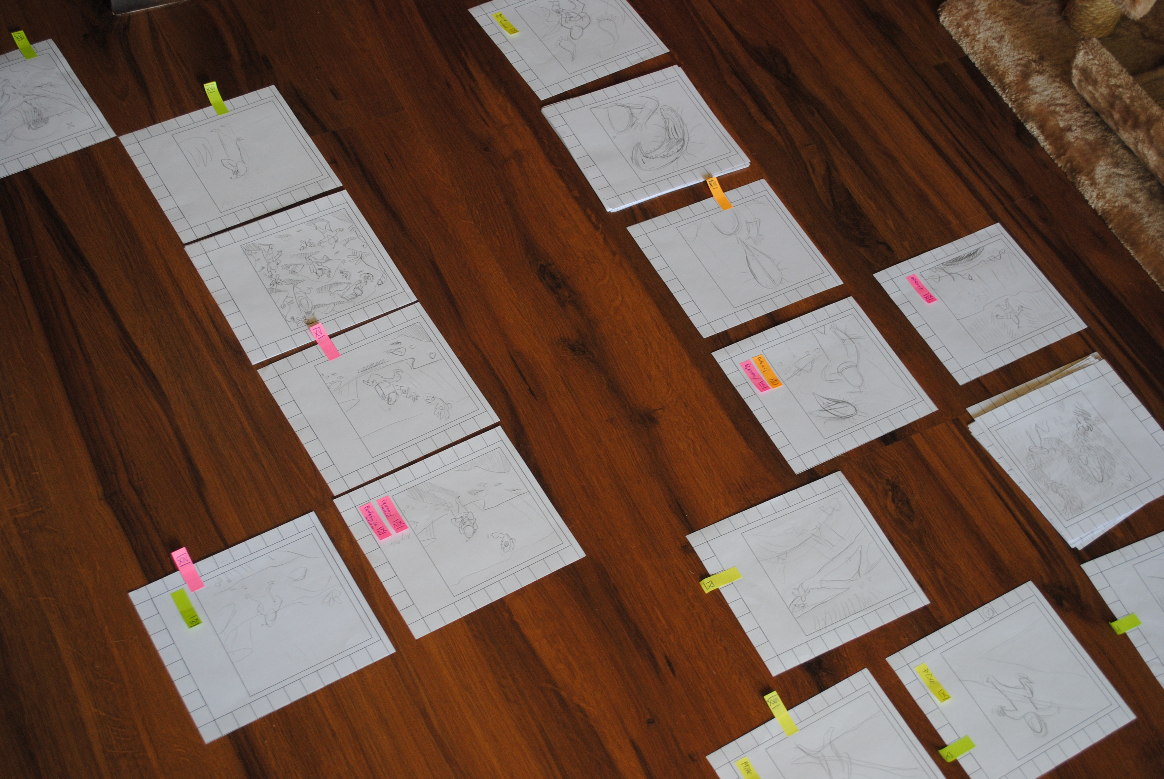
Another issue we faced was the sheer volume. Despite the relatively small size of the panels, the comic would have ended up being over 400 pages long, which significantly impacted the ease of reading.


Third Approach: A Comic with QR Codes
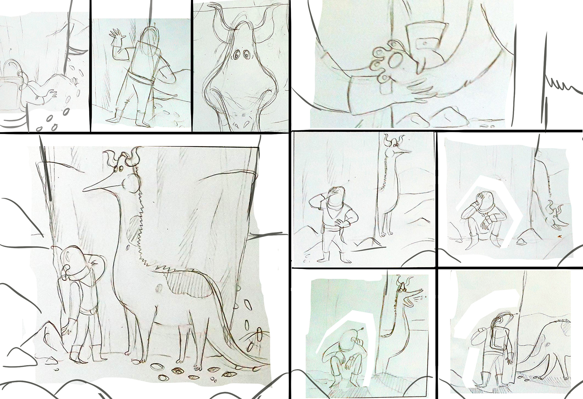
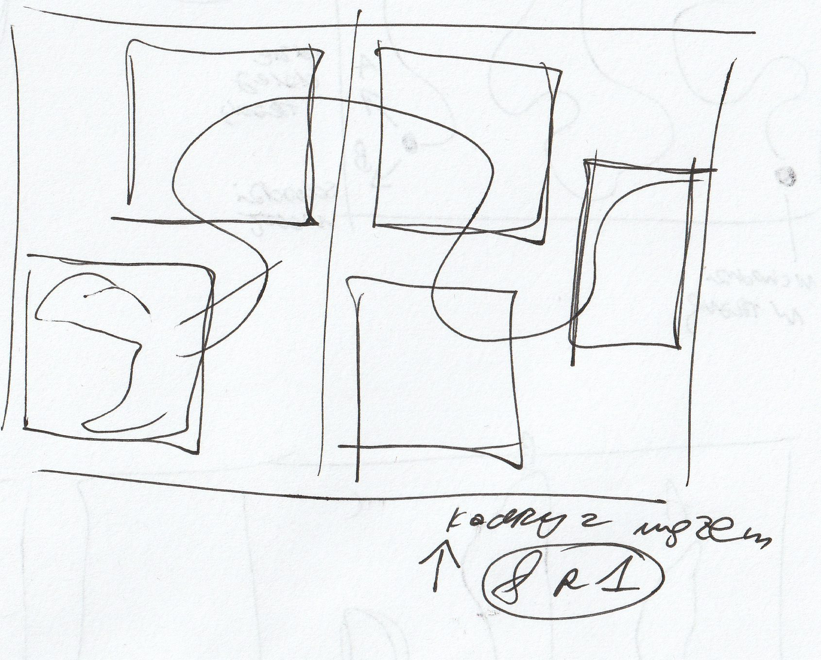
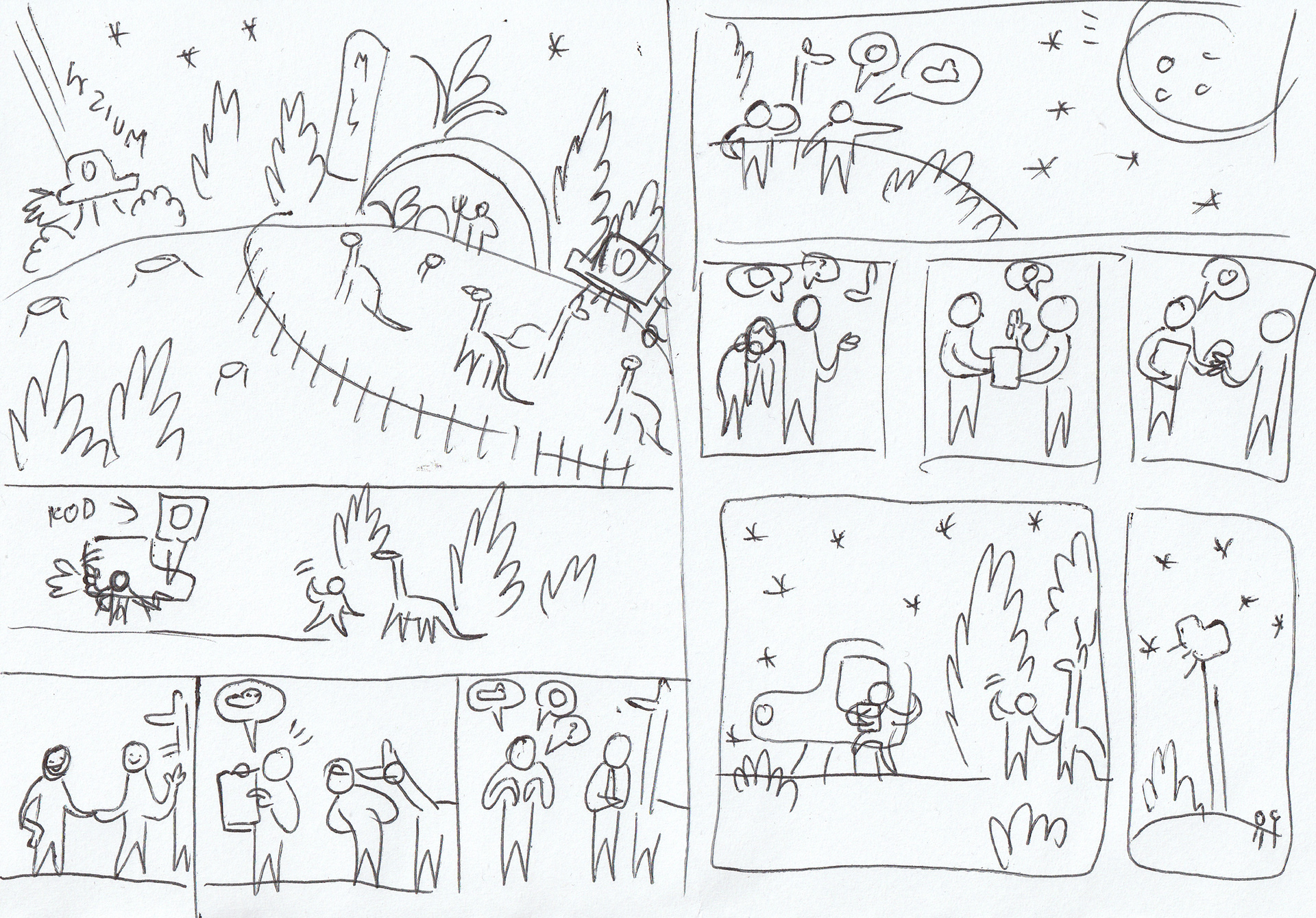
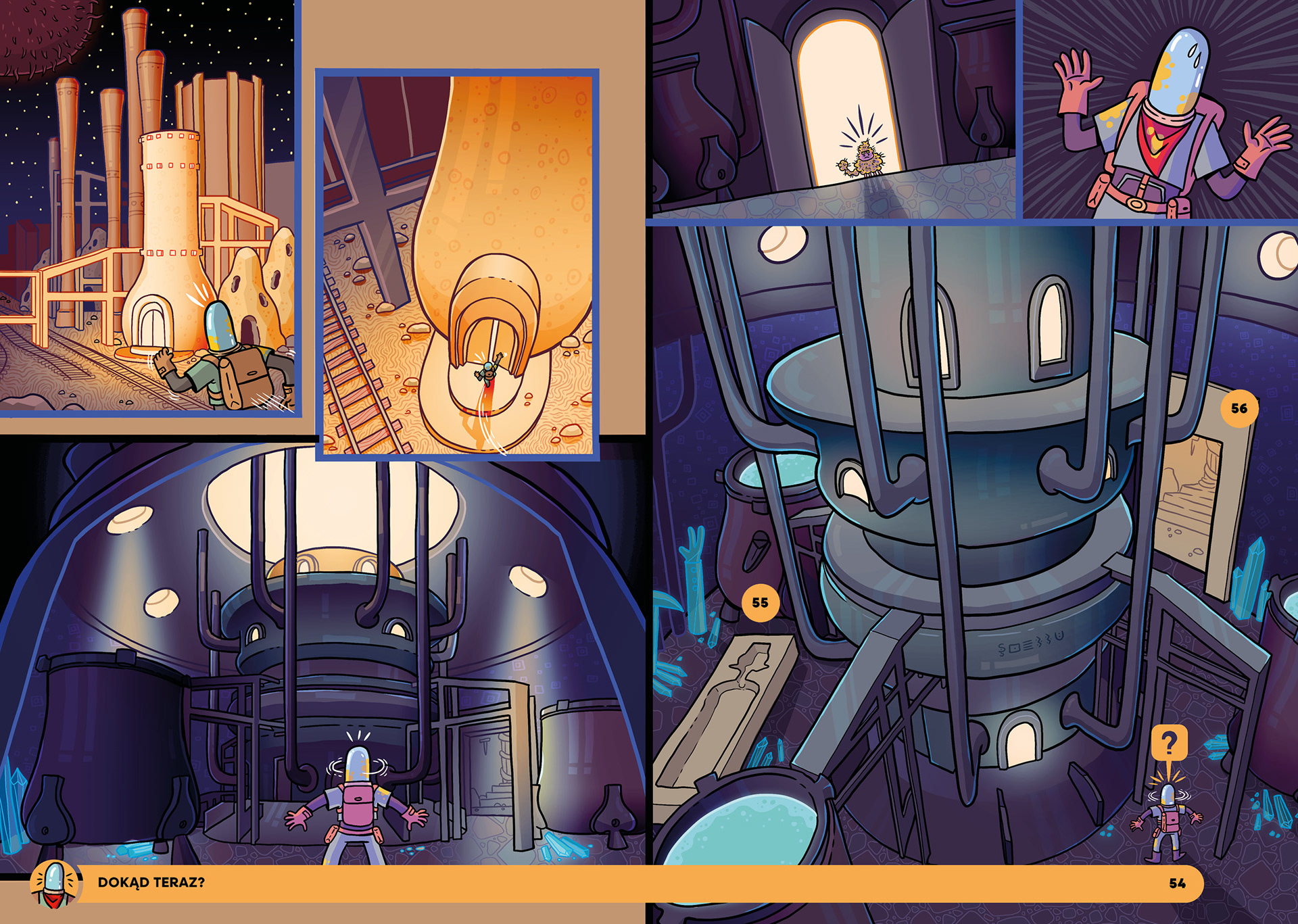
We decided to combine multiple individual pages into larger spreads, presenting the action in a format similar to a traditional comic. In some cases, merging a dozen smaller illustrations into one large composition resulted in truly impressive effects.
The encyclopedia also evolved during this phase. With the introduction of full-spread illustrations, there was no longer room to include it within the book itself. At this stage, we hadn’t yet determined whether it would take the form of a mobile app or a website, but we were confident that this was the right path to take.
Visual Style
An important aspect of the project was defining the visual style for the entire comic. We aimed to create a strange, slightly psychedelic atmosphere. Our goal was for the illustrations to feel vibrant, sharp, and rich in deep blacks—strongly evoking the vastness of space.
We also drew significant inspiration in the cartoons we loved as kids. Naturally, our reference board featured classics like Samurai Jack, Courage the Cowardly Dog, and Road Runner.First Designs of the World, Characters, and Vehicles
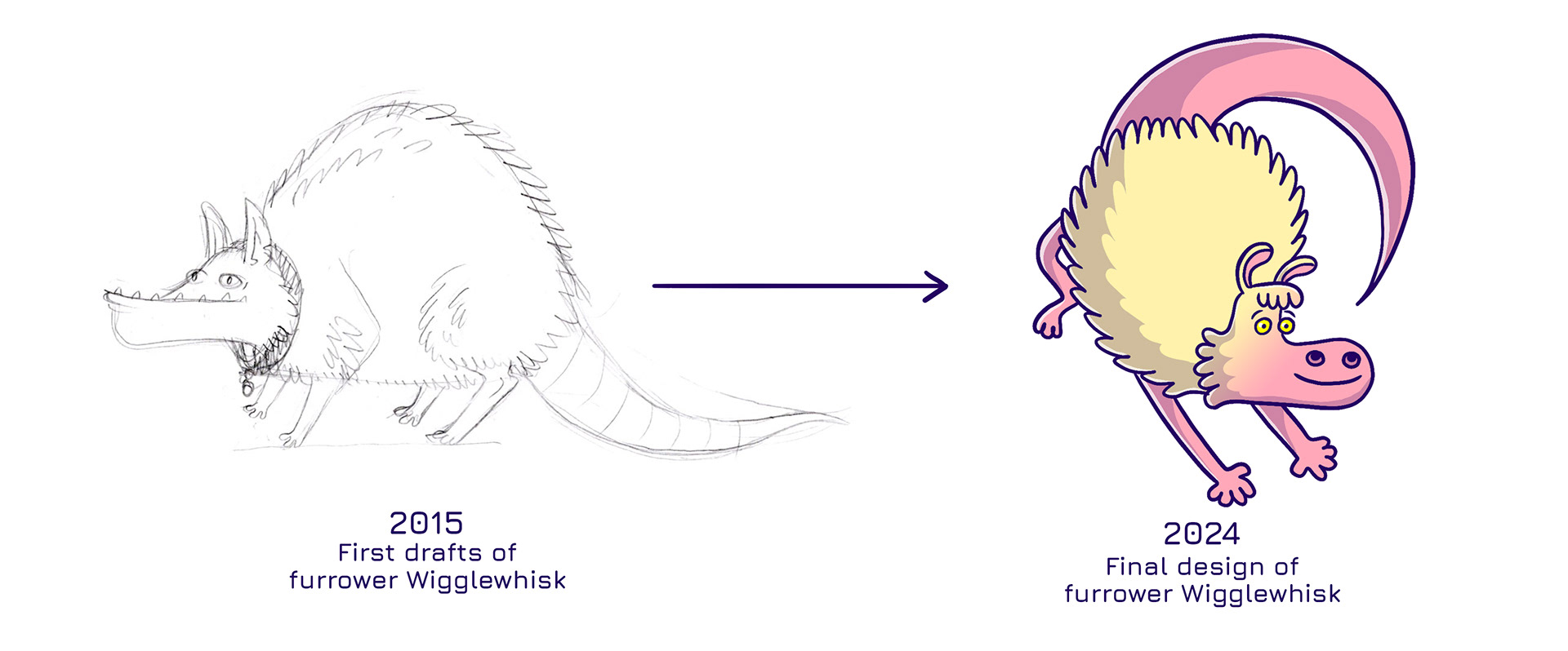
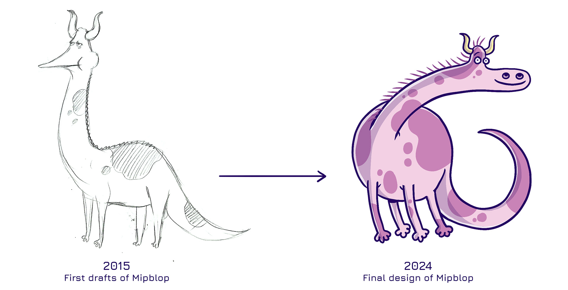
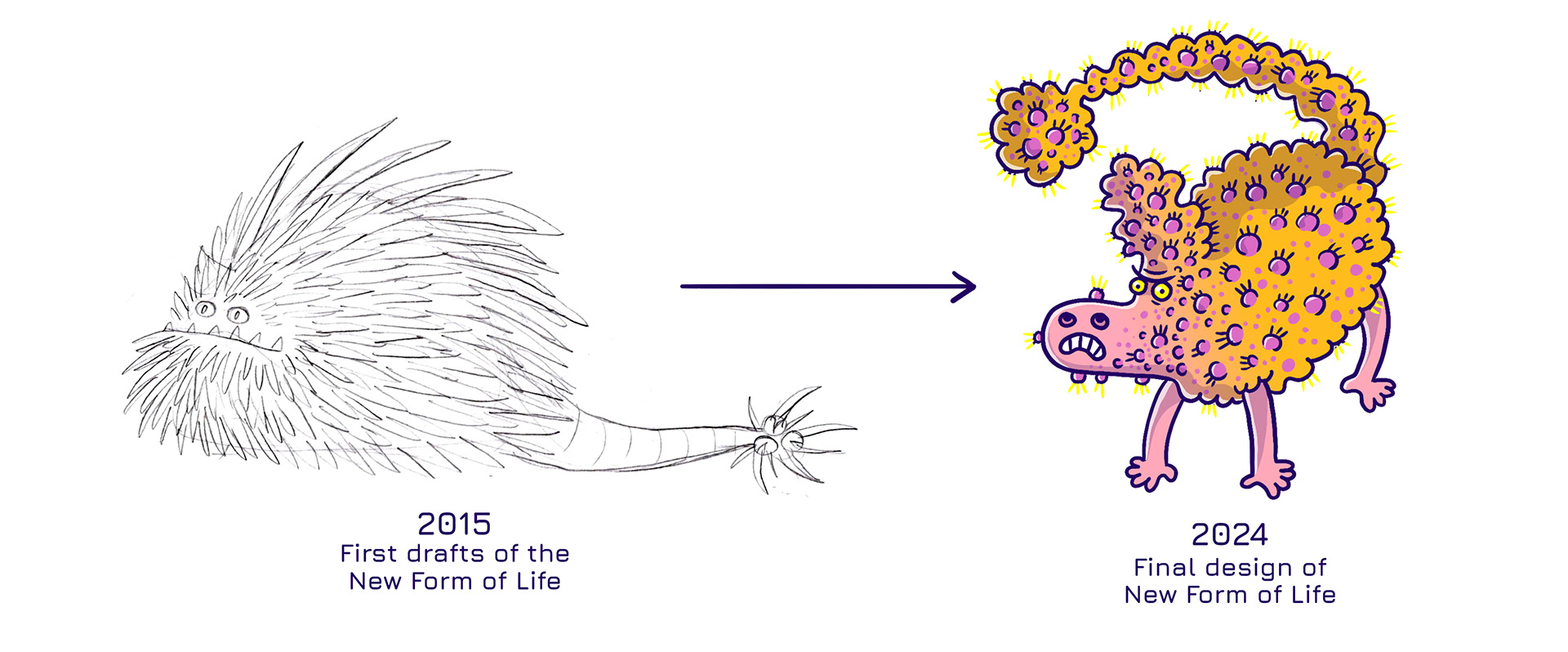
The visual style alone wasn’t enough to create a believable universe. We needed to carefully develop the visuals and identity of our protagonist, along with the other inhabitants of space. Equal care went into designing the geological structures of planets, vehicles, interiors, and every other detail encountered on this wild adventure!
Mockup
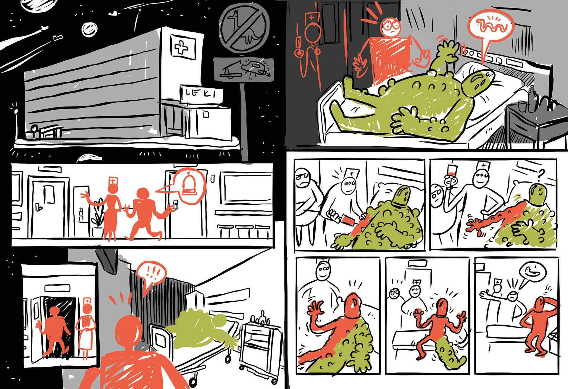
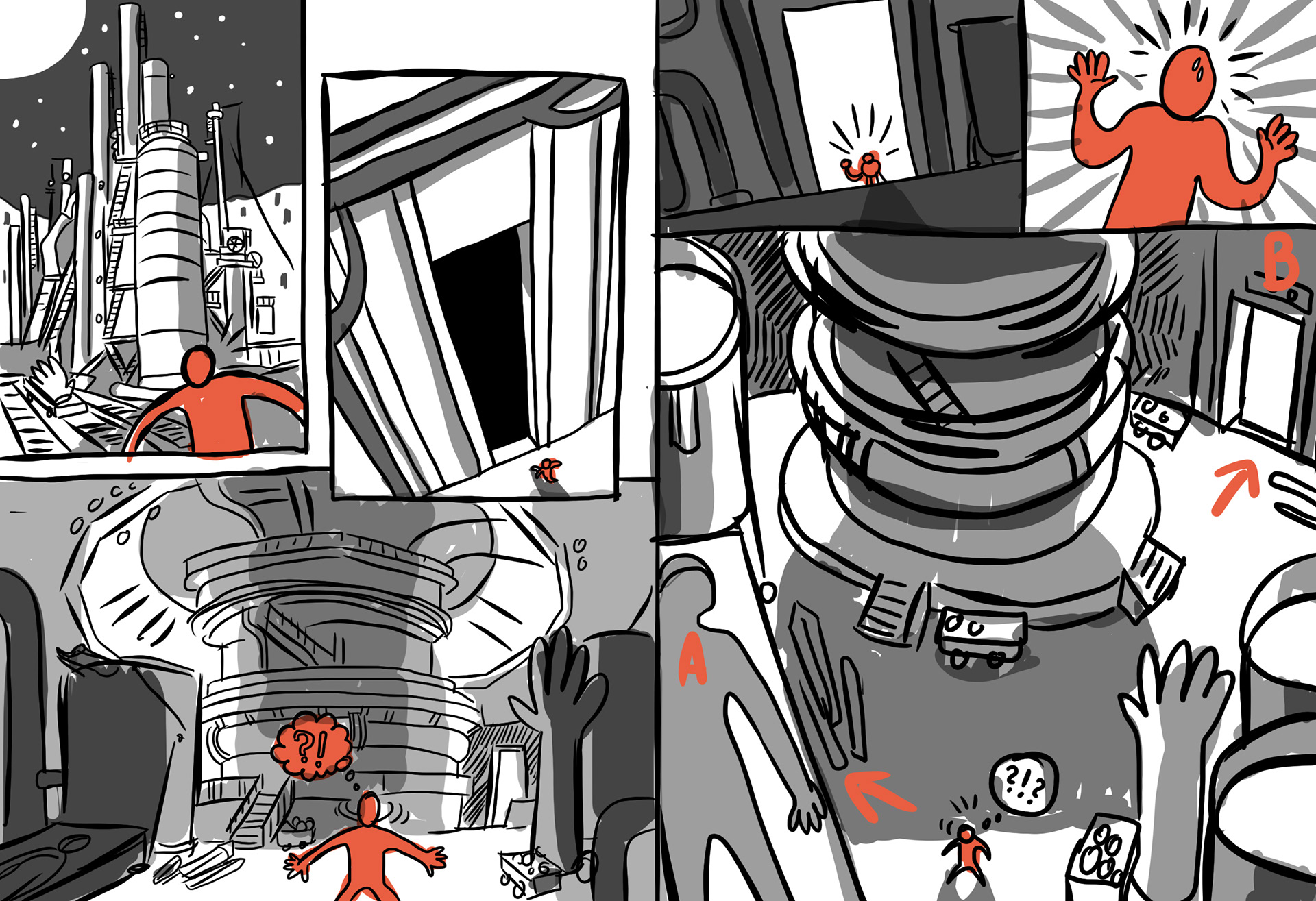
With the script complete and a preliminary outline of the world in place, we set out to create a detailed mockup of the entire comic along with the accompanying encyclopedia.
The result was an interactive presentation featuring hyperlinks to specific pages or related entries in the encyclopedia. This approach allowed us to simulate the experience of reading a comic with page references and paragraph-style navigation.
Publisher
Nikola had previously collaborated with Muduko on other projects, including Kraina Legend. One day, she decided to show Trackernauts to the editor, knowing that Muduko had a penchant for innovative projects.
It didn’t take long—less than an hour after sending it, a response came back:
"Nikola, we’re doing this! We’re moving our other projects aside and making this a priority!"
And just like that, Trackernauts resurfaced from the depths of our Google Drive and was back in the spotlight.
Feedback
After thoroughly reviewing the comic, the publisher suggested adding a brief summary at the bottom of each page to help readers stay oriented in the adventure. They also assisted in writing an introductory tutorial for the book.
What was quite unique about this collaboration was the publisher's hands-off approach—they refrained from heavily interfering with the comic's content and gave us plenty of creative freedom. We’re very pleased with how this partnership turned out!
Dilemma: App or Website?
It was our publisher who decided that a mobile app would be a better fit for the book and found a subcontractor to develop it. The publisher placed great importance on the marketing message they planned to direct at parents. They were concerned that using a website might encourage children to spend more time online, whereas a dedicated app would help keep readers more focused on the book itself.
This decision delighted us, as it gave us the opportunity to push the boundaries creatively and increase the formal diversity of the content we could present.
Production
Once we signed the contract, we were finally able to transition from the mockup phase to developing the final product. By then, we had a clear vision of what we wanted to achieve—it was just a matter of rolling up our sleeves and getting to work!
We organized the work on the book into several distinct stages, with each of us taking responsibility for specific tasks. In total, completing the comic required several weeks of focused effort.
3D Models
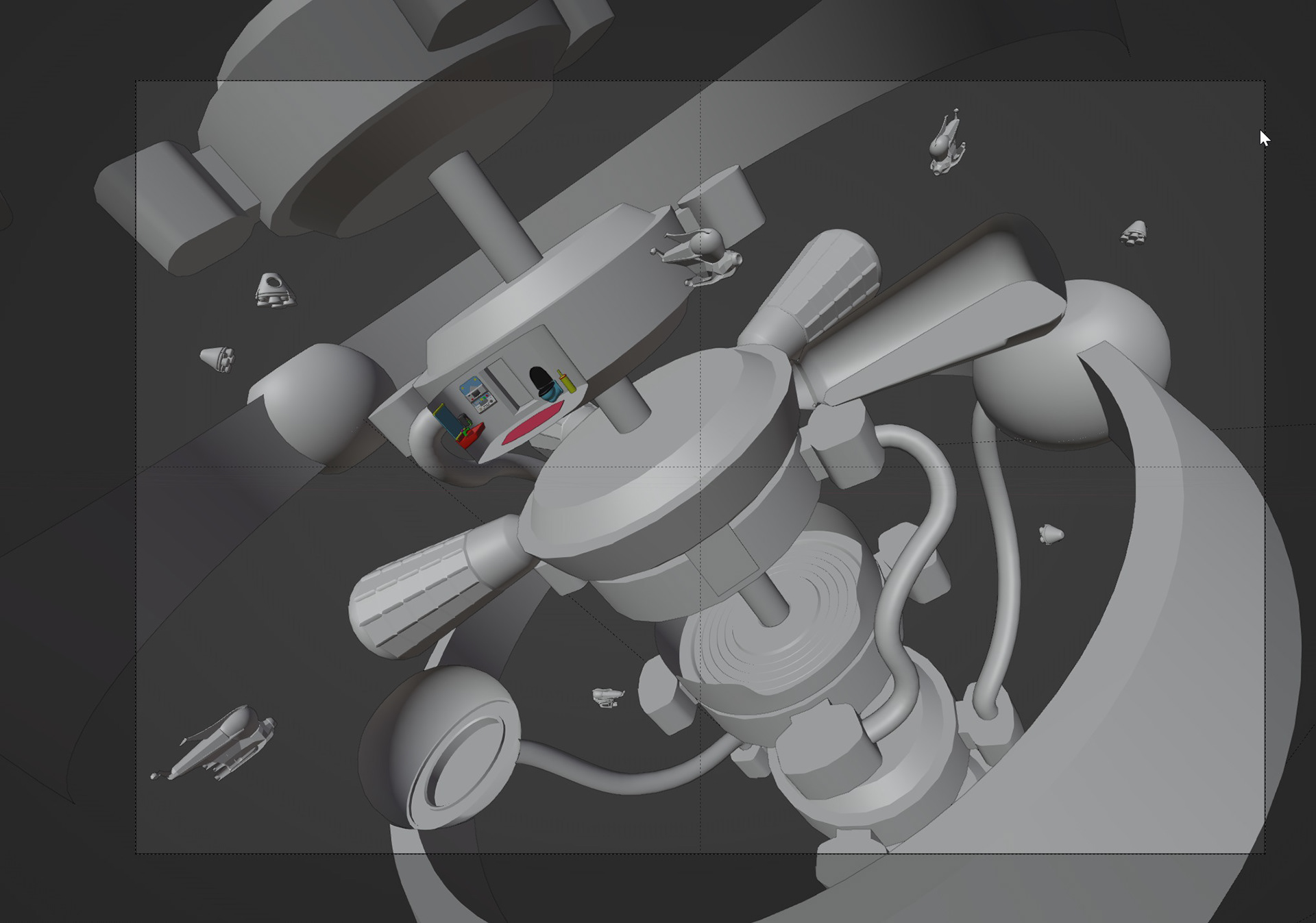
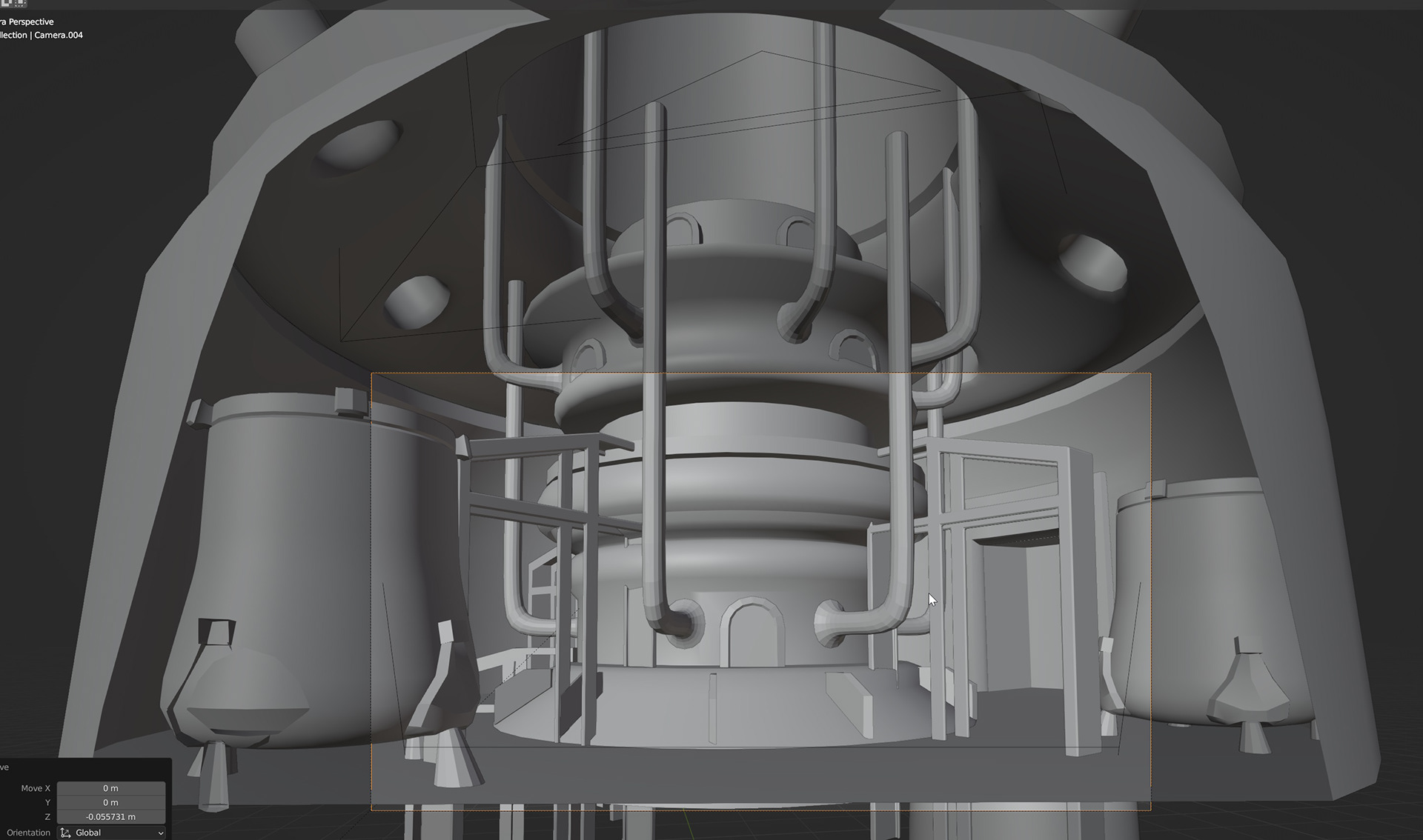
To enhance the quality of the illustrations, we designed 3D models of some of the more intricate rooms and vehicles. This approach significantly streamlined the process for frames featuring the same object across an extended sequence.

Lineart
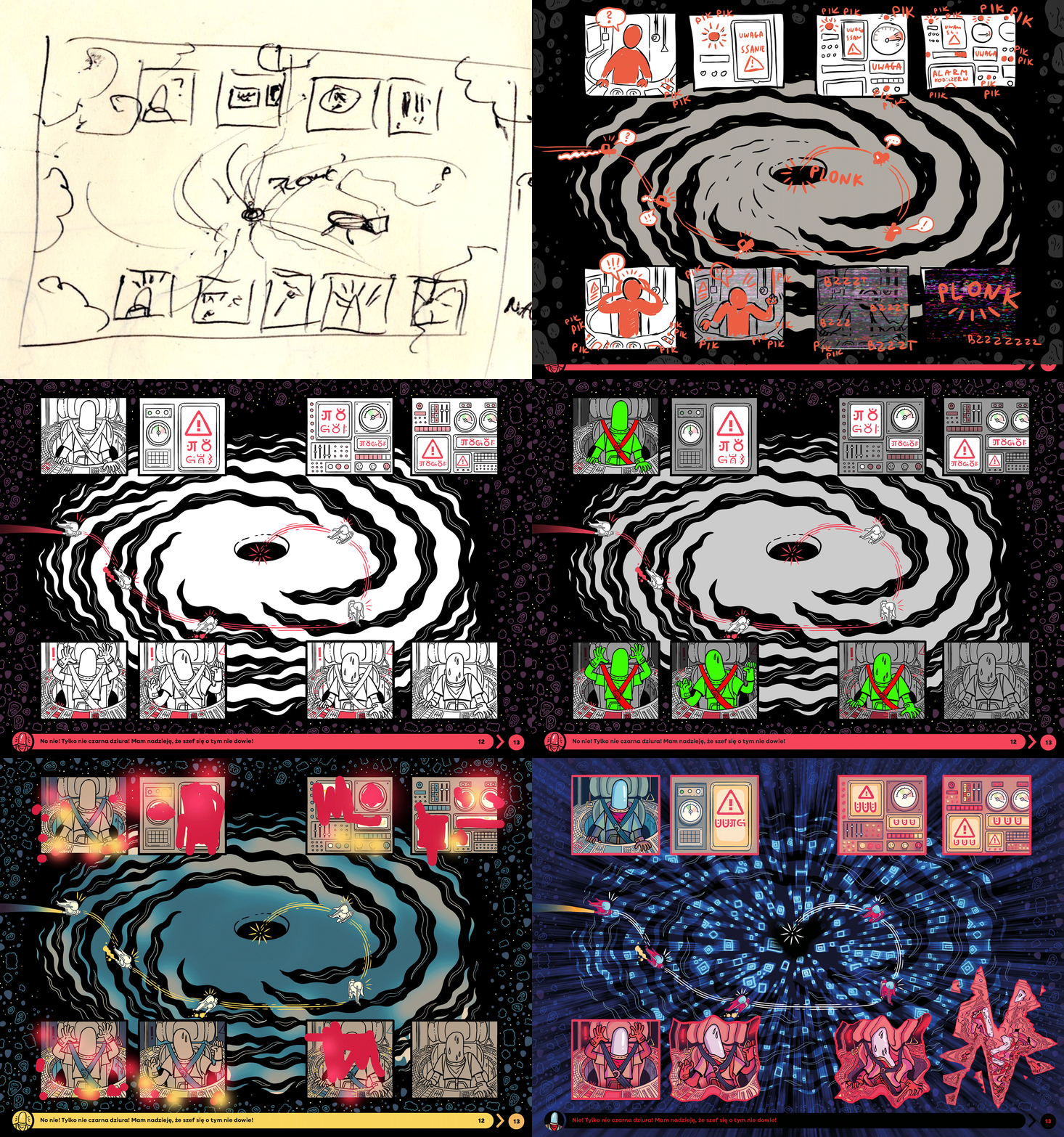
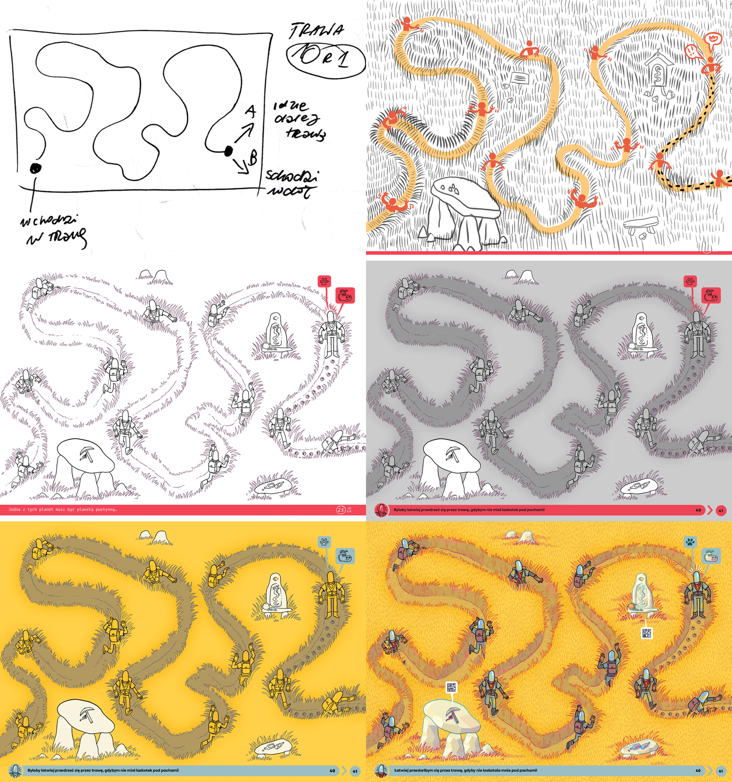
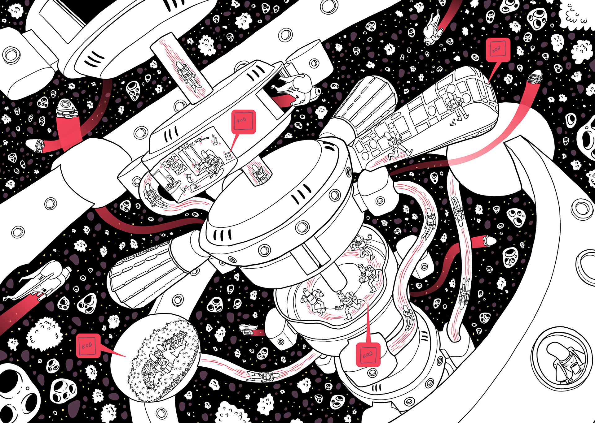
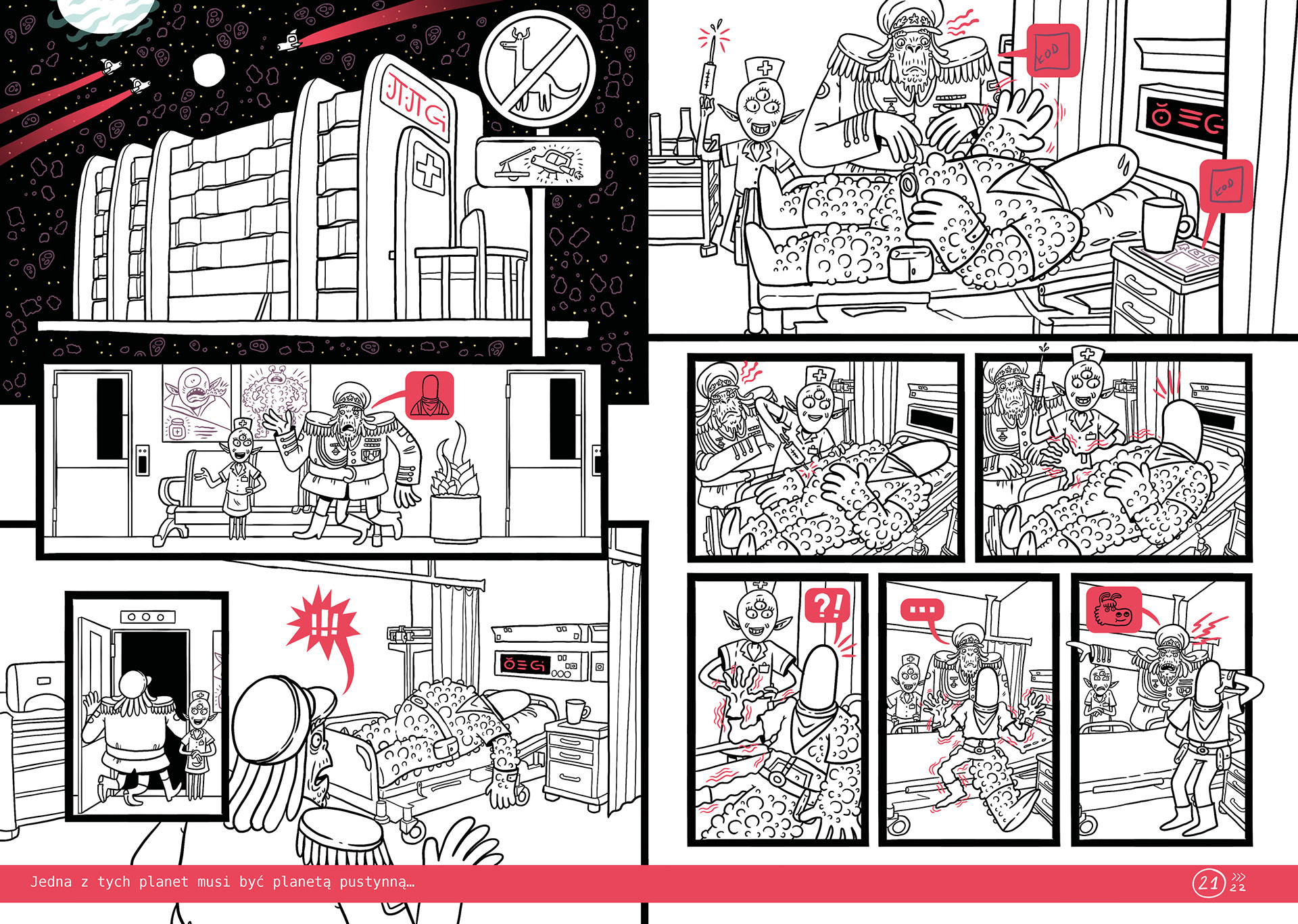
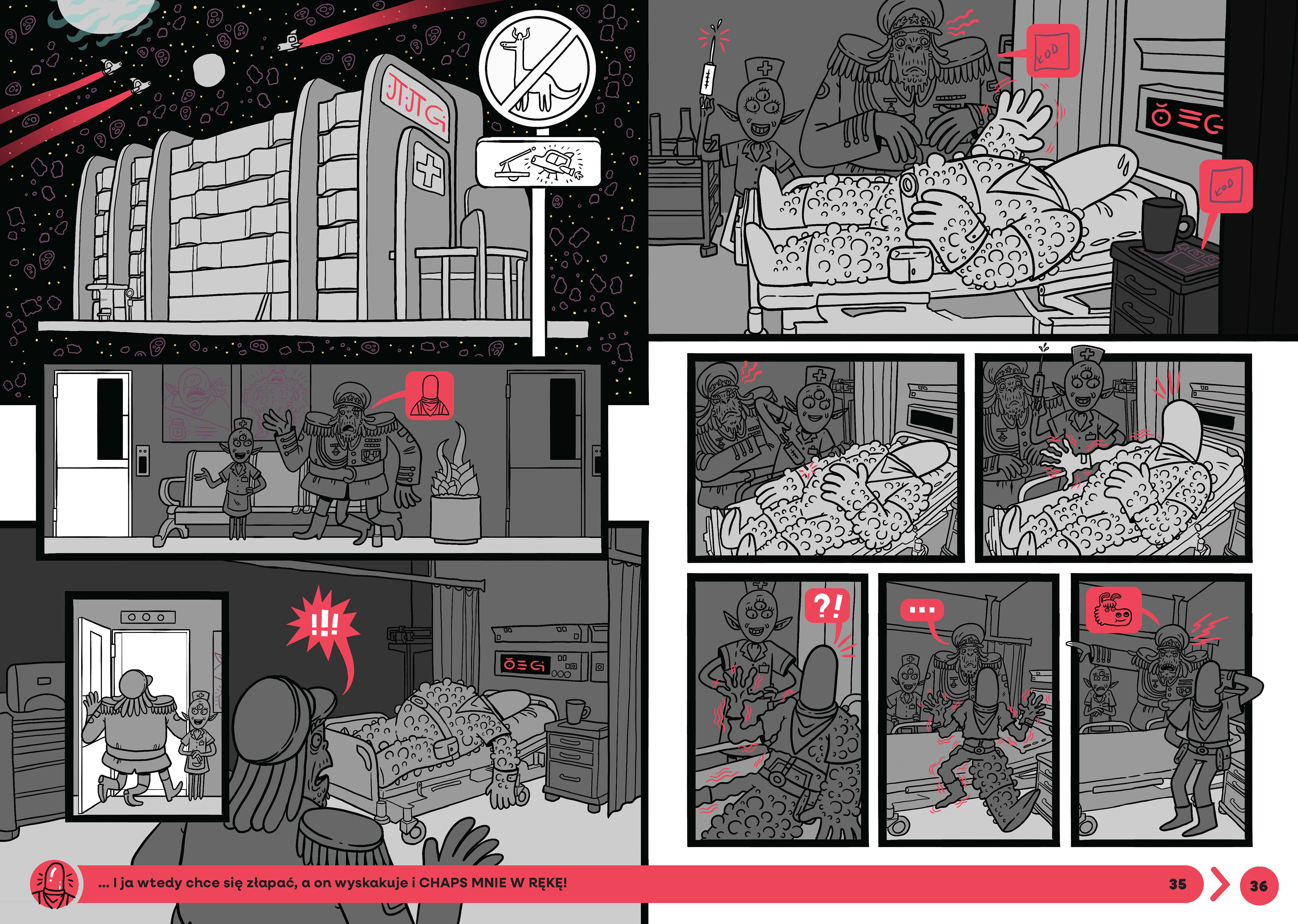
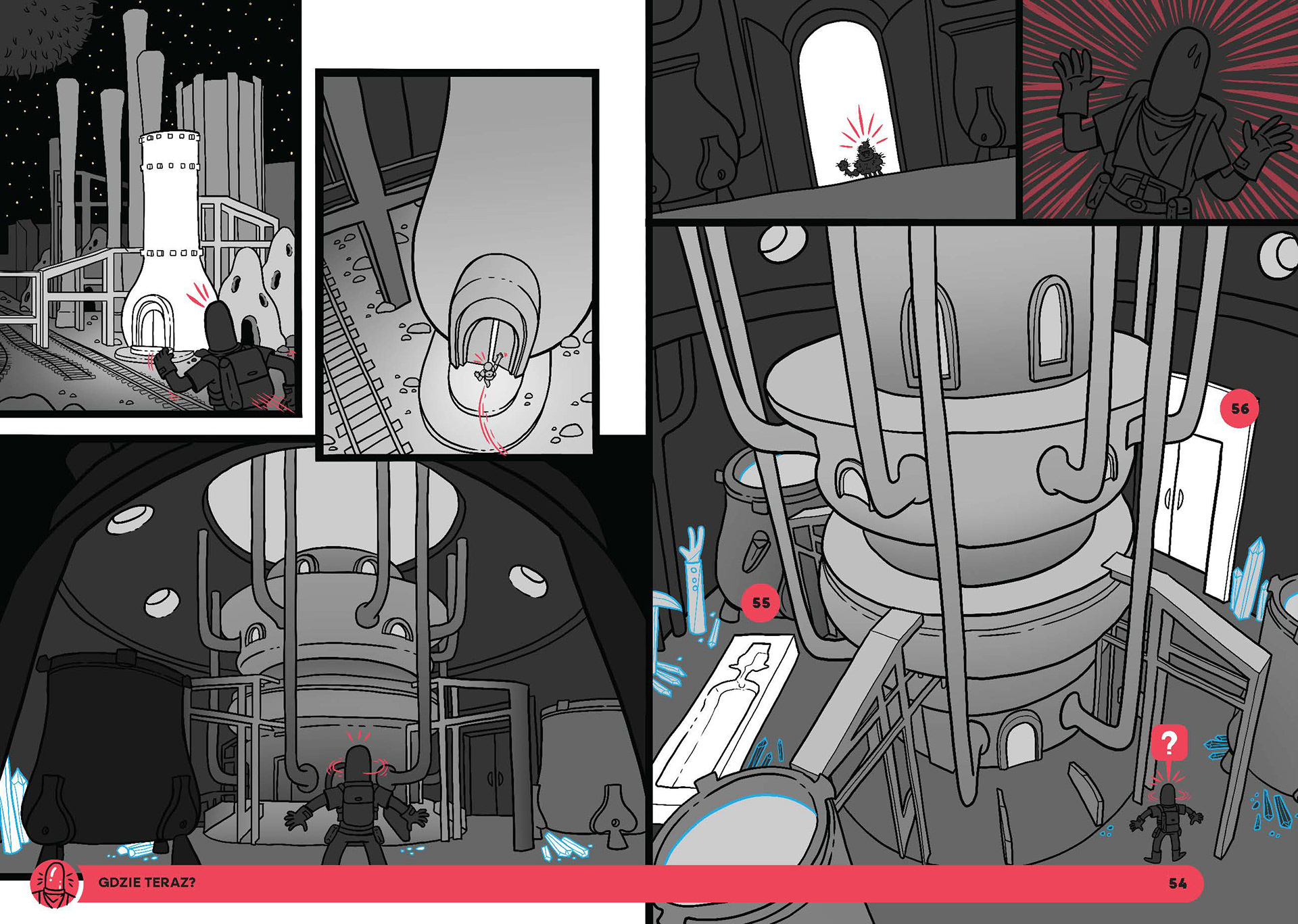
In the next stage, the mockup sketches and model renders were arranged into final frames.

Value
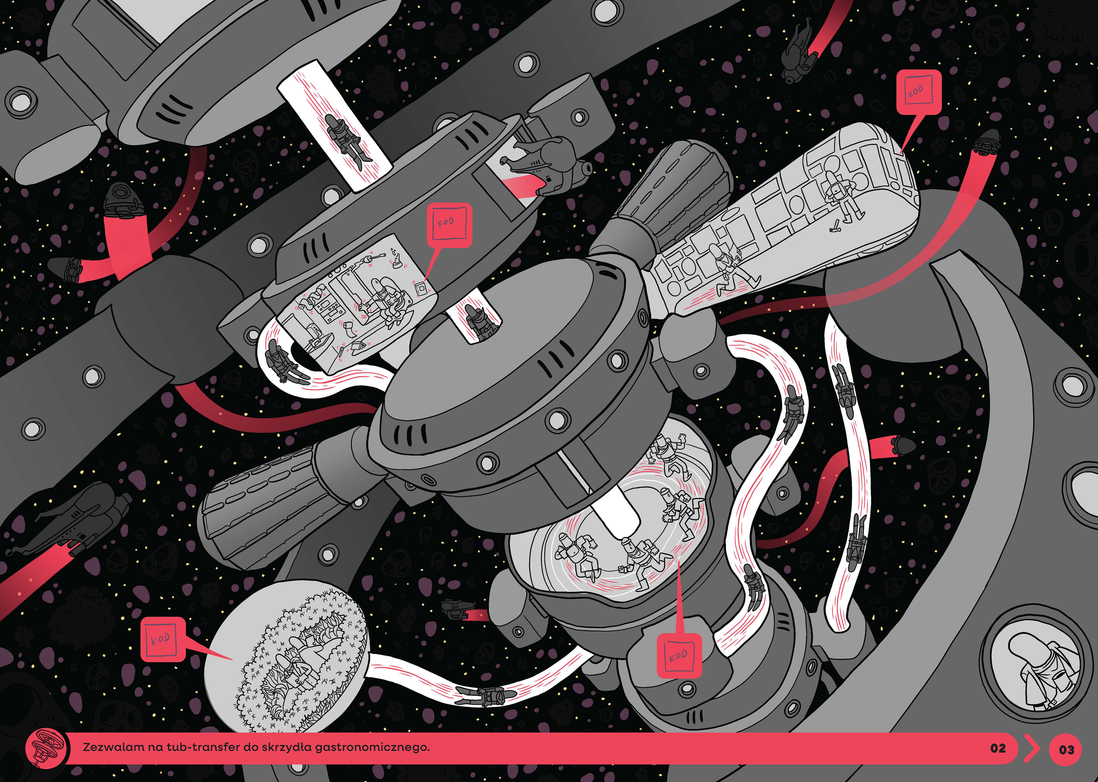
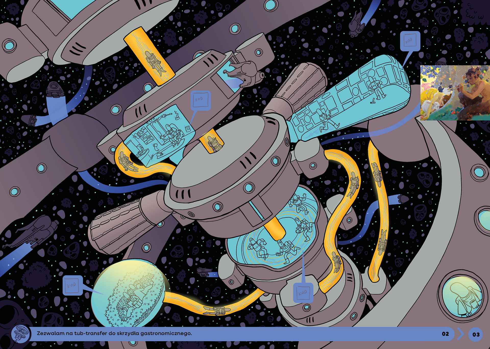
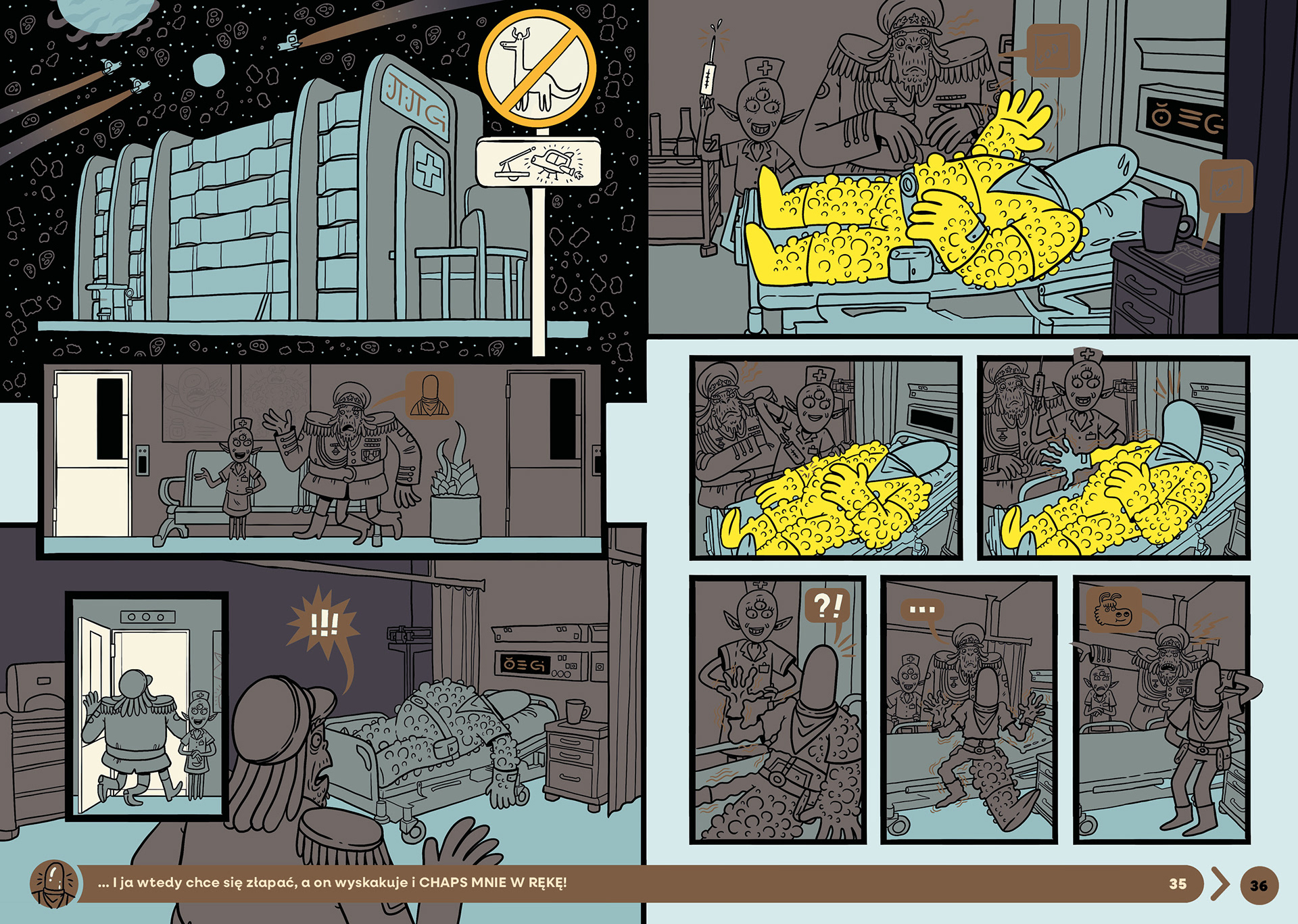
Each illustration was carefully adjusted in terms of value, directing the reader’s attention to key elements while enhancing the sense of depth and space within the frame.
Establishing the Color Palette
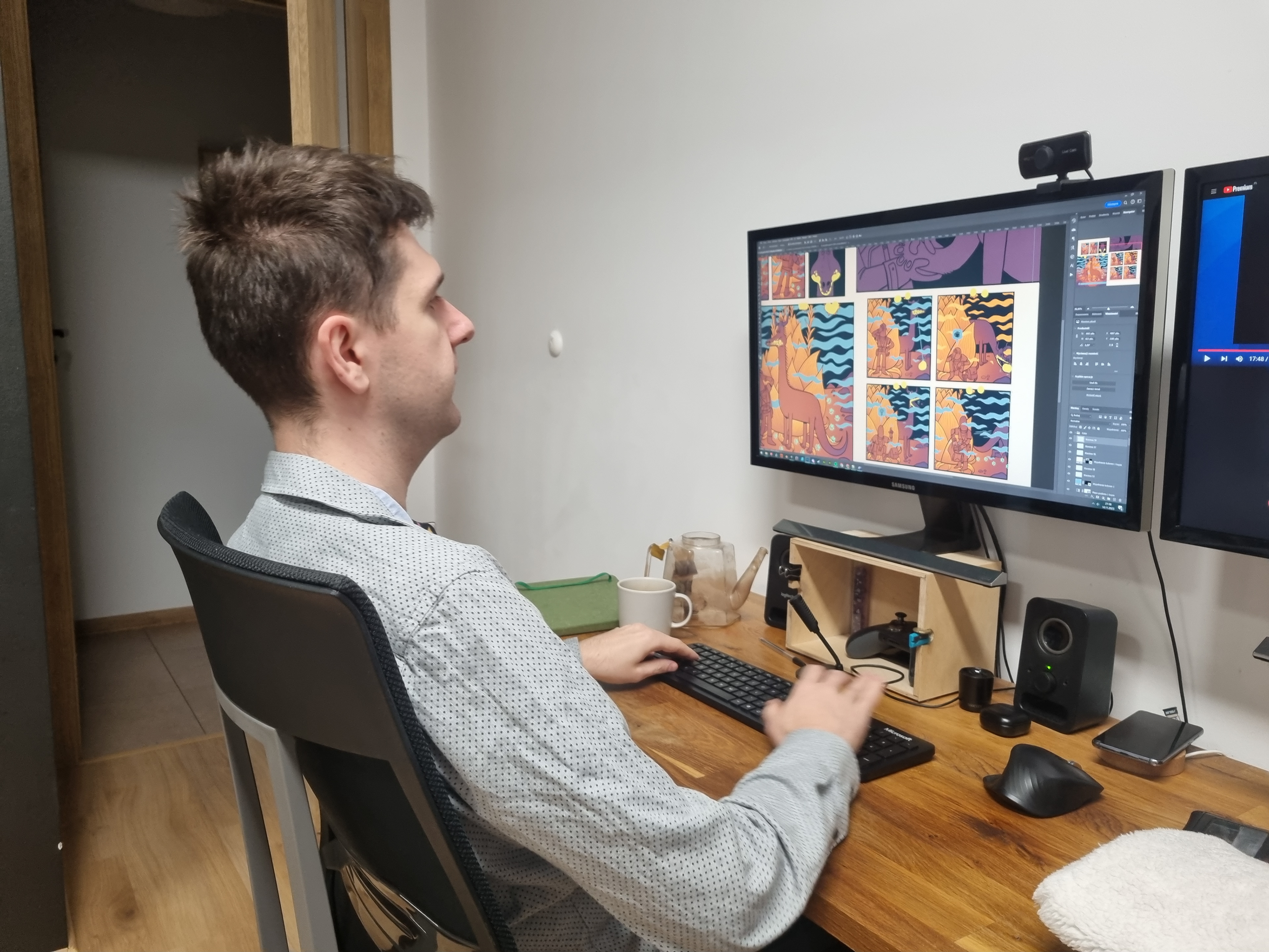
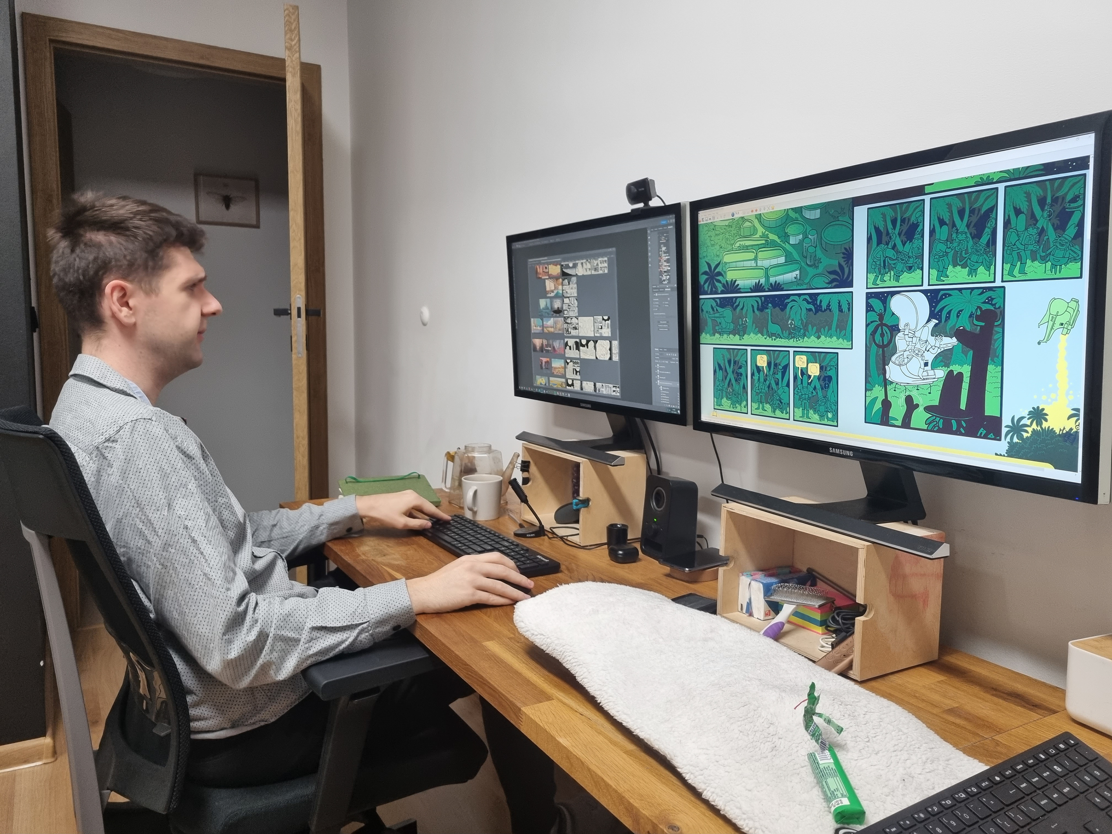
An important step was defining the color palette for the entire book. We wanted specific sections to convey distinct atmospheres and color schemes tied to the setting, as well as the emotional state of our protagonist.
Coloring
The color palette planned for each section had to be applied to individual illustrations. At this stage, we continued fine-tuning the colors and evaluating how the spreads interacted with one another.

Finalizing the Illustrations
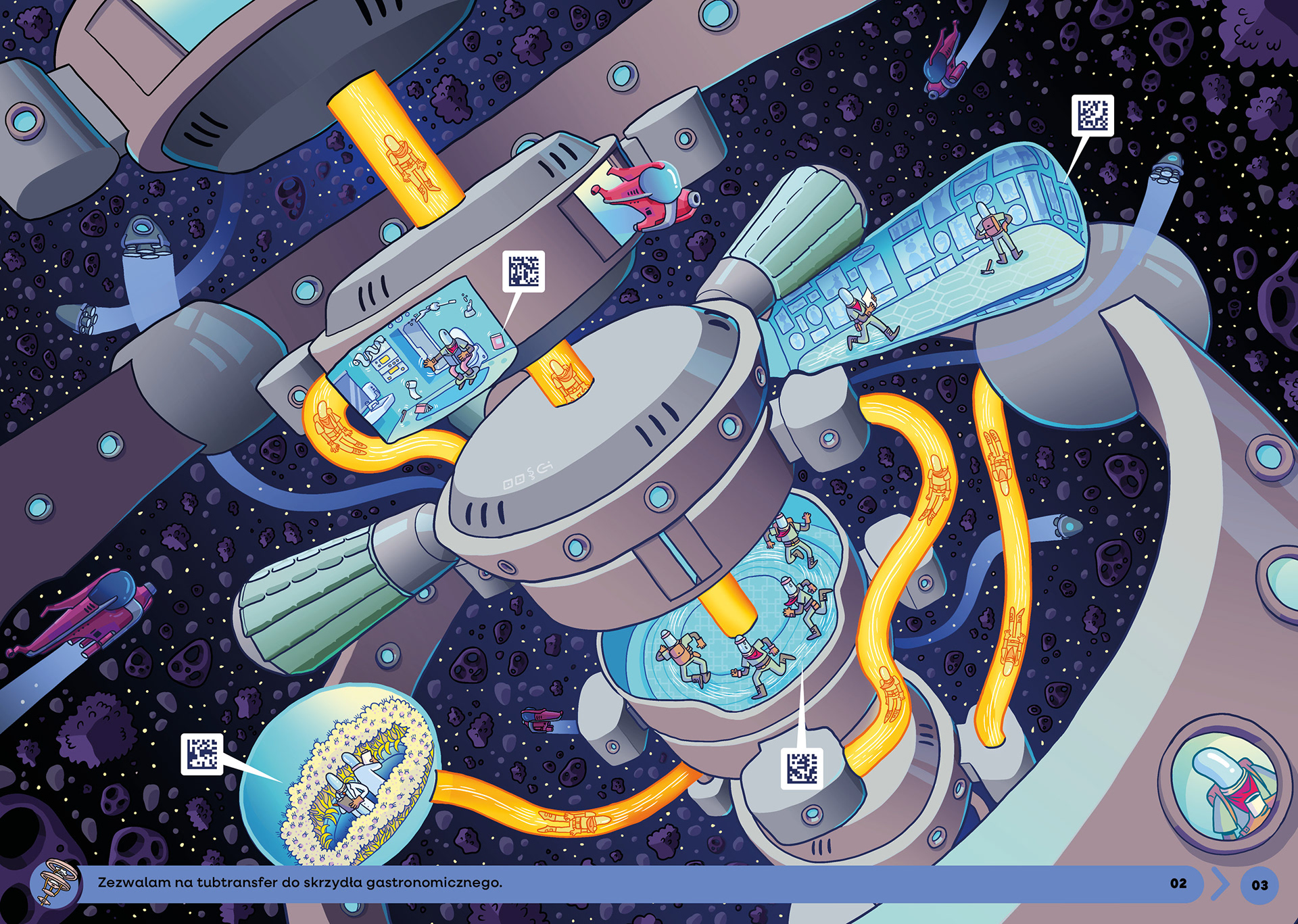
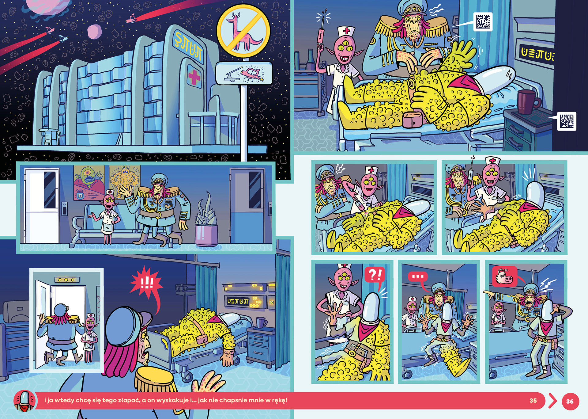
After completing the entire process and making a few refinements, we moved on to adding the final details, enhancing the color vibrancy, and incorporating localized effects.
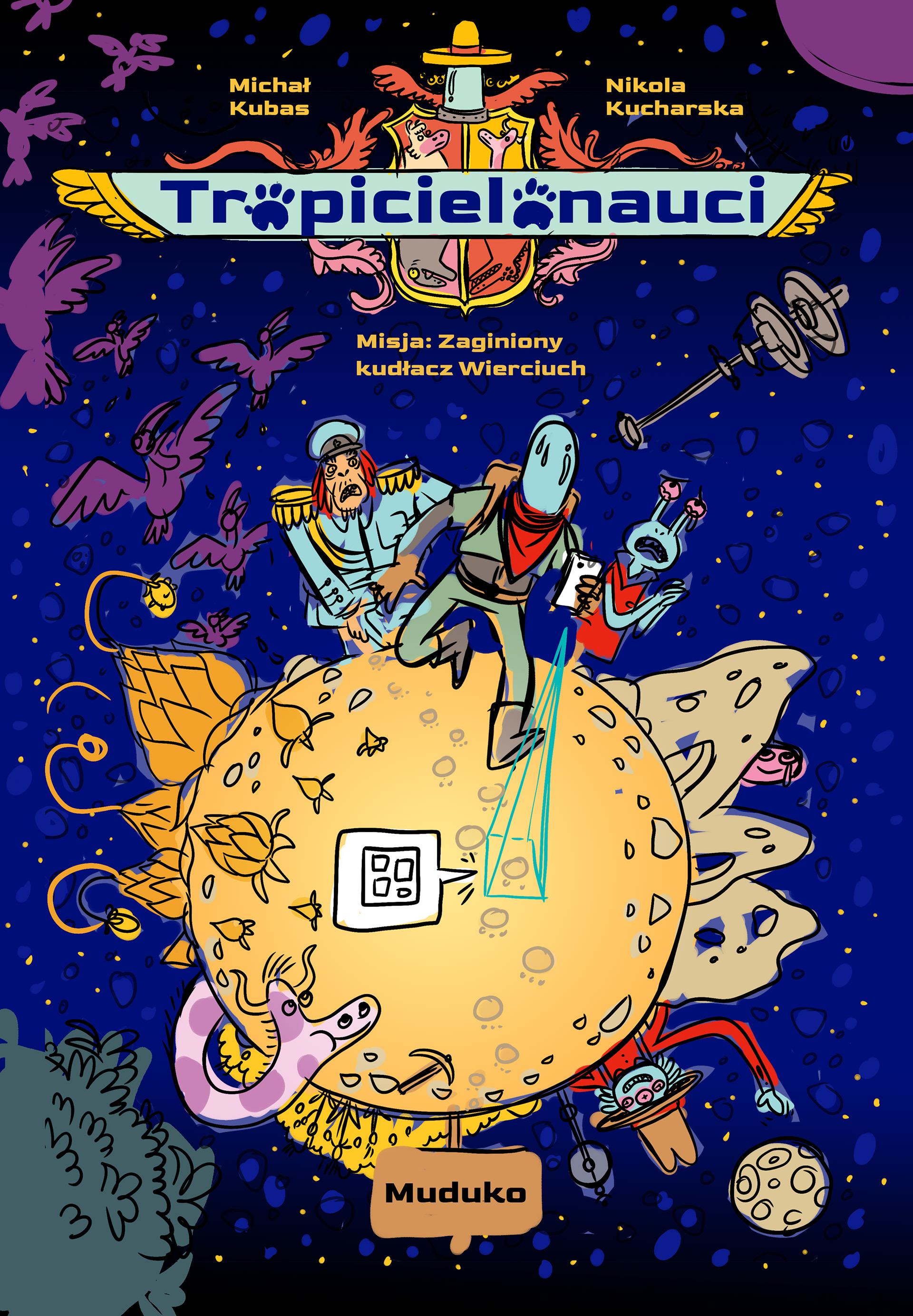
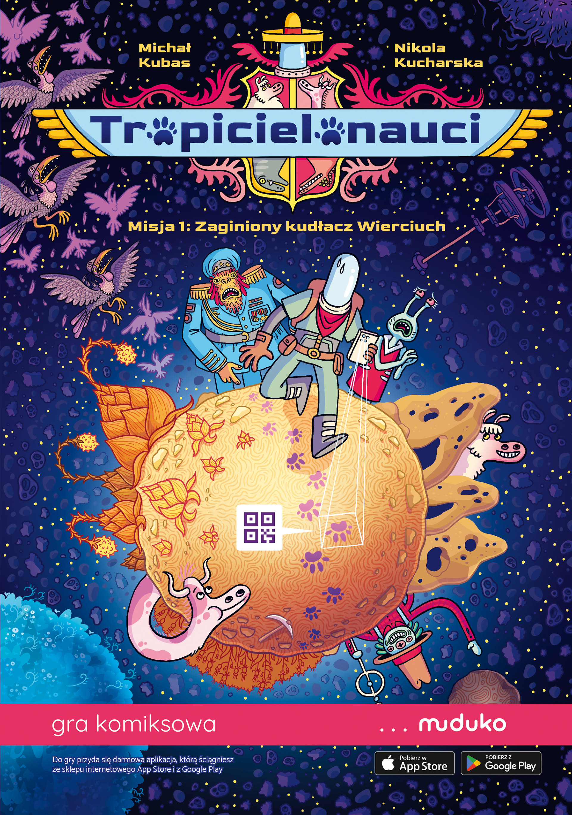
Cover and Series Logo
The final step in our work was designing the cover and the logo for the entire series. We wanted the book to stand out and immediately give readers a sense of what it might be about just by looking at it on the shelf.

TROPIBOT
The publisher hired the studio Last Qubit to work on the app. Our responsibilities included preparing the layout, providing a detailed description of the app's functionality, and creating all the content for the encyclopedia, including translations of the runic script.
The App: Prototype
To streamline communication and better convey our vision, we developed a quick prototype of the app. This prototype also played a key role in planning the encyclopedia's content, especially during the early stages, when the final app wasn’t yet ready for this purpose.
The App: Preparing the Layout
With a clear understanding of the app's functionalities, we created a quick visualization of our concept for the app's overall style.
The App: Preparing Illustrations and Content
Creating the encyclopedia was a complex and demanding task. The challenge lay not only in the amount of content we wanted to include, but also in ensuring precise synchronization with the book. With so many interwoven threads, even the smallest addition or removal could create significant complications.
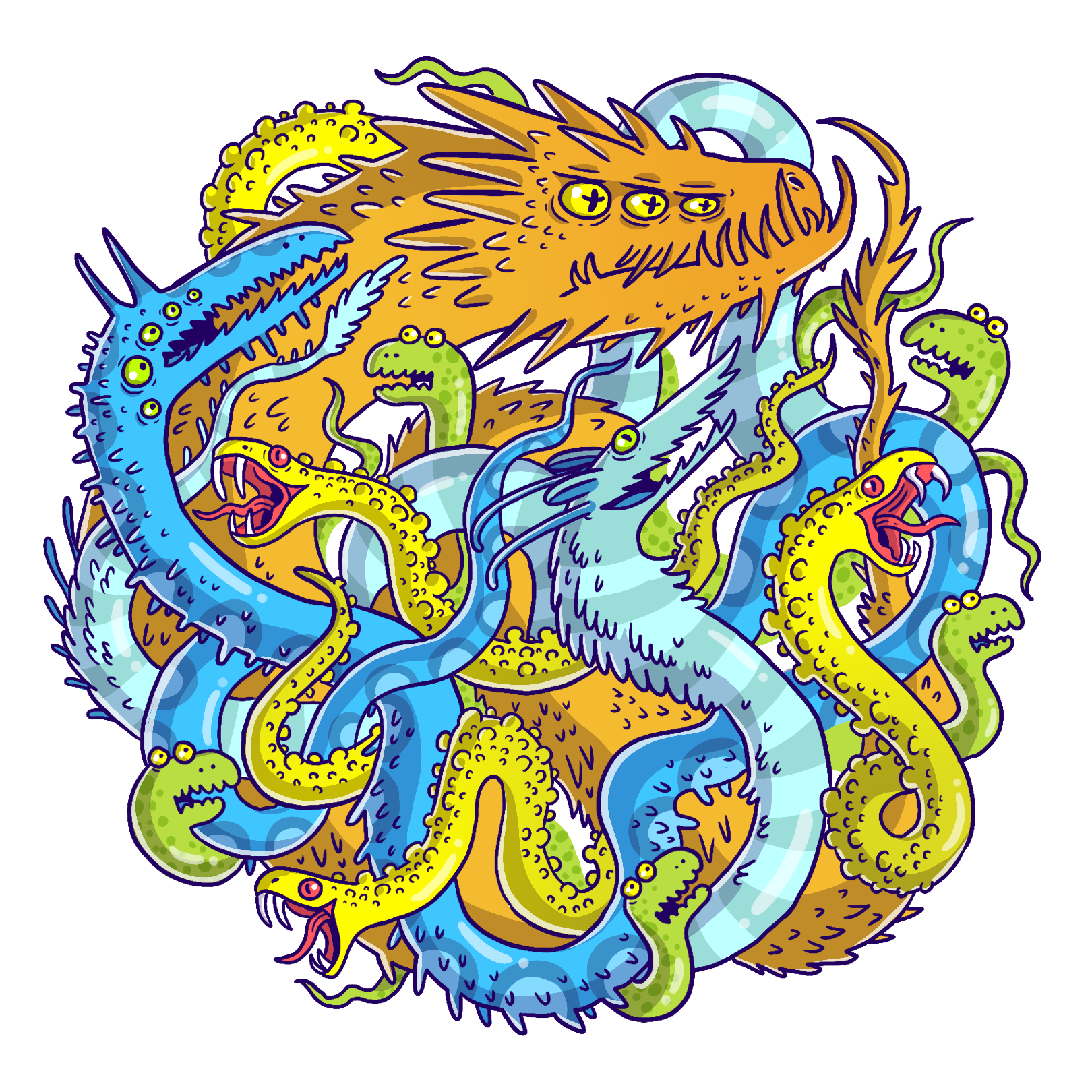
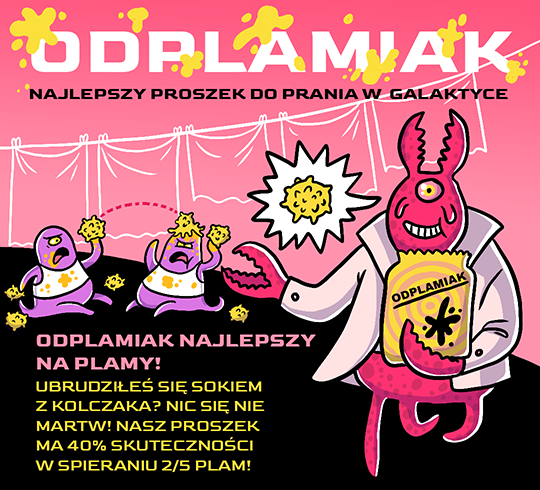
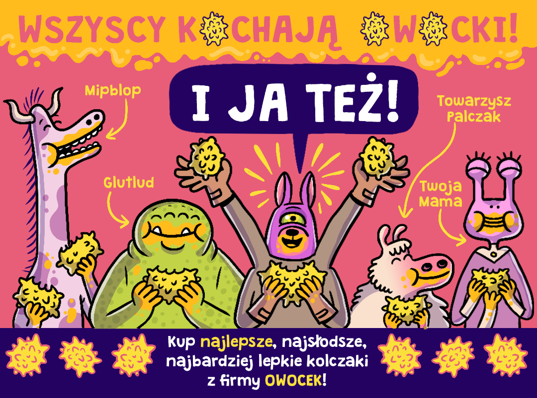
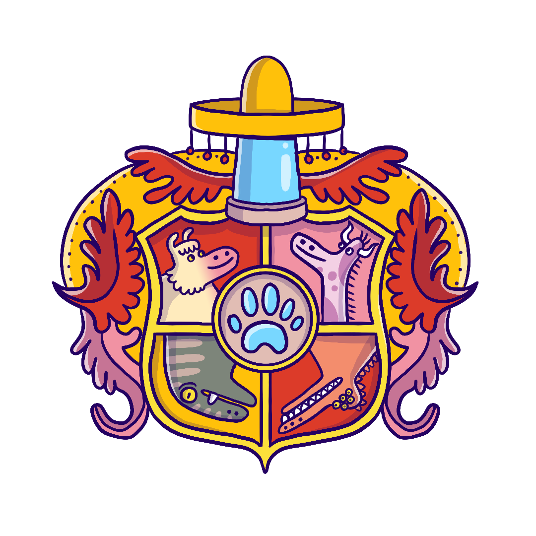
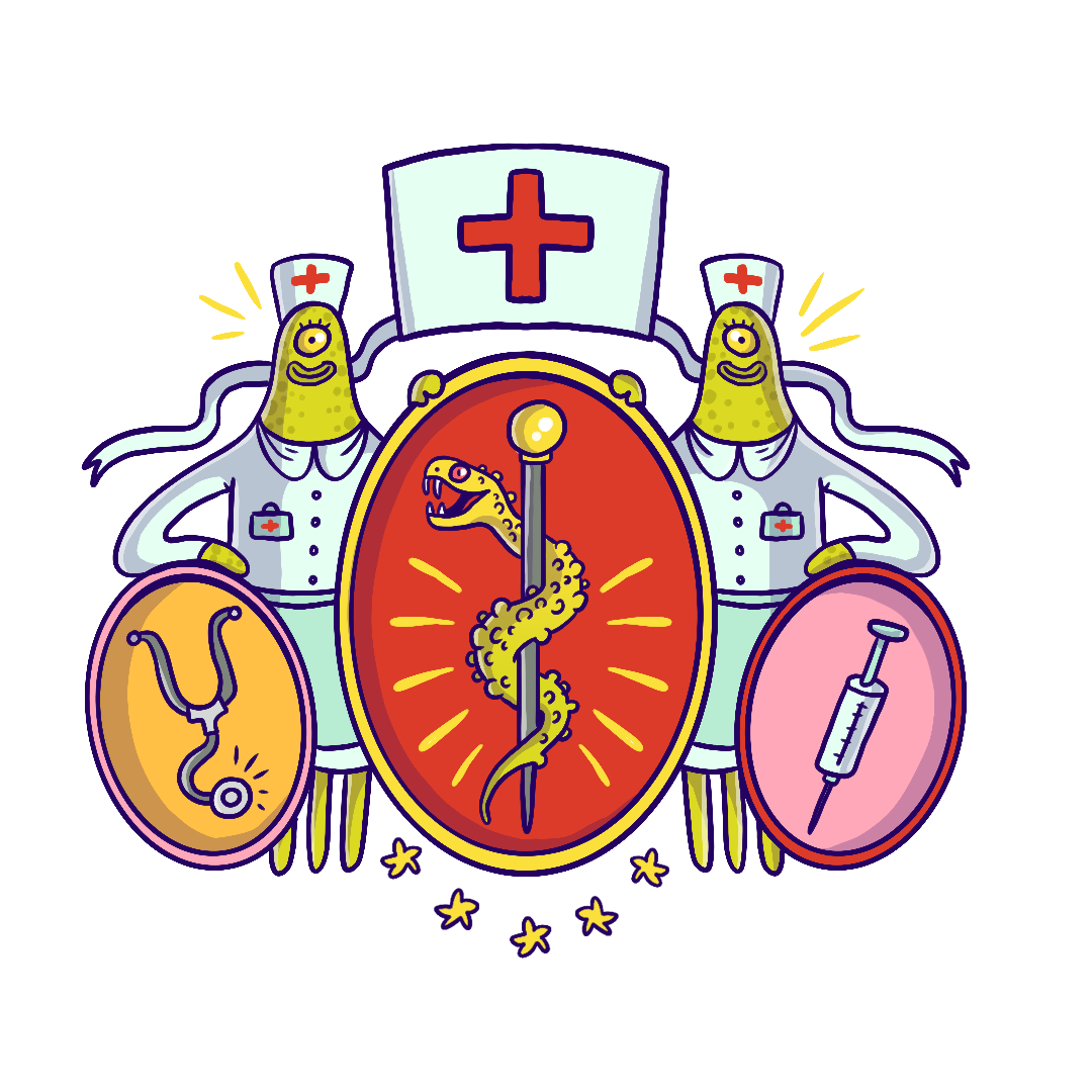
The app contains 127 entries, and we were determined to make the encyclopedia's content as diverse as possible. As you journey through space, you’ll encounter diaries, notes, advertisements, voice recordings, frescoes, letters, magazines, and even interactive assistants you can converse with!
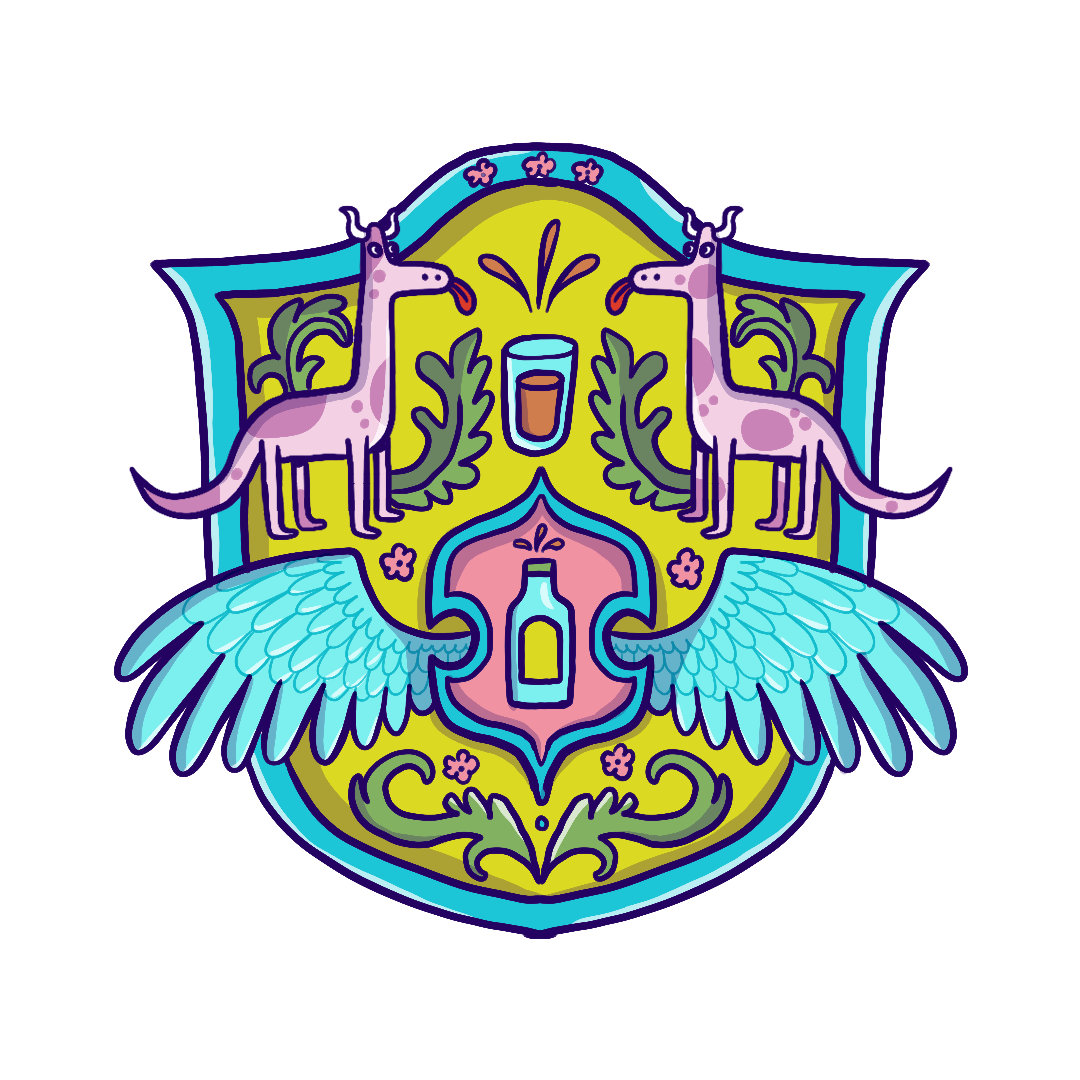
Beyond the encyclopedia entries, we also created illustrations for interface elements, achievements, and the character creator, ensuring a cohesive and engaging experience.


The App: Animated Logo
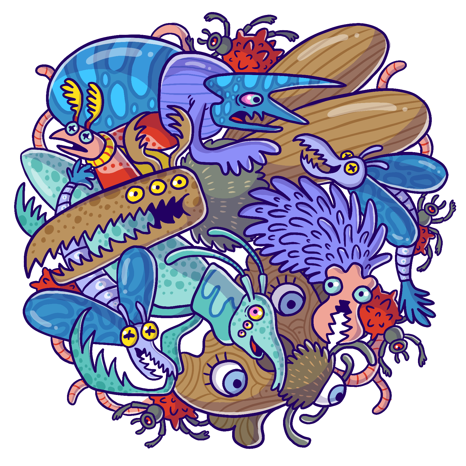
The final missing piece was the app's logo and its introductory animation.
Summary
Creating this comic was an incredible adventure, and the moment we first held it in our hands will stay with us for a long time. We’re thrilled with how the comic turned out, and judging by the reviews, we’ve managed to create something that visually intrigues readers. Reviewers praise the quality of the illustrations as well as the humor—both of which were key elements we aimed to deliver!
We hope the comic sells well, allowing us to create a sequel. Next time, though, we’ll try to include more narrative conveyed through classic comic speech bubbles.