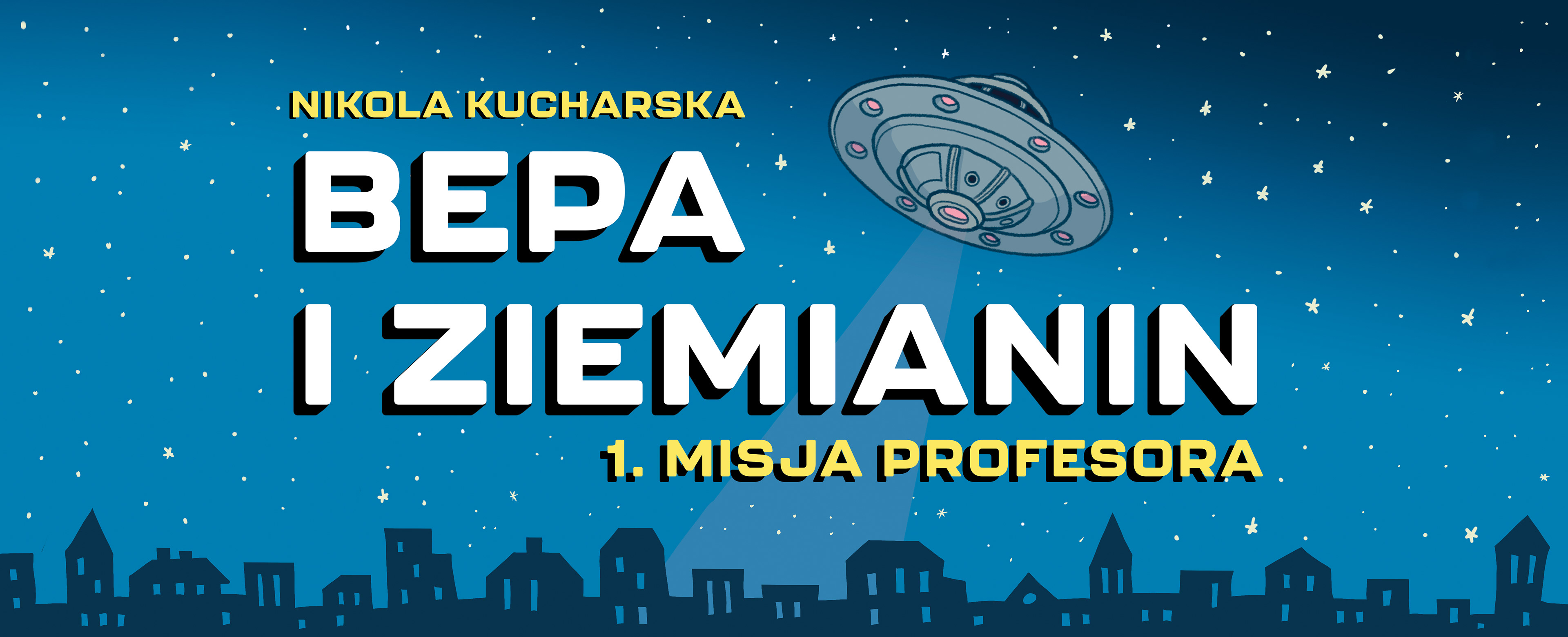
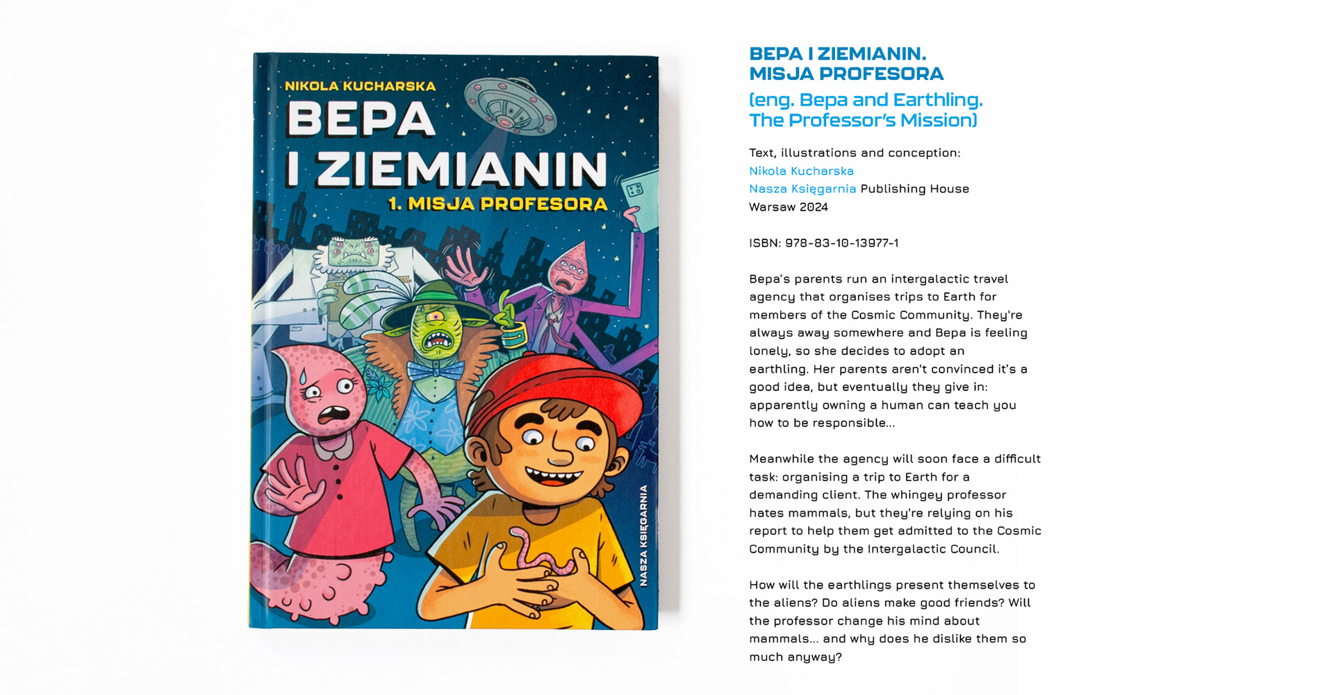


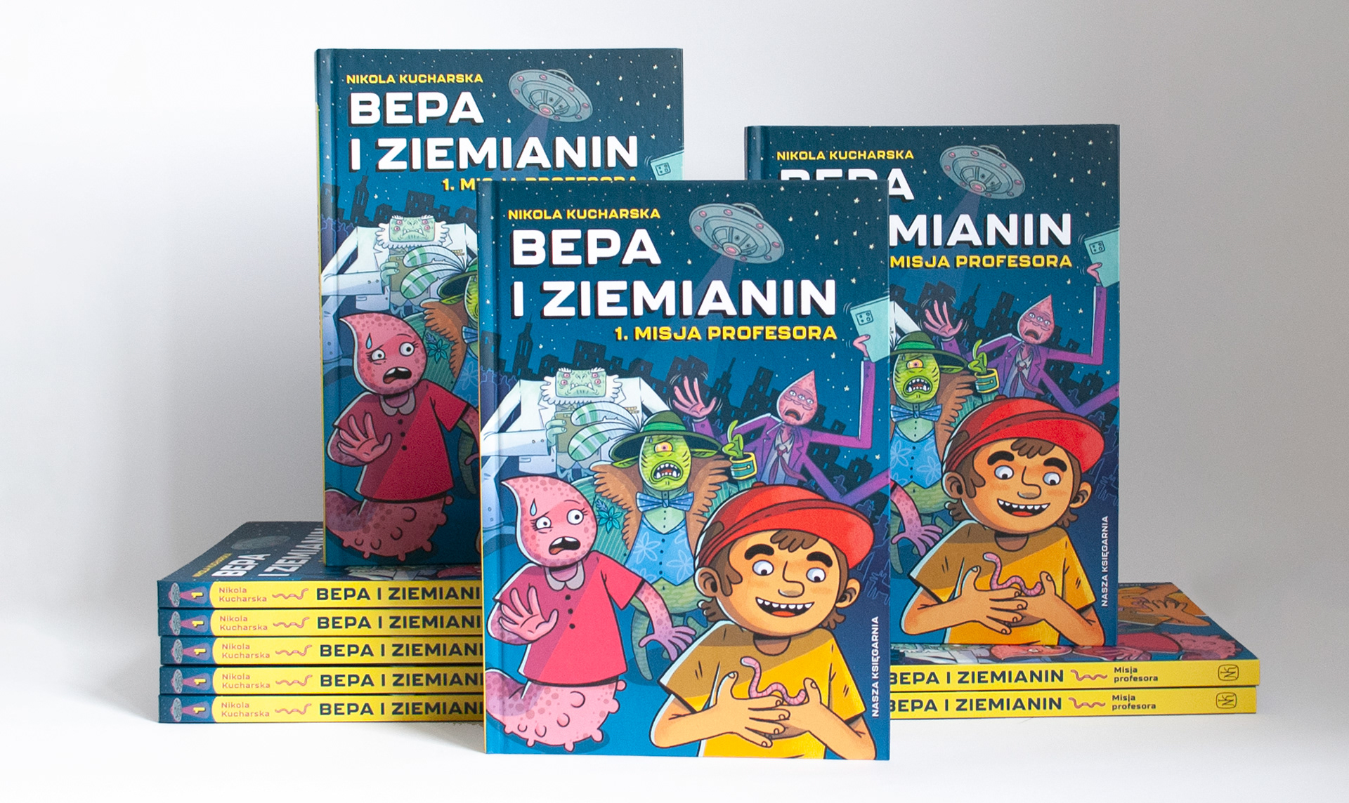
"Bepa and Earthling" is a comic book aimed at children aged 9 and up. However, my goal was to create a multi-layered project:
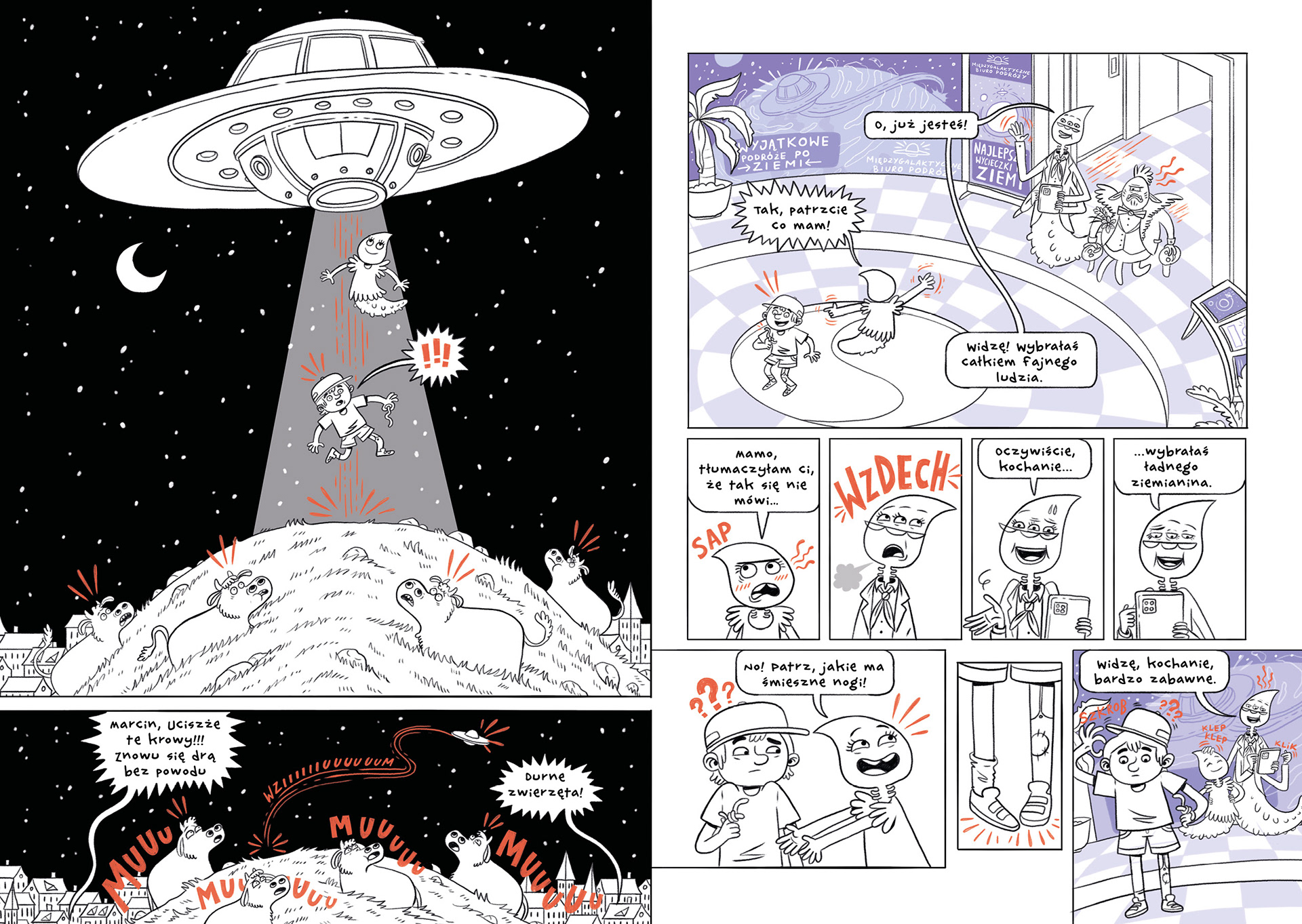
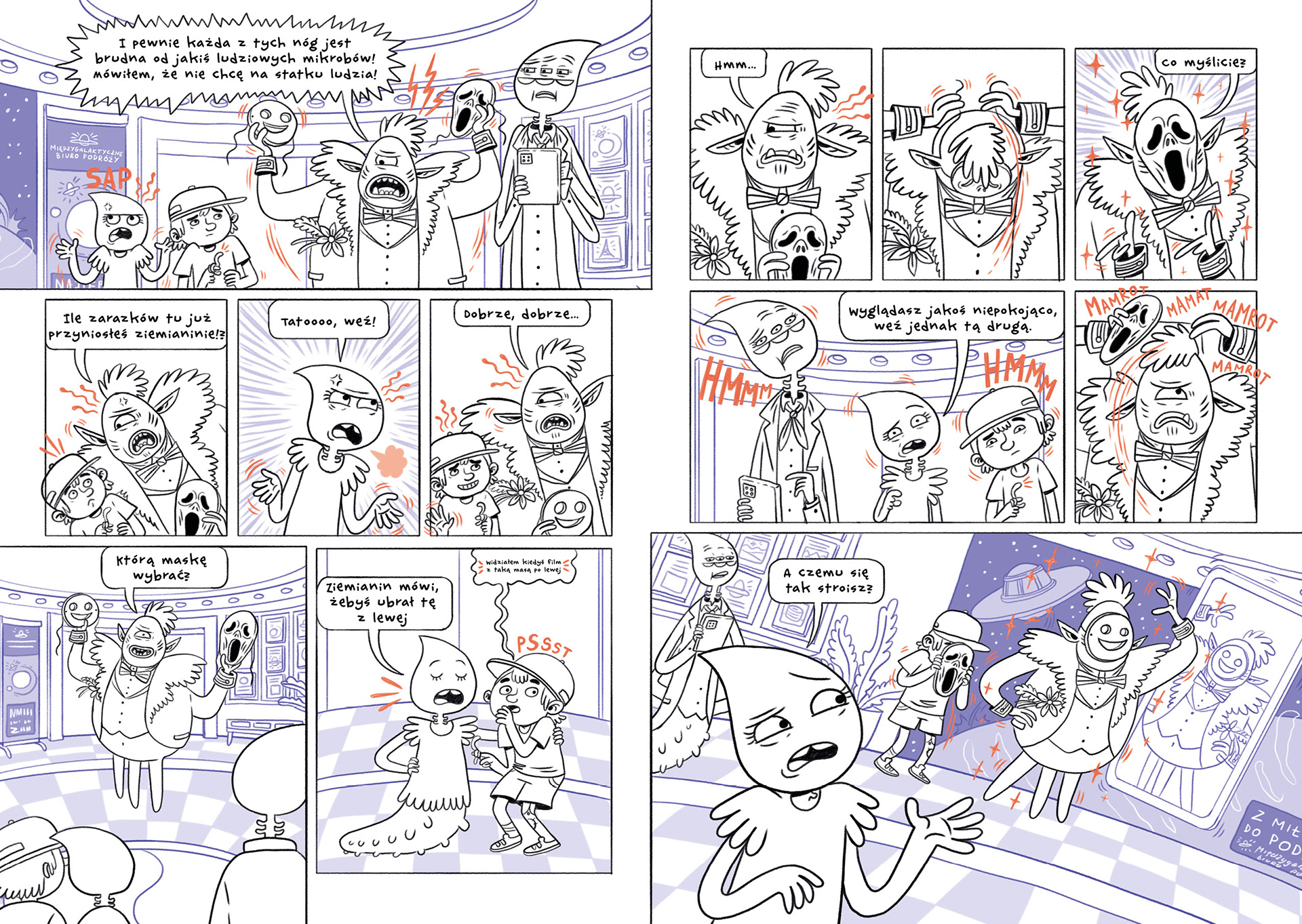
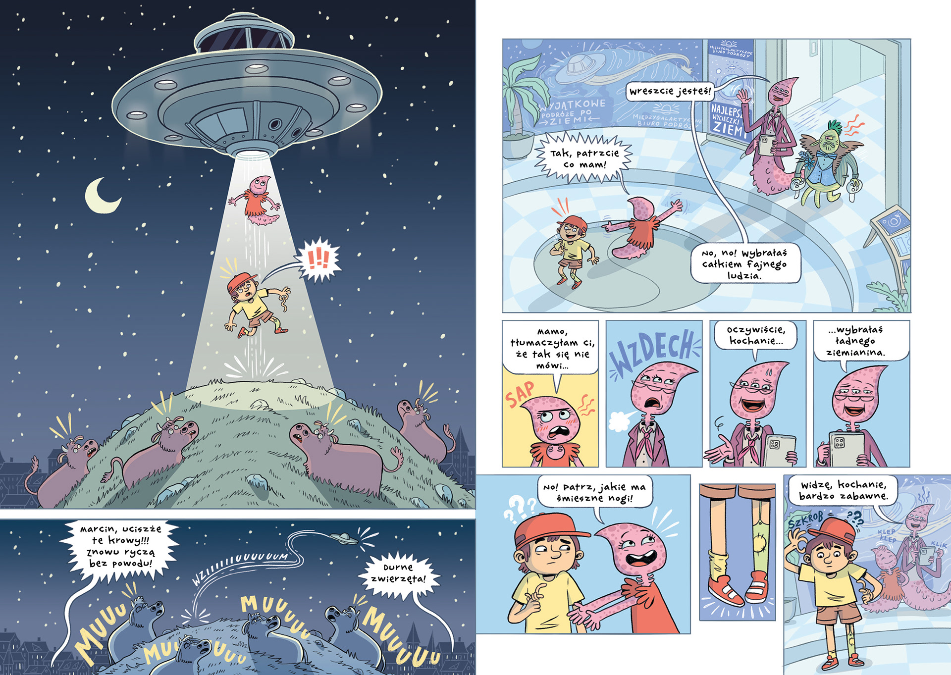
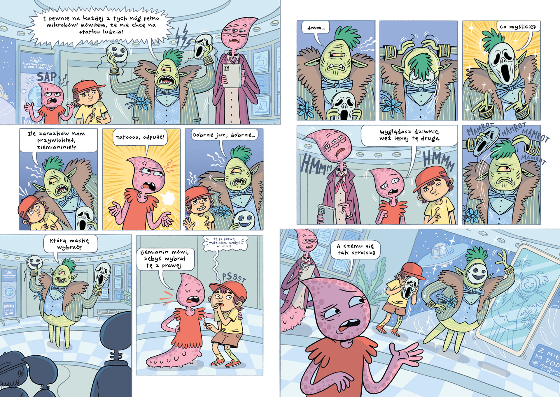
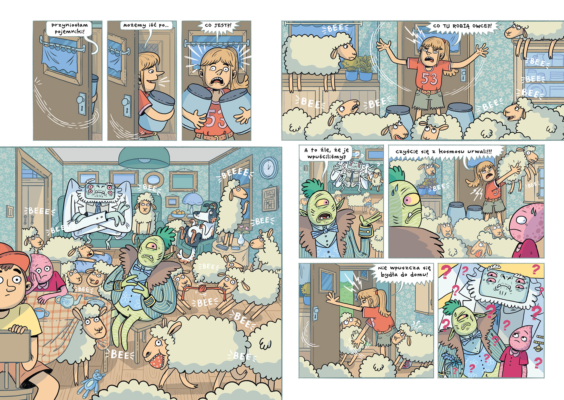
The primary layer of the story is an action-packed, fast-paced, and humorous narrative that will keep young readers engaged from start to finish. The aliens, who are the protagonists of the comic, have a completely different, non-anthropocentric perspective on the world compared to humans. This allows for an endless number of situational jokes, where the reader’s knowledge is contrasted with the way the aliens perceive Earth.
At the same time, the comic contains a second, deeper layer aimed at an adult audience. The story presents the concept of a non-anthropocentric worldview in an accessible manner, drawing on, among other things, the philosophy of Peter Singer. It addresses animal rights and reflects on our attitudes towards them, touching on issues of prejudice, assumptions, and hypocrisy.
It is challenging to discuss such serious and significant topics without falling into pathos. The fact that the book is targeted at a young audience forced me to approach the subject in an unconventional way, presenting it in a maximally accessible, satirical, and unpretentious manner.
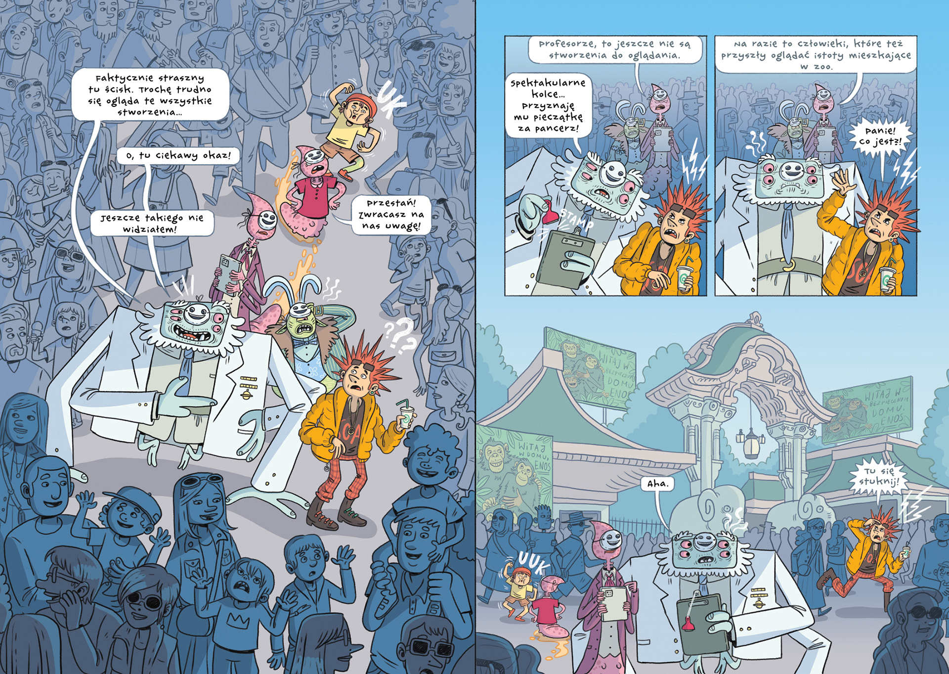
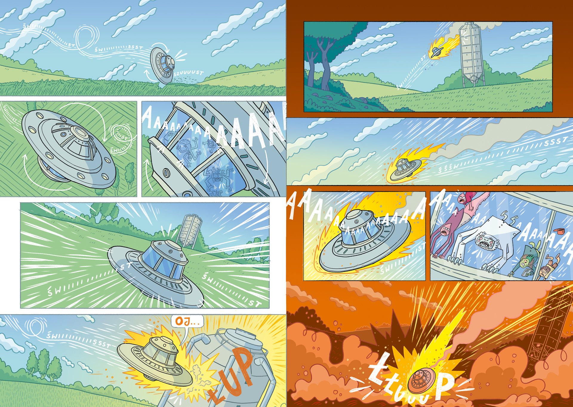
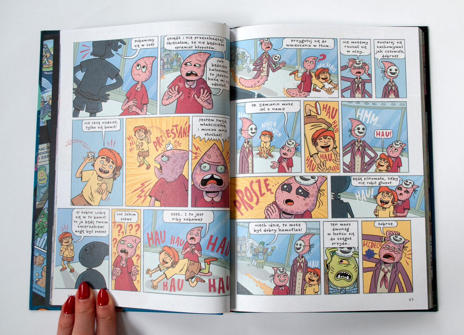
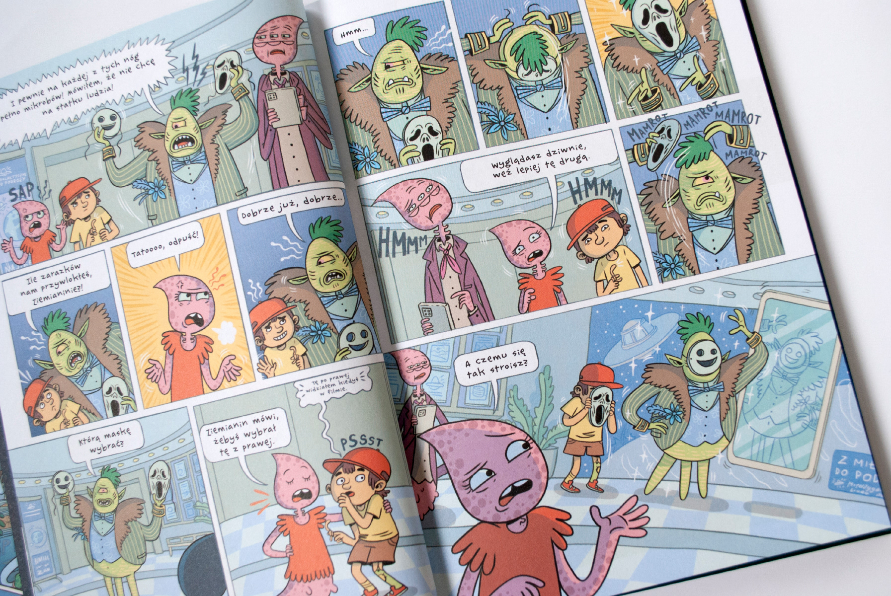
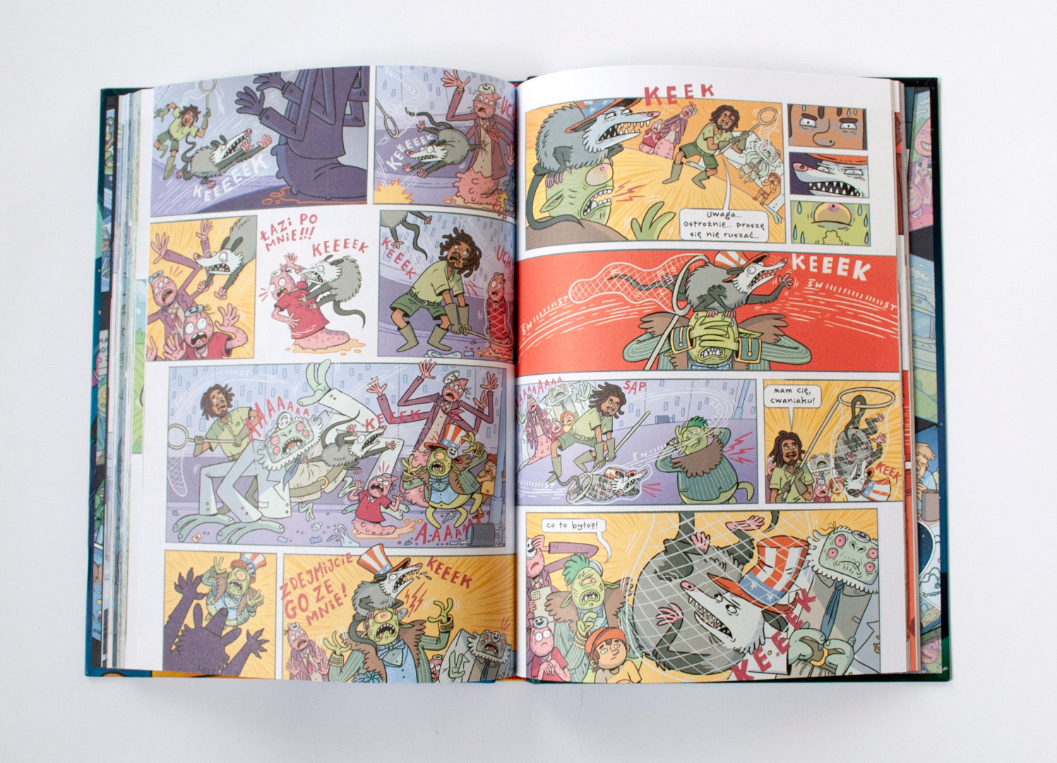
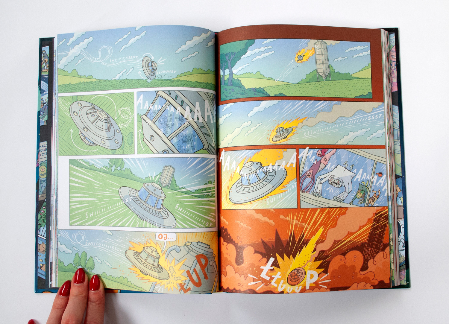
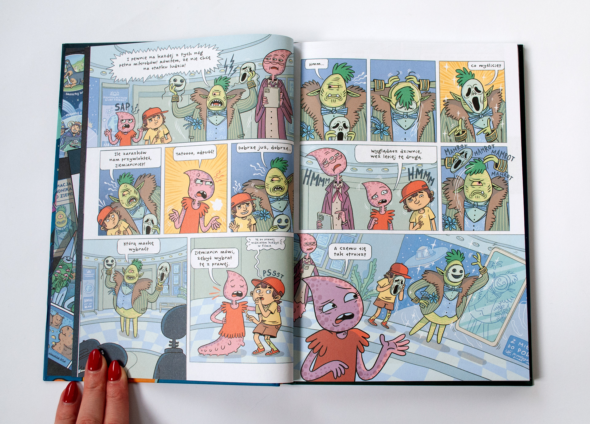
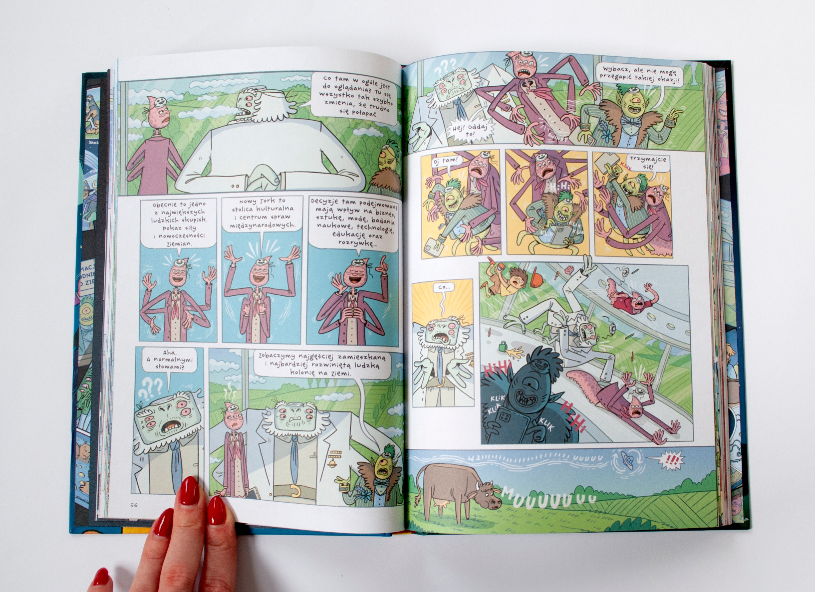
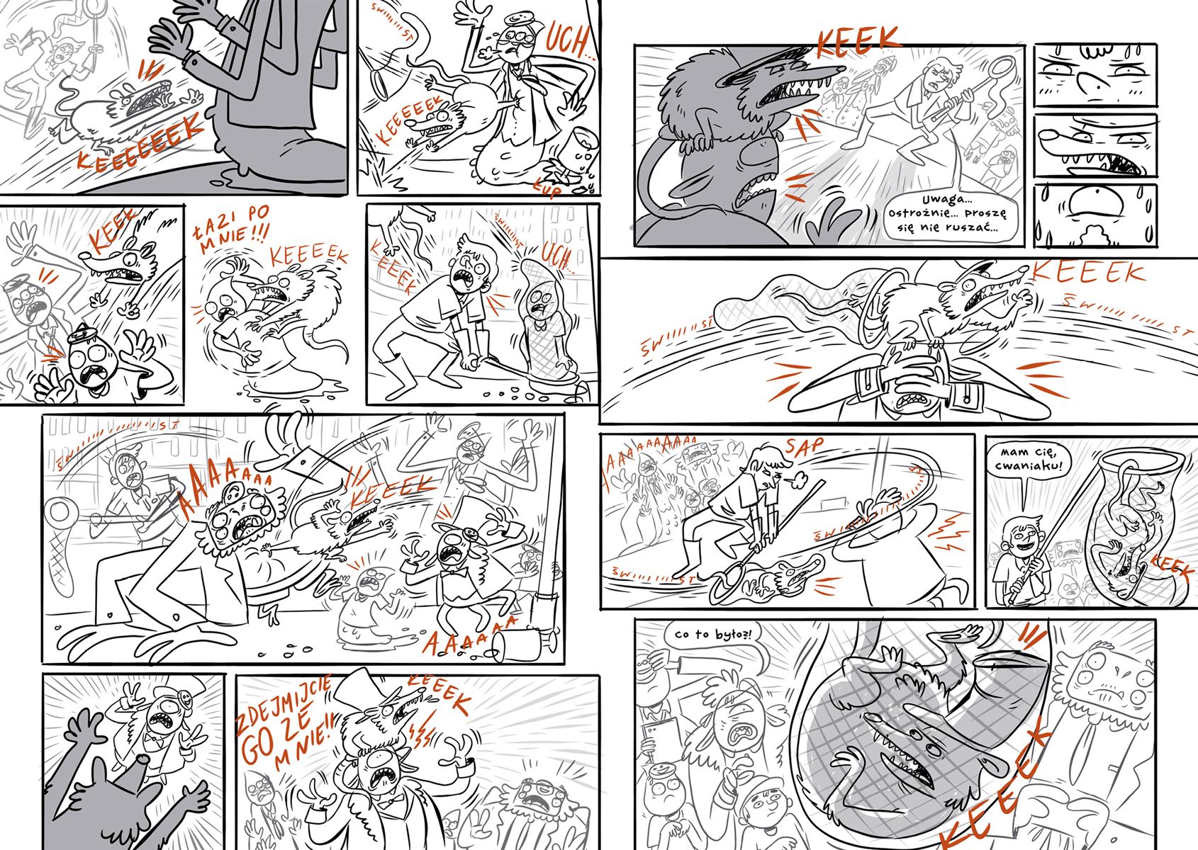
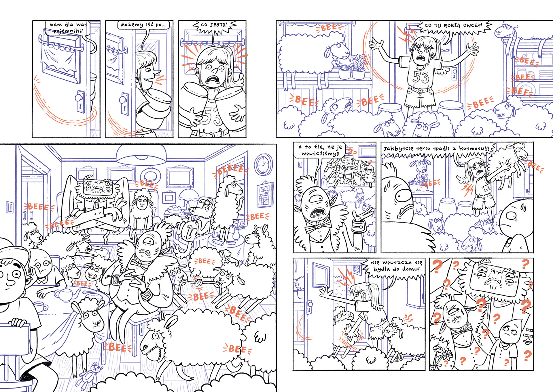
To create a sense of fast-paced action, I used a large number of narrow and smaller panels. In this title, I rarely employ wide or panoramic shots, as they would slow down the story's pace.
In the visual layer, I opted for precise, linear drawings characteristic of my style. I used subtle, flat colors with very delicate, localized shading, which give the book the vibe of children's cartoons.

Concept and Script
"Bepa and Earthling" was envisioned as a series from the very beginning. Initially, the publisher proposed creating a series of comics for teenagers about geography. Geography is a broad topic, with many diverse books and comics already created on the subject. To say something fresh, I needed to find a new, interesting perspective for the story.
That's when the idea of making the protagonists aliens came to me. This allowed both the reader (a child) and the characters (aliens) to explore Earth with equal curiosity and ignorance — as explorers, without prejudices or assumptions. Additionally, choosing aliens as the protagonists enabled the creation of a geographical journey without temporal, linguistic, or distance constraints. This could make for an epic journey impossible for any human character to undertake.
The idea was well-received by the publisher, who gave me the green light to continue. As I gradually considered the selection of locations and attractions for the aliens to visit, I encountered more and more pitfalls. How to discuss the origin of the pyramids without questions about slavery or religion? How to show many animals in one place? Likely by depicting a zoo. But how to discuss zoos without questioning the ethics of caging some animals by others? Is it possible to talk about our history and culture without heavy stories of colonialism, slavery, and exploitation? The abundance of such questions, arising from the thought experiment of portraying aliens lacking human perspective, historical knowledge, conceptual understanding, and cultural context "we are born with," made the task more challenging than I initially assumed. I could either abandon the idea or fully embrace it. I chose the latter.
I decided to base the entire story on the difference between human and alien perspectives. During my reflections and research, I became particularly intrigued by questions concerning the relationship between different Earthlings and the myriad questions that arise from this. From the perspective of aliens, humans and other non-human animals are equally Earthlings. Why, then, is their moral status so different? Reflecting on this and searching for answers to the growing number of questions, I came across Peter Singer's books, which profoundly impressed me and convinced me that the direction I had chosen was the right one.
Focusing on exploring the theme of interspecies differences, I abandoned the initial premise of creating a geographical comic. Fortunately, the publisher was very open to my decision and allowed me to freely pursue this direction.
Creating the world and the entire plot was a gigantic undertaking for me. The concept evolved significantly in my mind. Initially, I wanted the comic to be a collection of short stories within one book, but I ultimately decided on a full-length narrative divided into three volumes. Meanwhile, the group of protagonists (initially purely alien) gained a human member to make it more relatable to readers.
"Professor's Mission" was to be the first part of the series. I had never written such a complex and multi-threaded story before. Previously, I had written shorter texts aimed at younger audiences. So I quickly began to learn how to write and construct a plot that had a good pace and appropriately placed highlights.
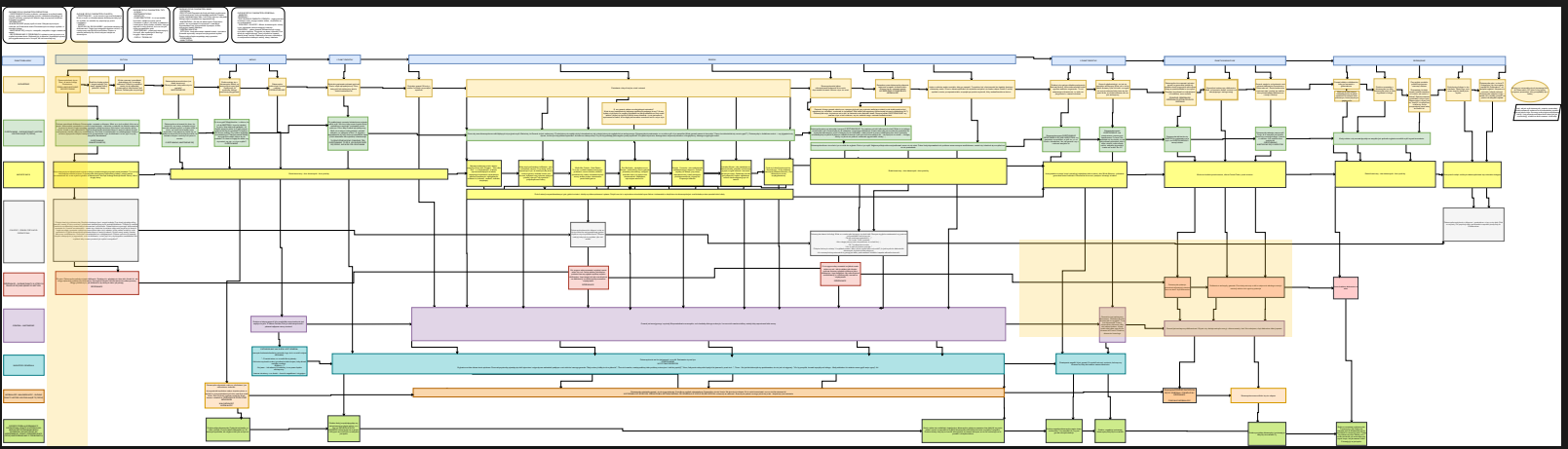
Five versions of the script, countless notes and documentation, and even auxiliary charts were created before the final version of the script emerged.

Character Design
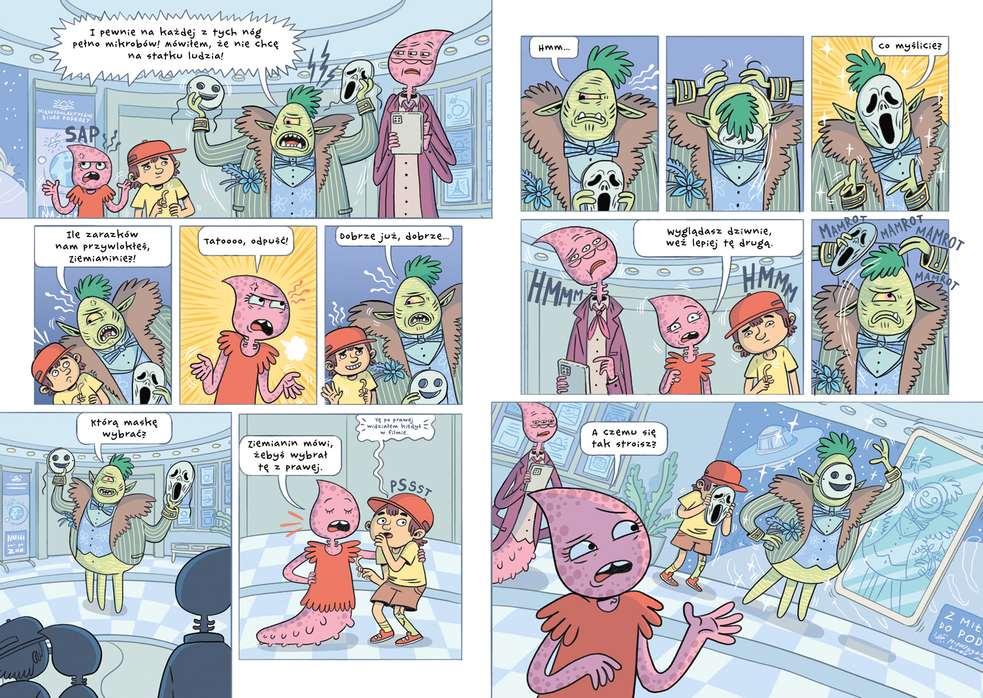
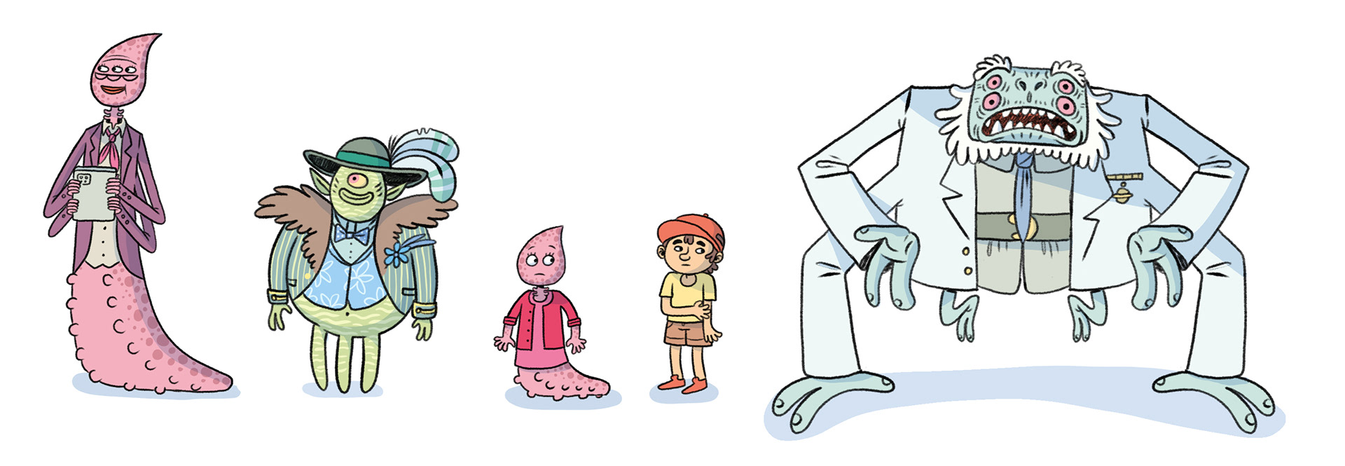
The comic heavily relies on its characters, so good character design was an incredibly important part of my work. Since there aren't many characters in the book, each one needed to be maximally distinctive, have a unique and interesting silhouette, and clearly convey the personality of the character.
Below, you can see the first version of the characters and further down, the final version. To ensure the comic’s maximum readability, I decided that each character would be designed with a cohesive, fairly monochromatic color palette. By assigning a specific color to each character, I could clearly and effectively design the panels and organize the hierarchy of importance for various elements on the page.
Firs version:

Final version:
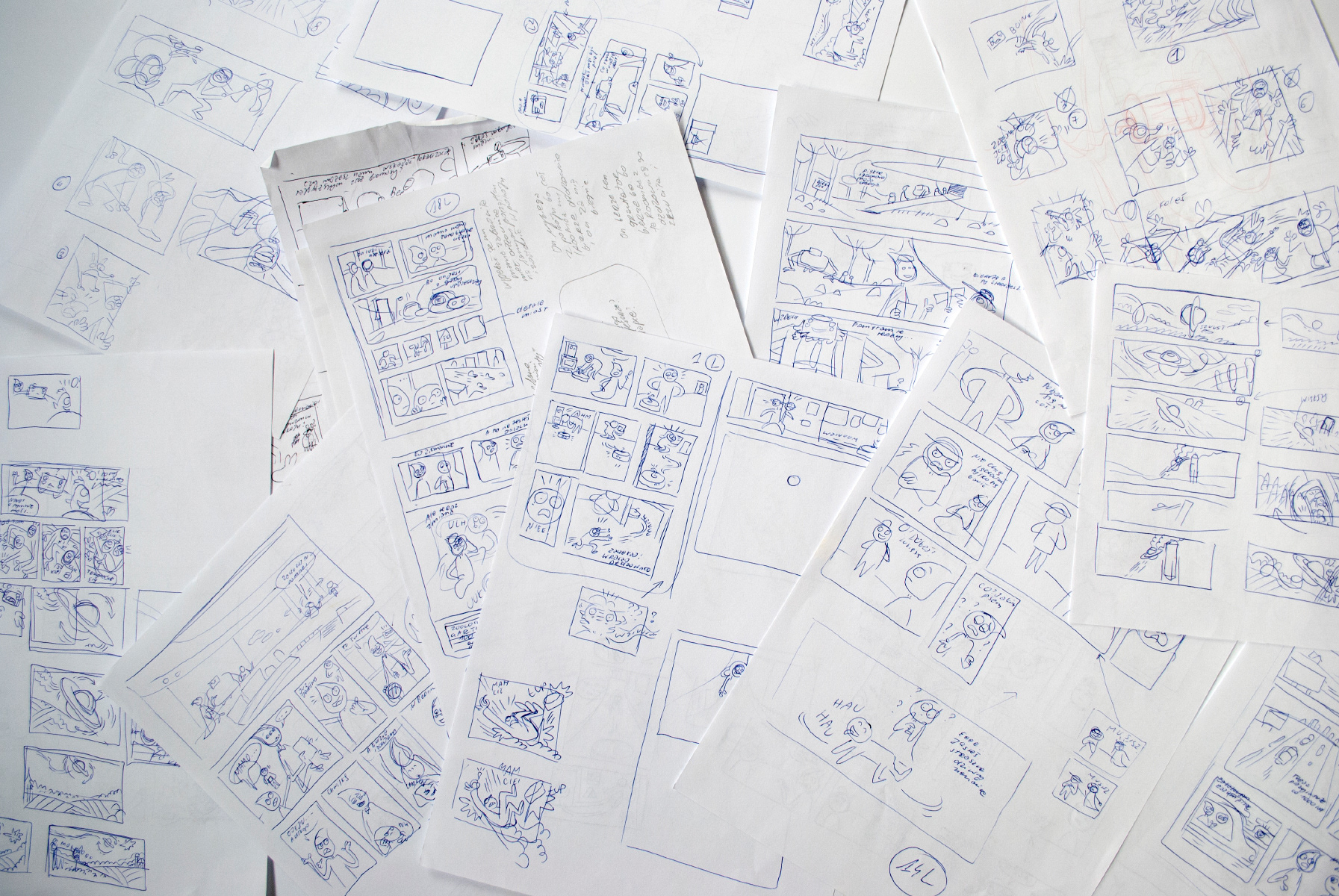
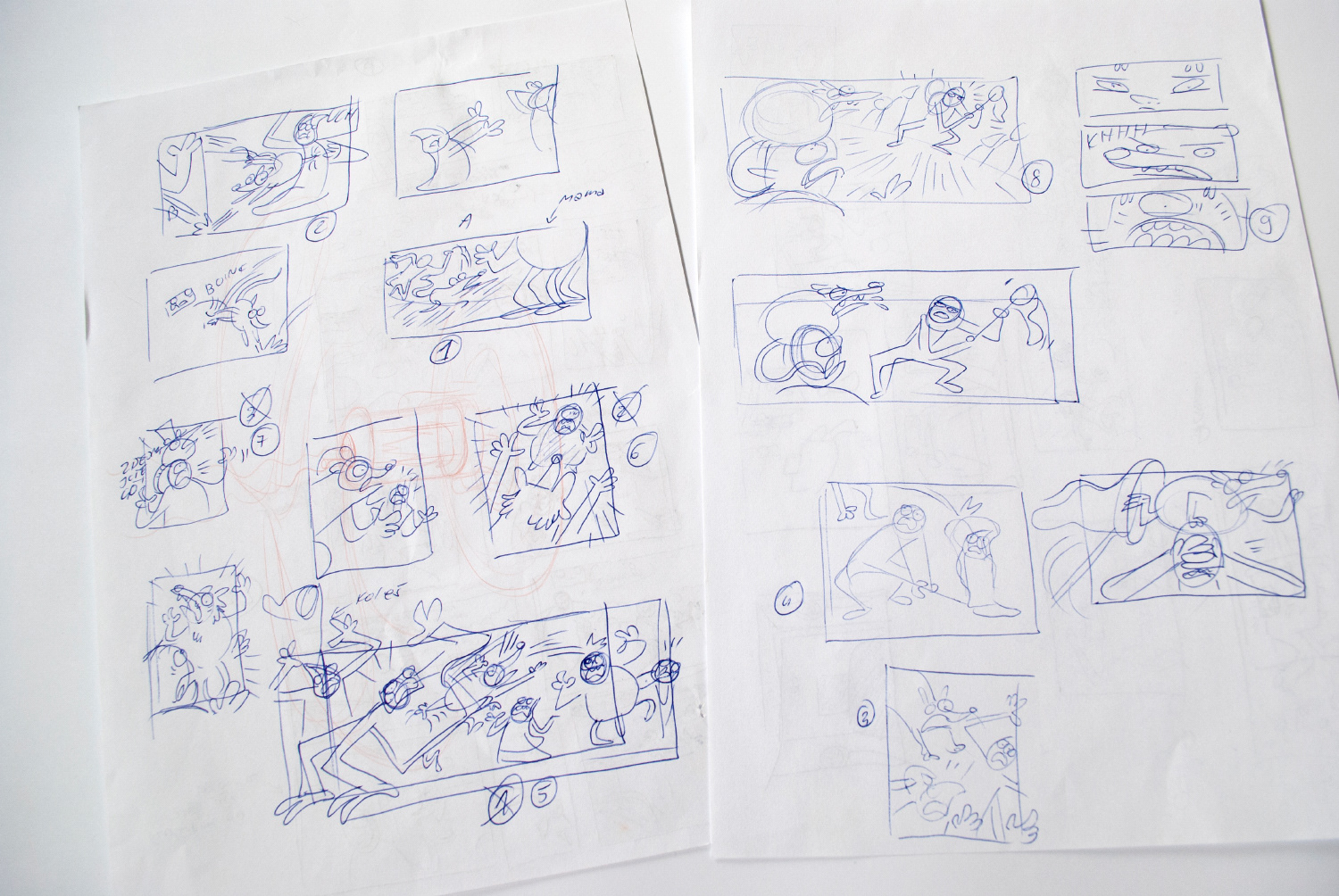
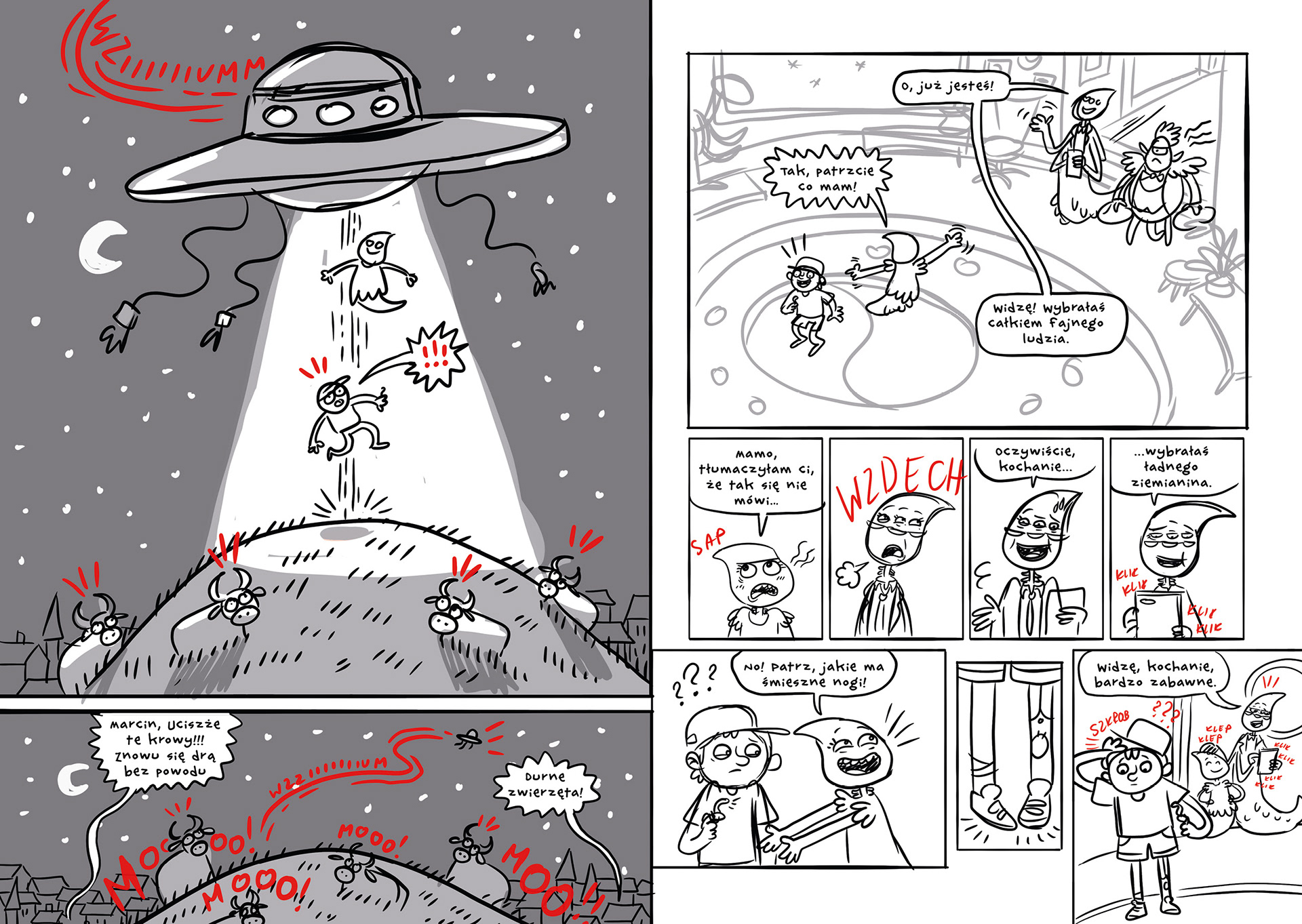
Sketches
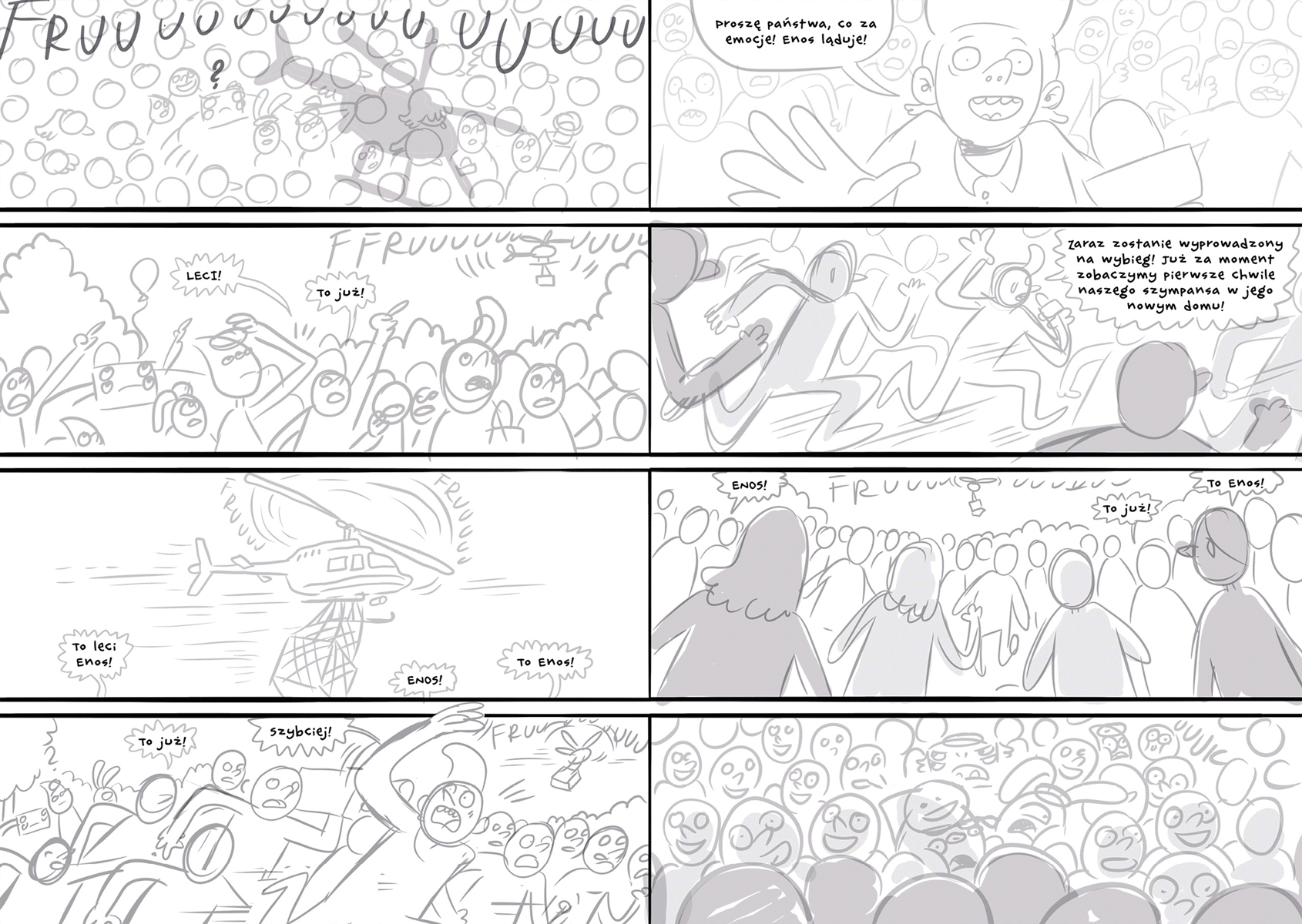
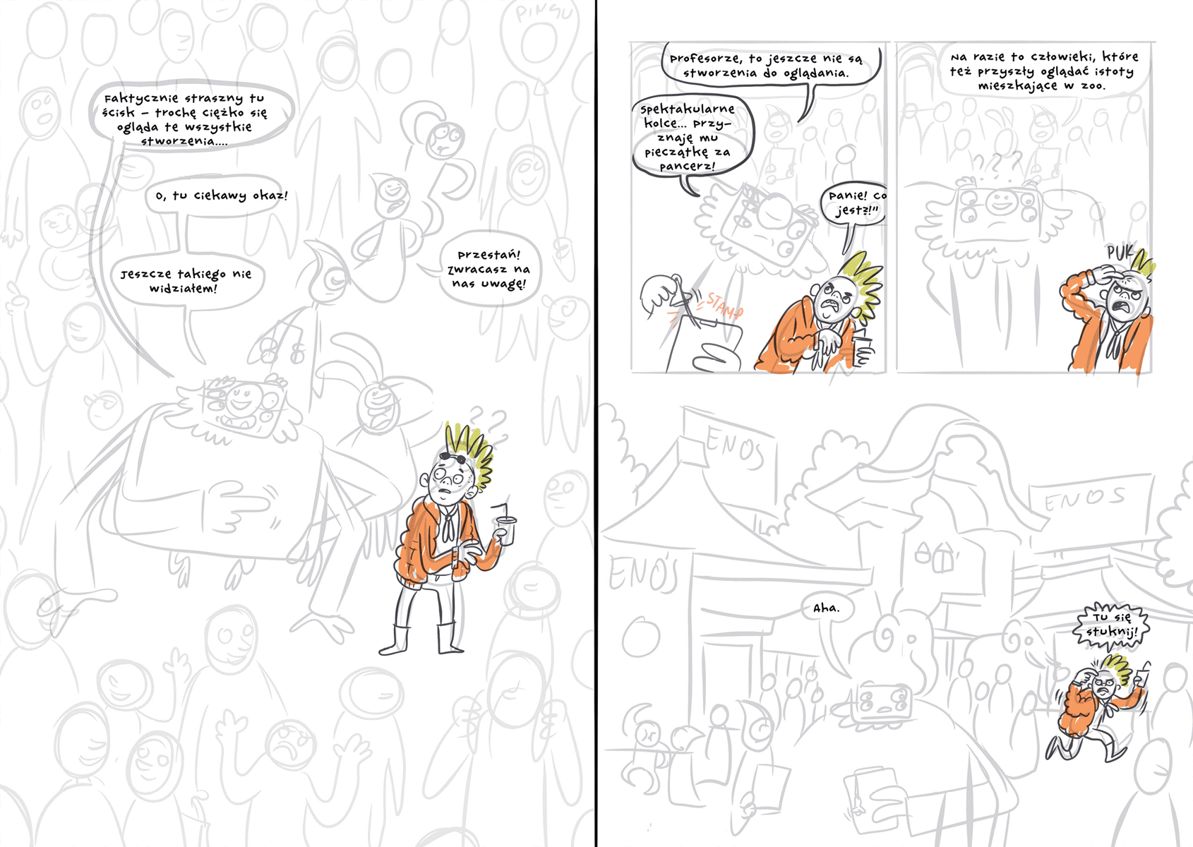
The first sketches of the panels and initial ideas for illustrating various scenes were done on paper. At this stage, it was about loosely exploring the best and smoothest ways to frame the scenes. Given the imposed (and fairly limited) length of the book, it was important that each panel was well-thought-out, conveyed the maximum amount of information, and seamlessly advanced the plot.
I aimed to frame the comic in a very cinematic way — each panel was designed to flow smoothly from the previous one. I thought of the sequence of panels in terms of "camera movements," which gave the entire story a rather fluid rhythm.
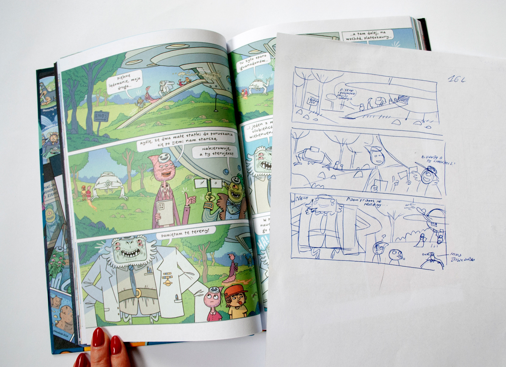
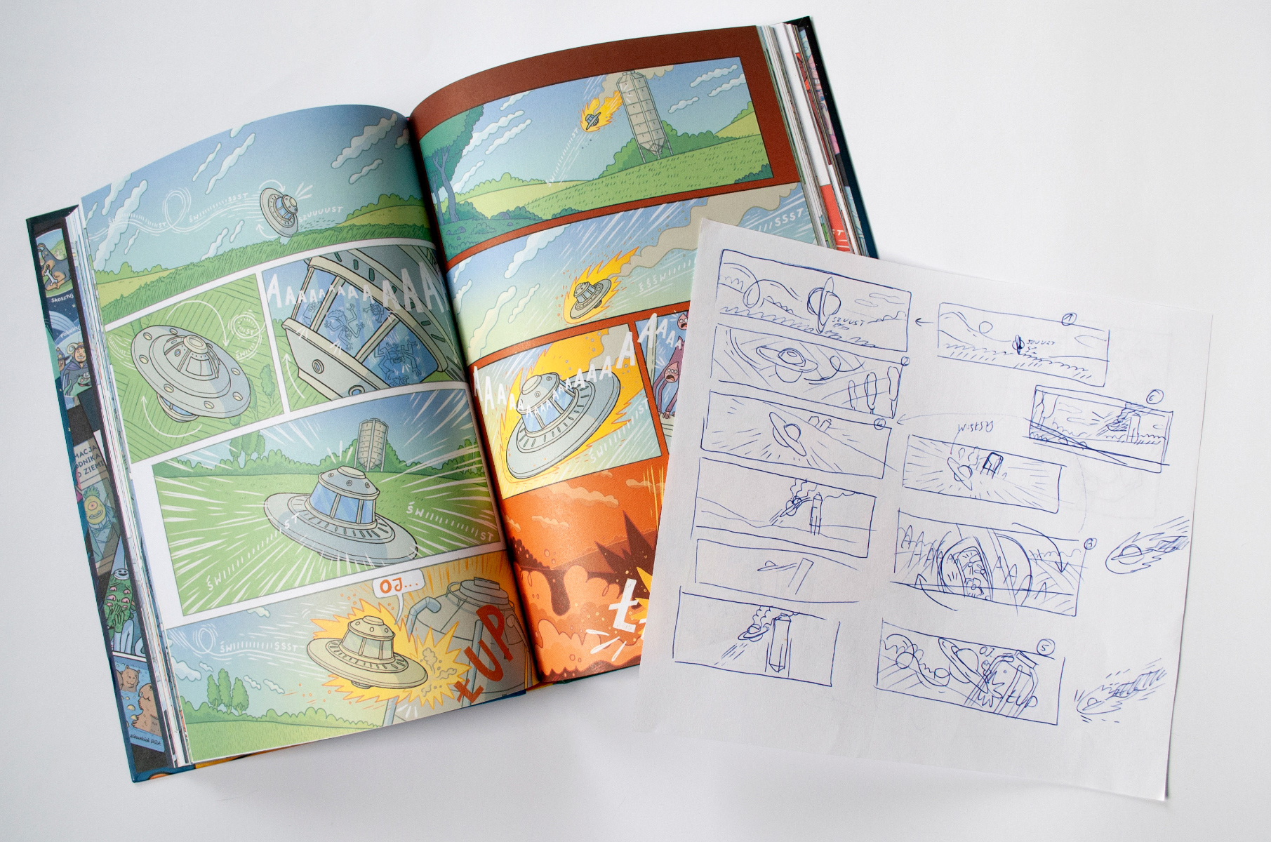

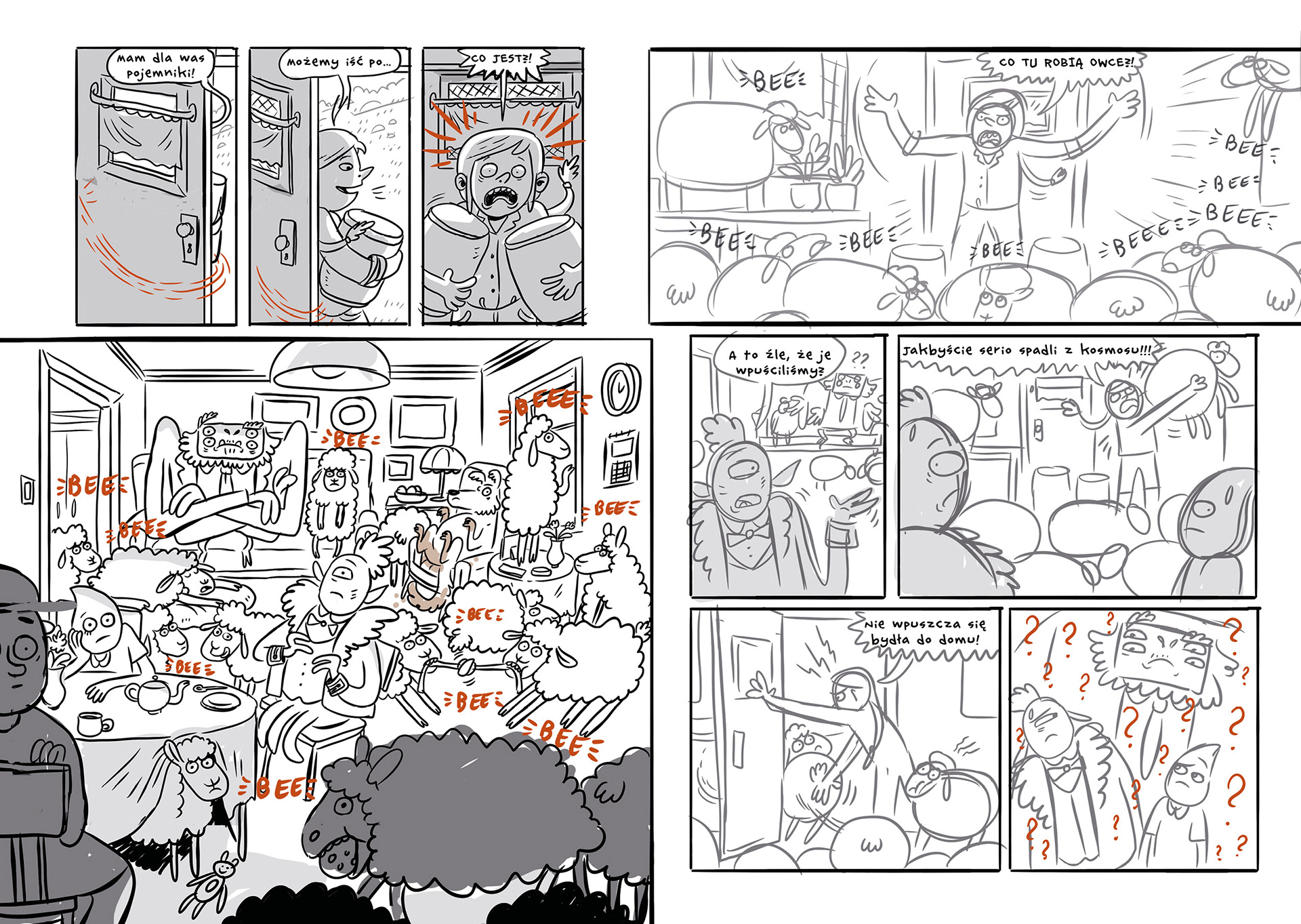
Storyboard
I assembled the sketched panels into the first storyboard mock-up, which served as a visual translation of the script. At this stage, I made quite a few changes. Working on the comic taught me that comics are a visual medium — wherever possible, it's better to convey the story through images and action rather than words and dialogue. Using this newfound knowledge, I revised parts of the action to align with this principle. These changes significantly enhanced the dynamism of the entire story.

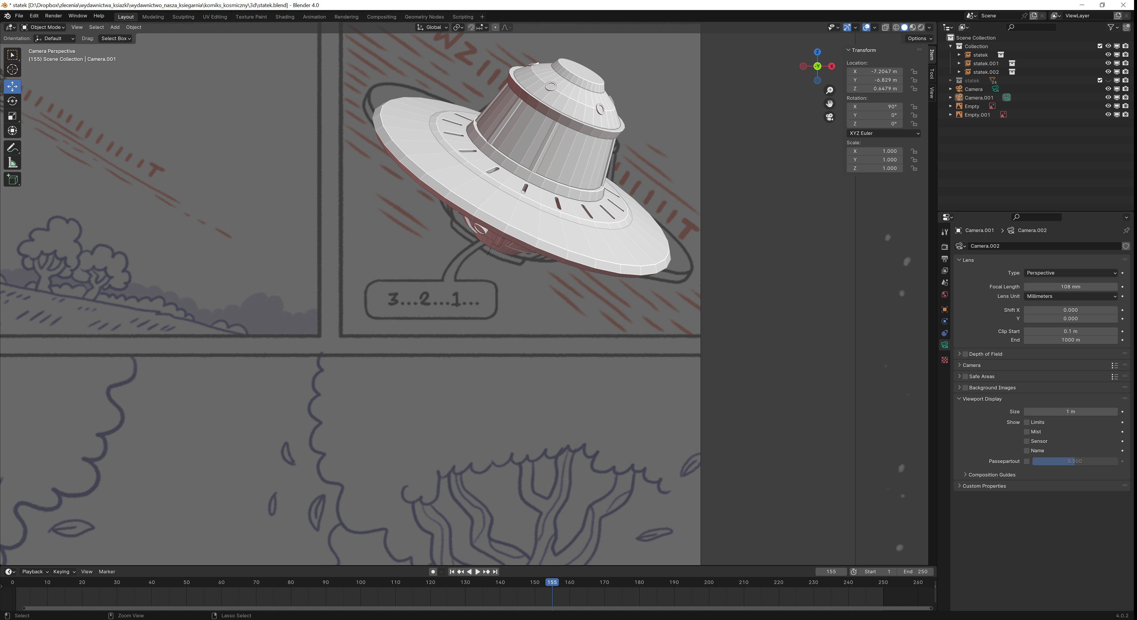
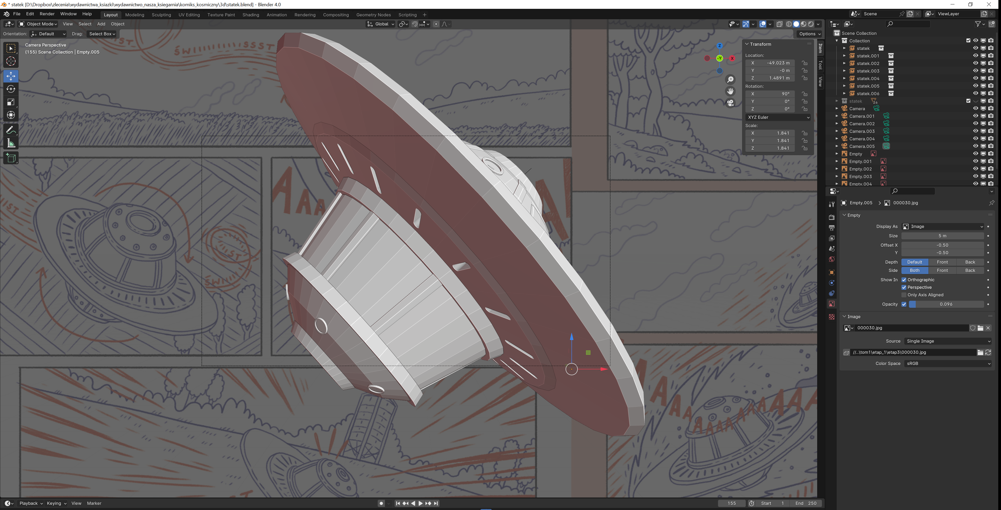
Using 3D Models
While working on the comic, I also discovered how useful 3D models can be. I learned the basics of Blender to create blockouts of certain elements that were particularly difficult to draw, such as the spaceship. This allowed me to depict it in the most dynamic shots and enhance the cinematic quality of the entire comic.
Line art
The line art stage was the most labor-intensive part of working on this project. I aimed for the panels to convey as much information as possible through the artwork, often depicting multiple threads on different planes within a single image. The comic is highly linear and relies on precise, relatively detailed drawings.
Coloring
In the comic, I used flat color blocks with very subtle and sparing shading. The backgrounds are kept very cohesive in color and relatively neutral in tone, ensuring that the colorful and monochromatic characters always stand out in the foreground. This approach allowed me to precisely plan the hierarchy of elements on each spread, clearly indicating at a glance which elements are important to the story.

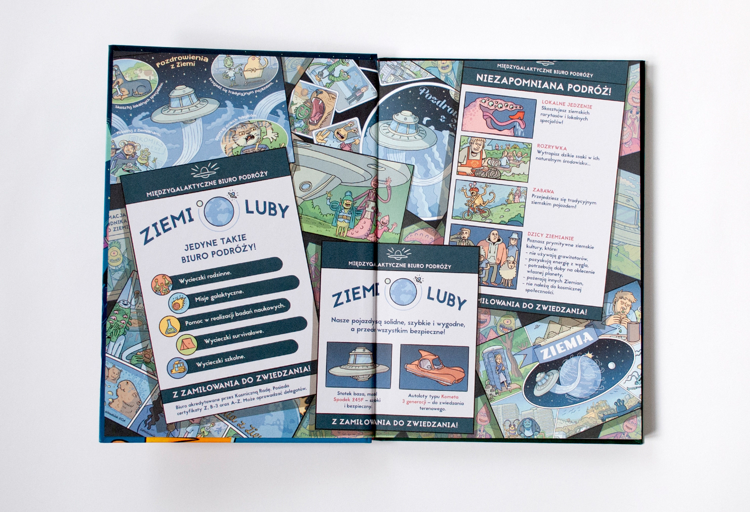
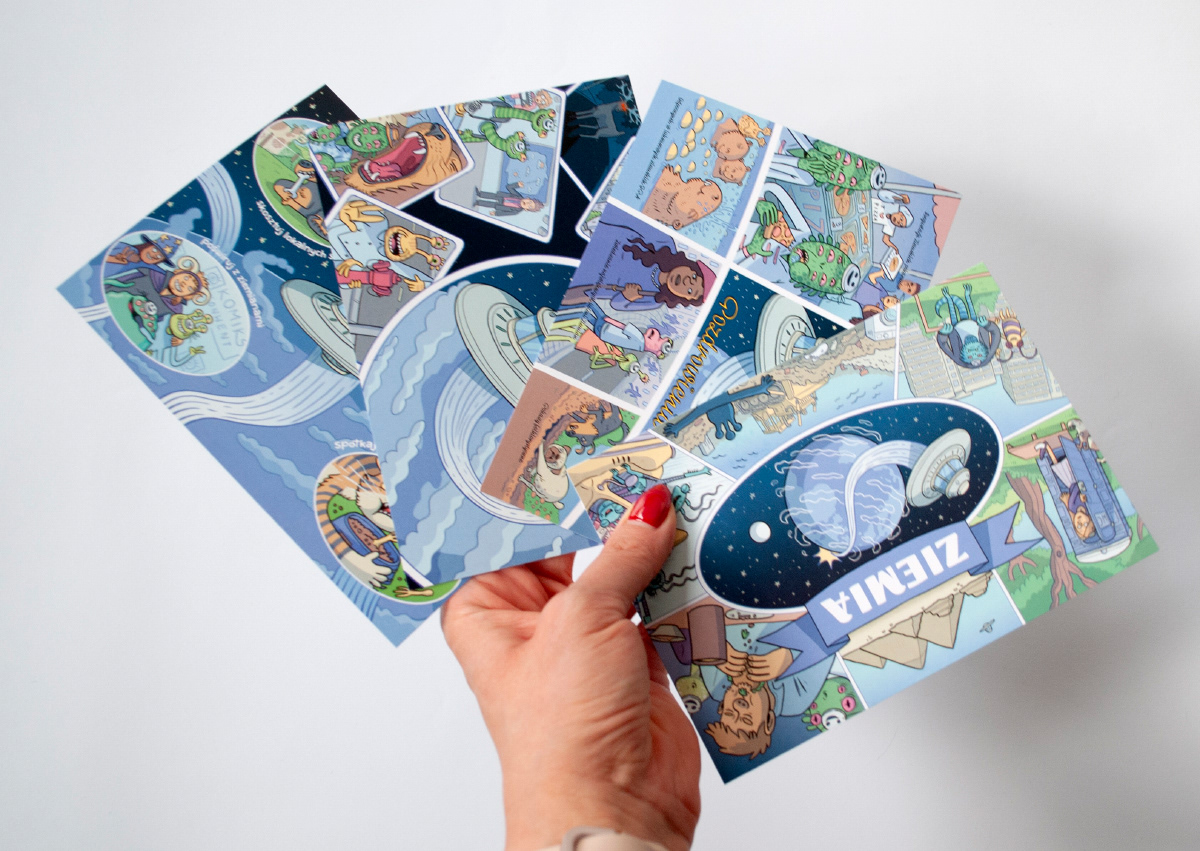
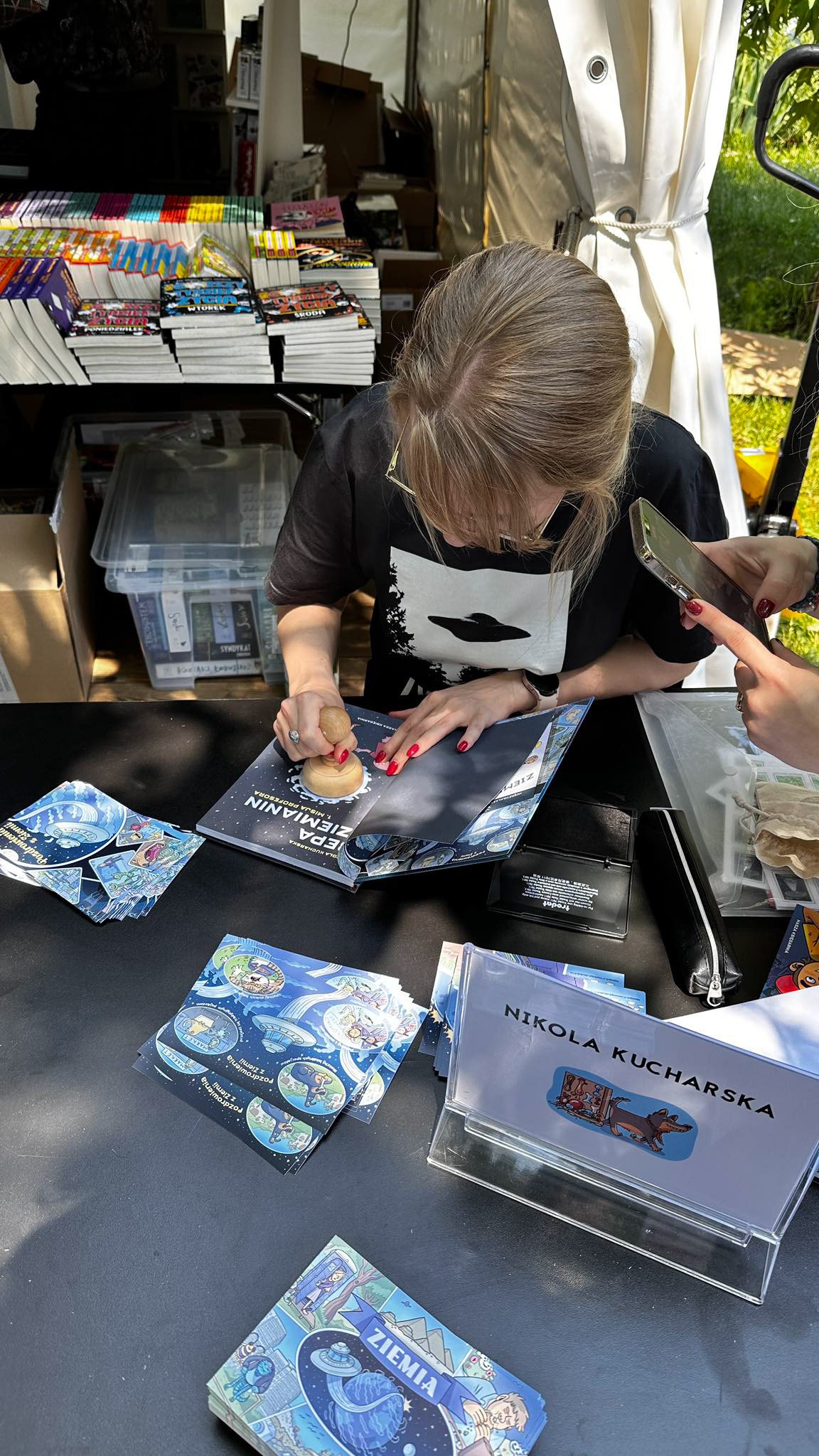
Even at the script stage, I considered which elements could be used for marketing purposes. The first volume of the story revolves around a travel agency that guides aliens around planet Earth. I decided that the promotional materials would include postcards with greetings from Earth. Their form, design, and layout are reminiscent of classic, somewhat kitschy postcards that can be bought in any tourist spot in Poland.
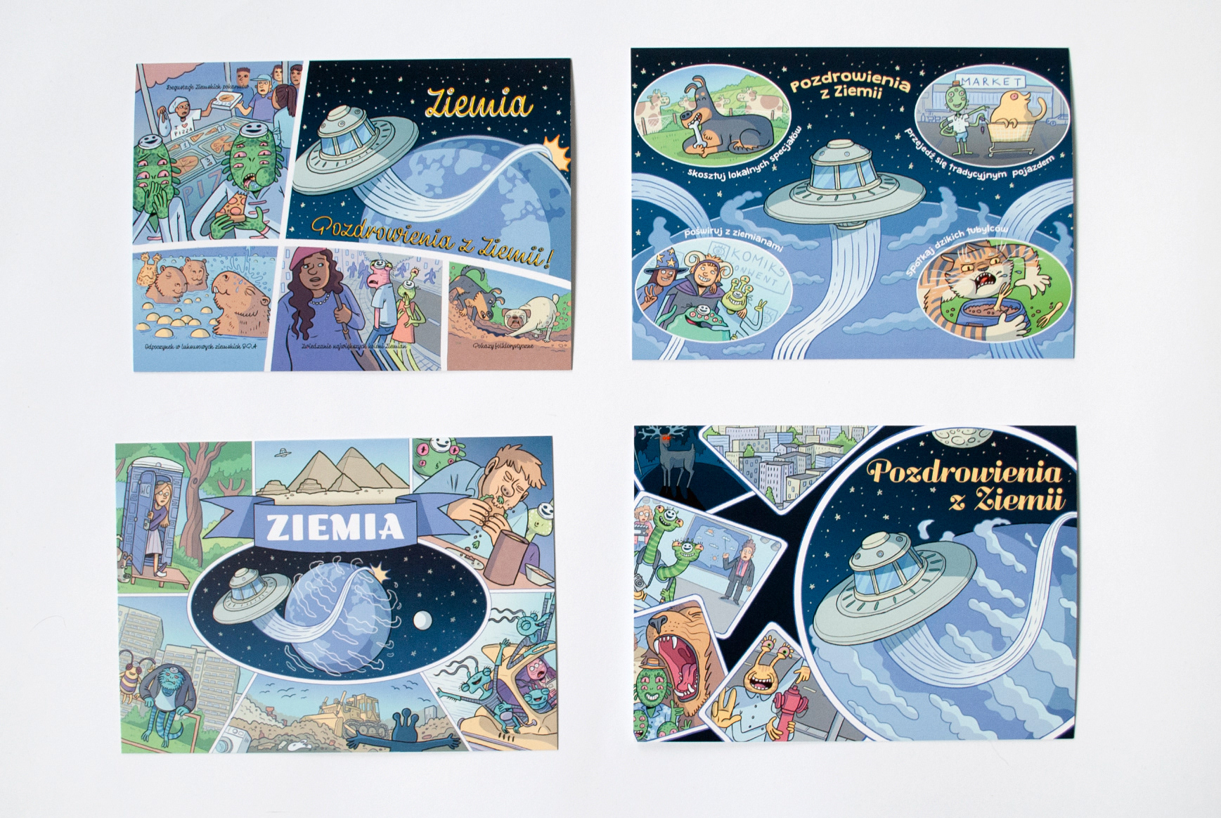
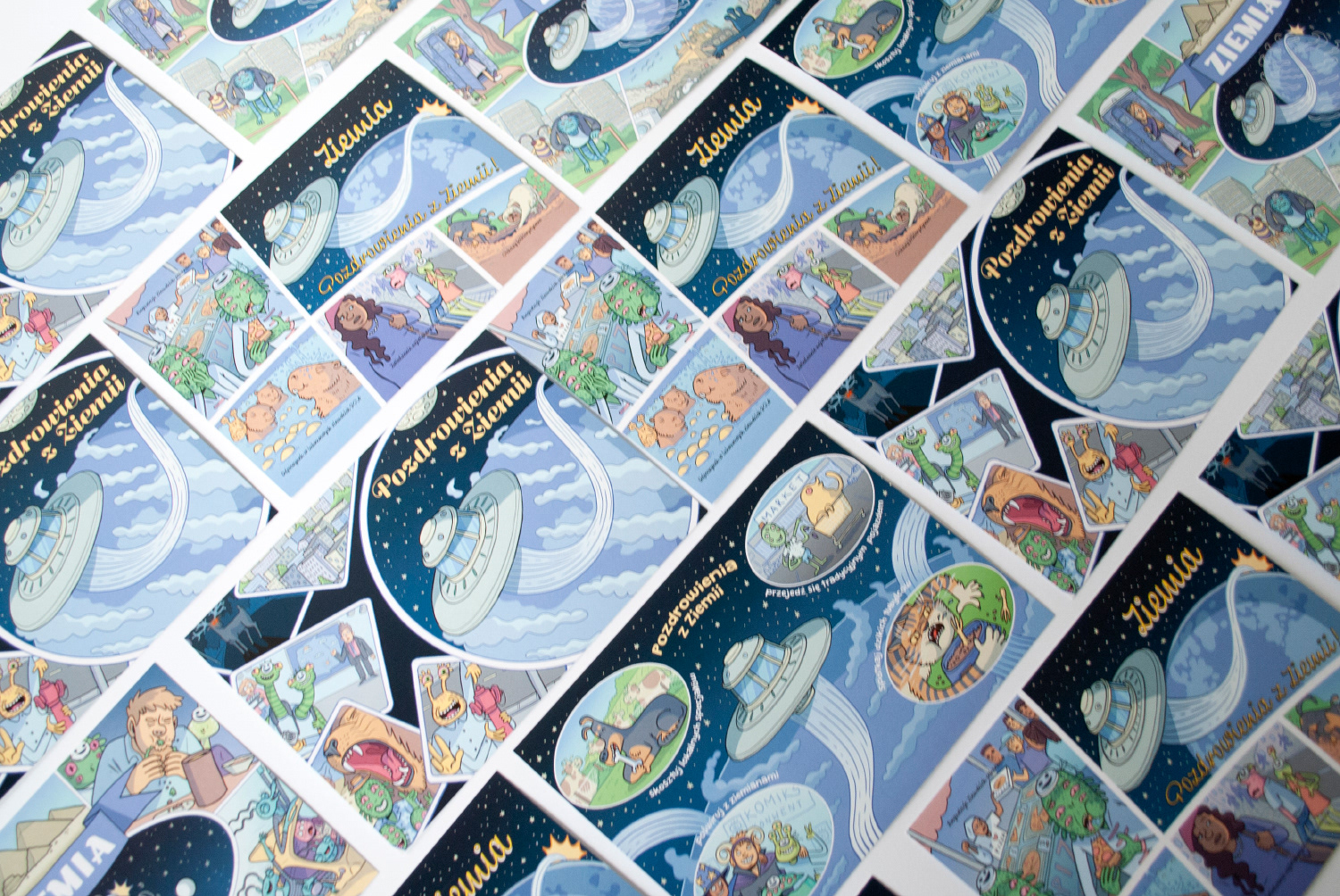
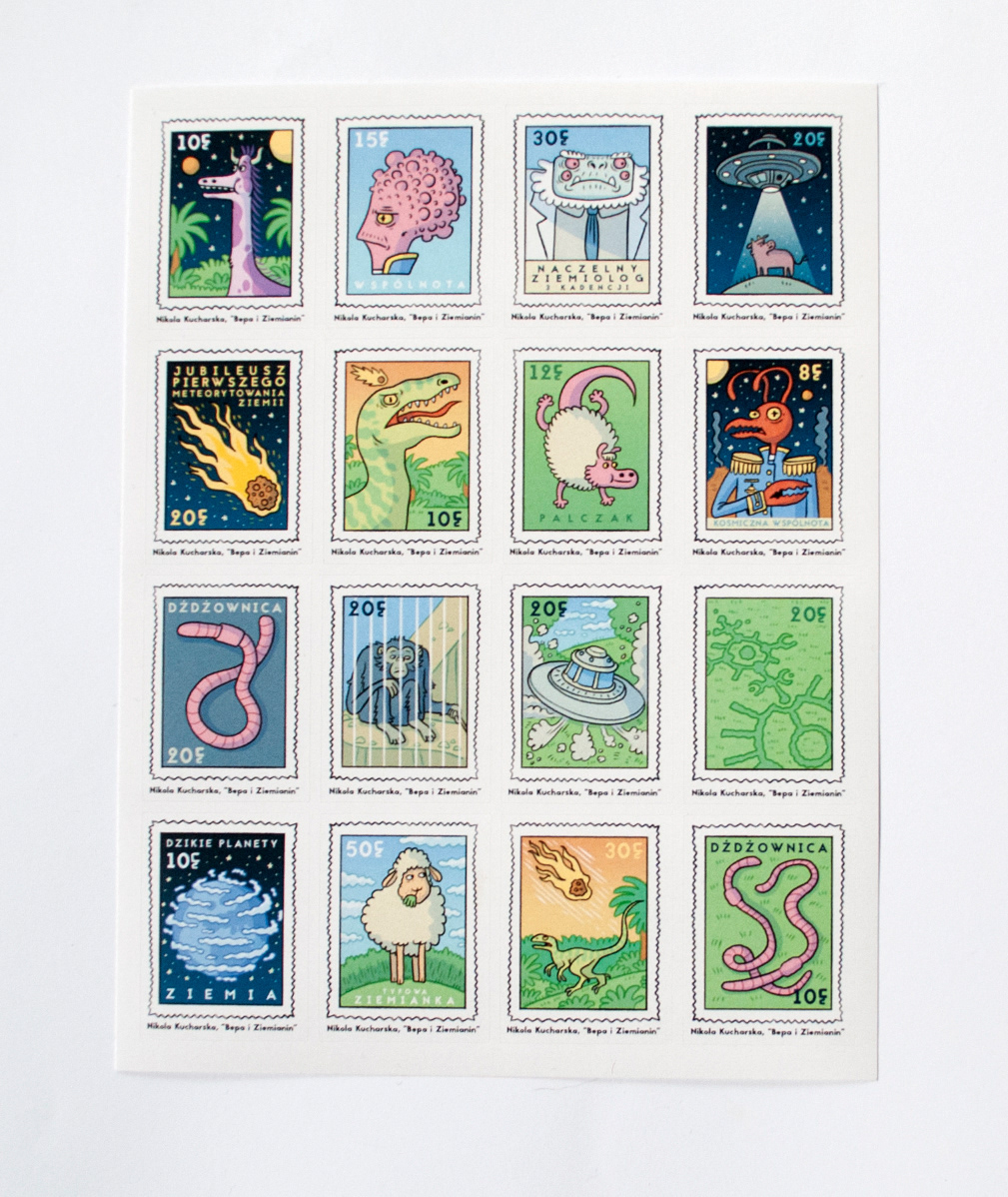
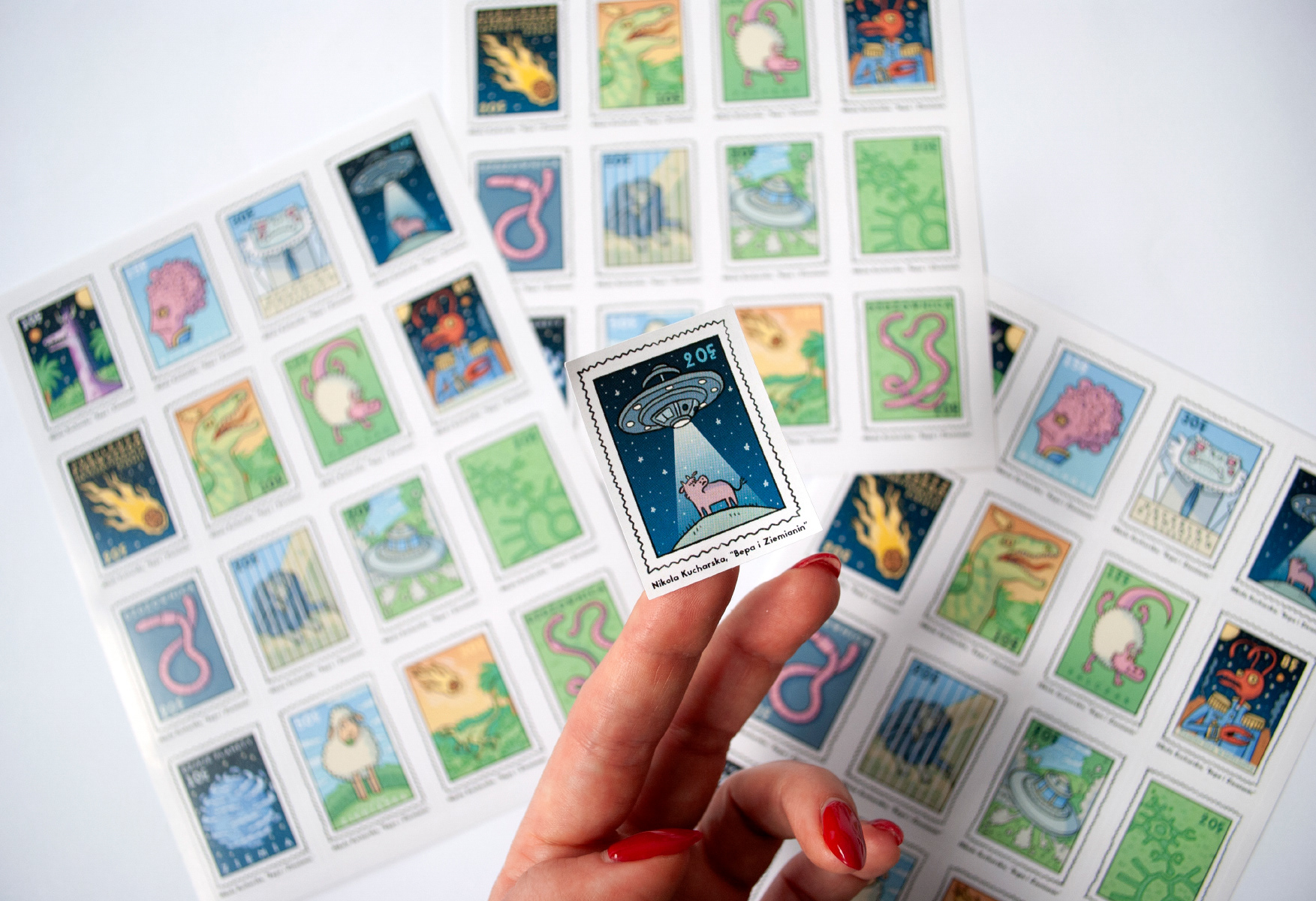
I also designed sticker sheets to accompany the postcards, mimicking postage stamps. The stickers feature motifs from the book, enhancing the thematic connection and appeal of the promotional materials.

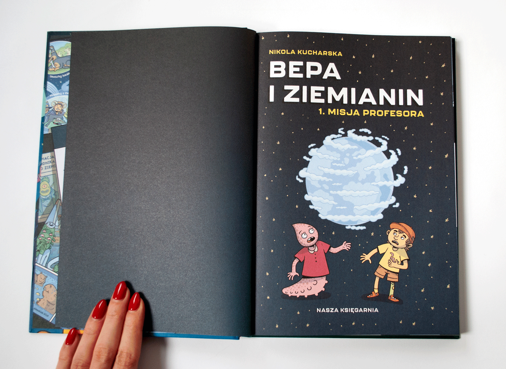
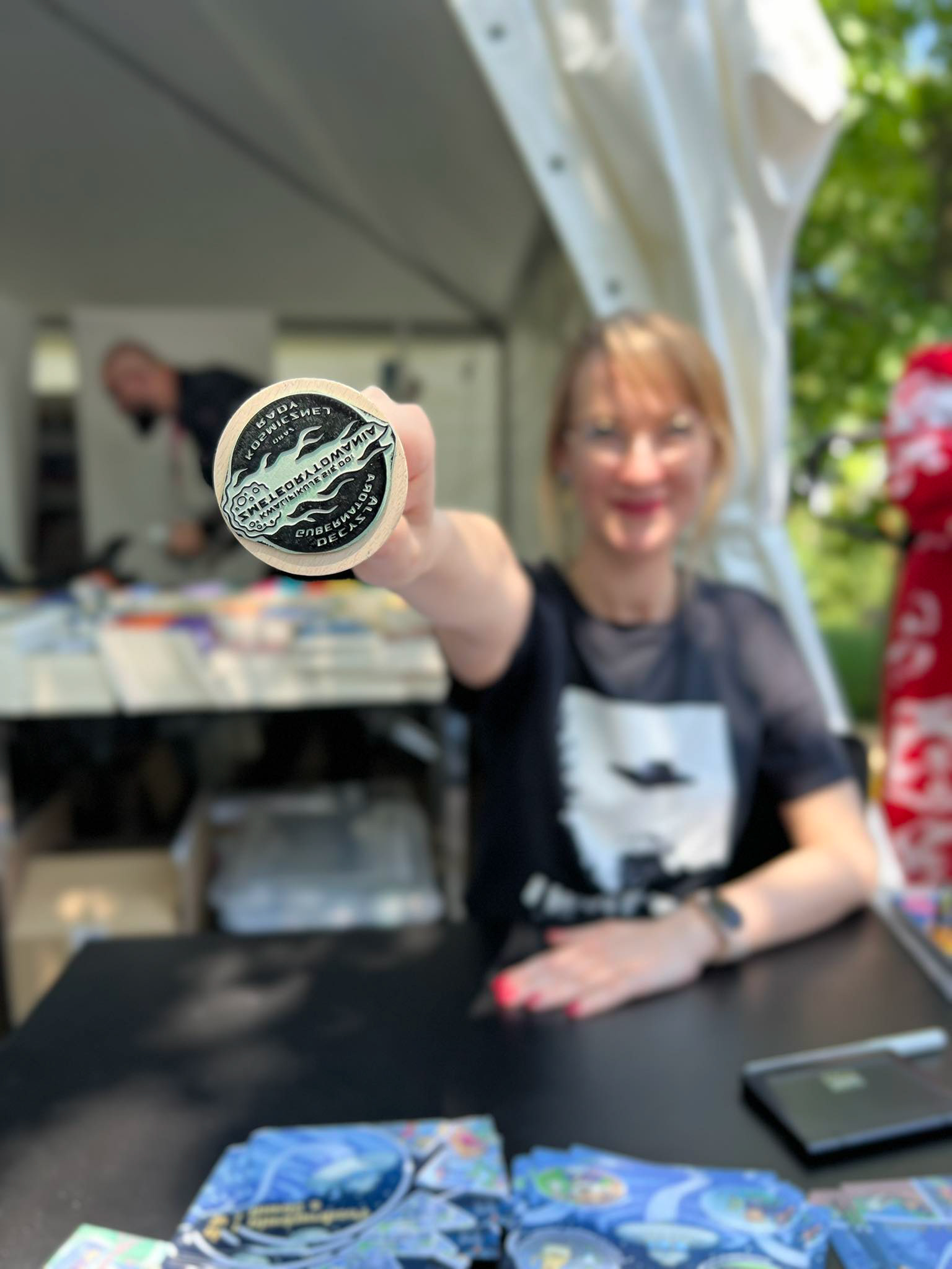
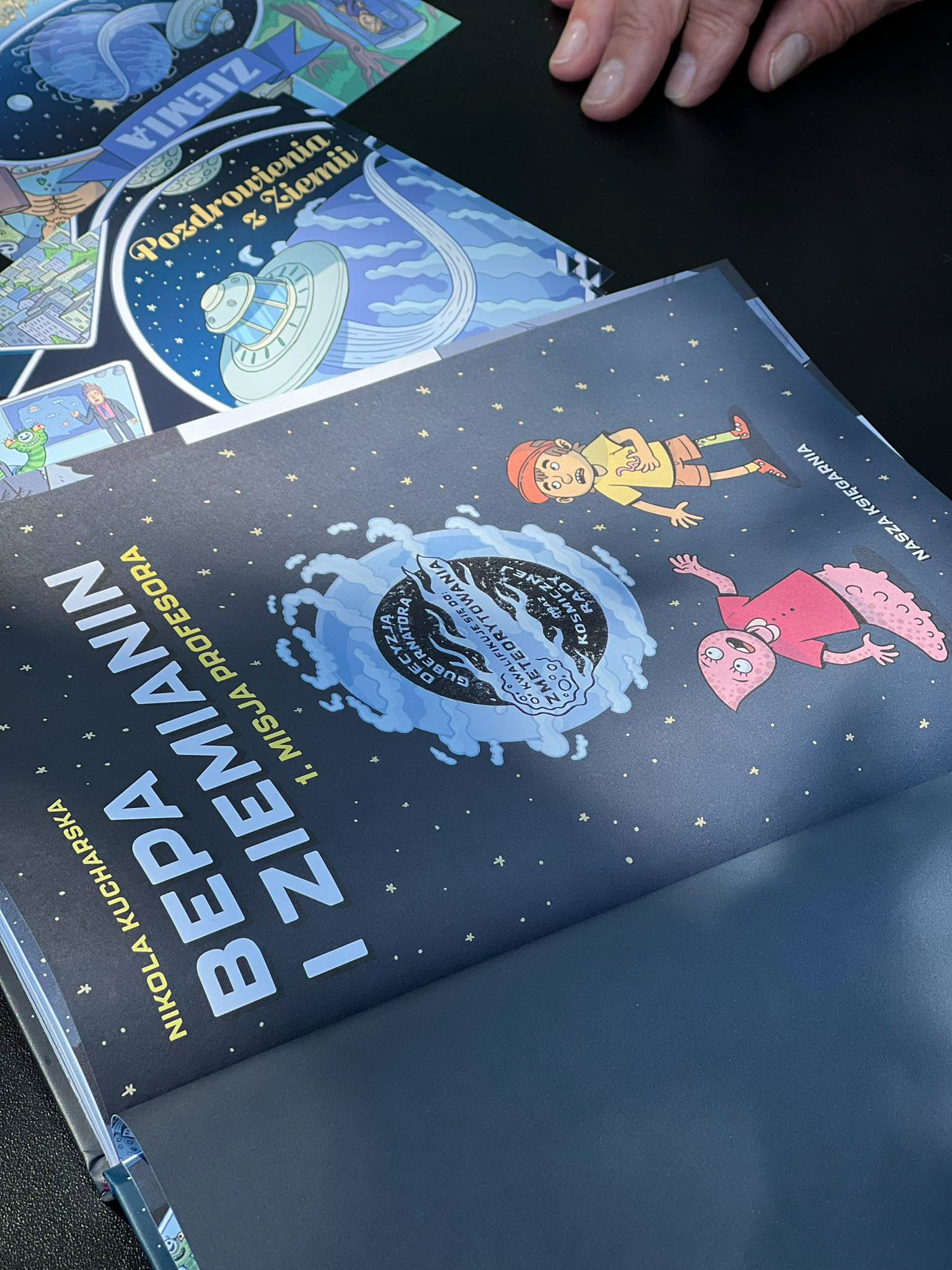
The final element is a stamp featuring the Meteorite, with the inscription "By the Decision of the Governor and the Cosmic Council: TO METEORIZED." The title page is designed in such a way that the stamp complements the illustration present there.
The text on the stamp refers to the final scene of the comic, in which the Governor decides to send a meteor to Earth to destroy all mammals.
The stamp's design itself is reminiscent of the stamps that the titular Professor has been using throughout the story to stamp his report for the Cosmic Council.

The next volumes of 'Bepa' are already planned out. I know how this story will unfold and conclude. I also have a script prepared for the second volume, which is waiting to be illustrated.
Working on the second part should be slightly less complicated. The universe and project foundations are established and will remain unchanged. I aim to maintain the dynamics, color scheme, framing style, and cinematic quality of this project. In the next installment,
I want to further explore the possibilities offered by using 3D graphics in comics. I also have interesting visual ideas that will be key to the story.
I want to further explore the possibilities offered by using 3D graphics in comics. I also have interesting visual ideas that will be key to the story.
The next installment is scheduled for release next year - I will definitely present it here!